 On May 1, 1933, in the depths of the Great Depression, The Catholic Worker newspaper made its debut with a first issue of twenty-five hundred copies. Dorothy Day and a few others hawked the paper in Union Square for a penny a copy to passersby.–https://www.catholicworker.org/
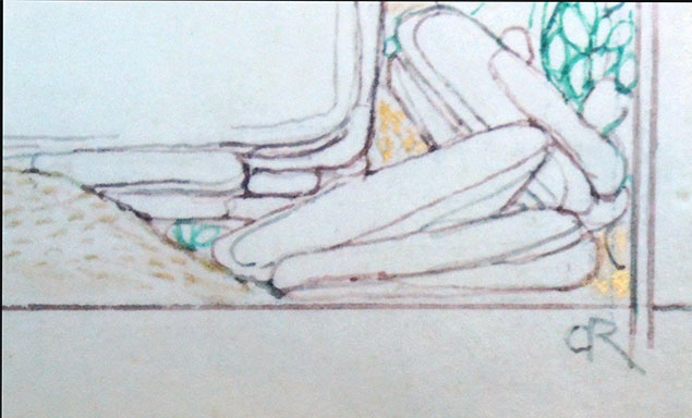
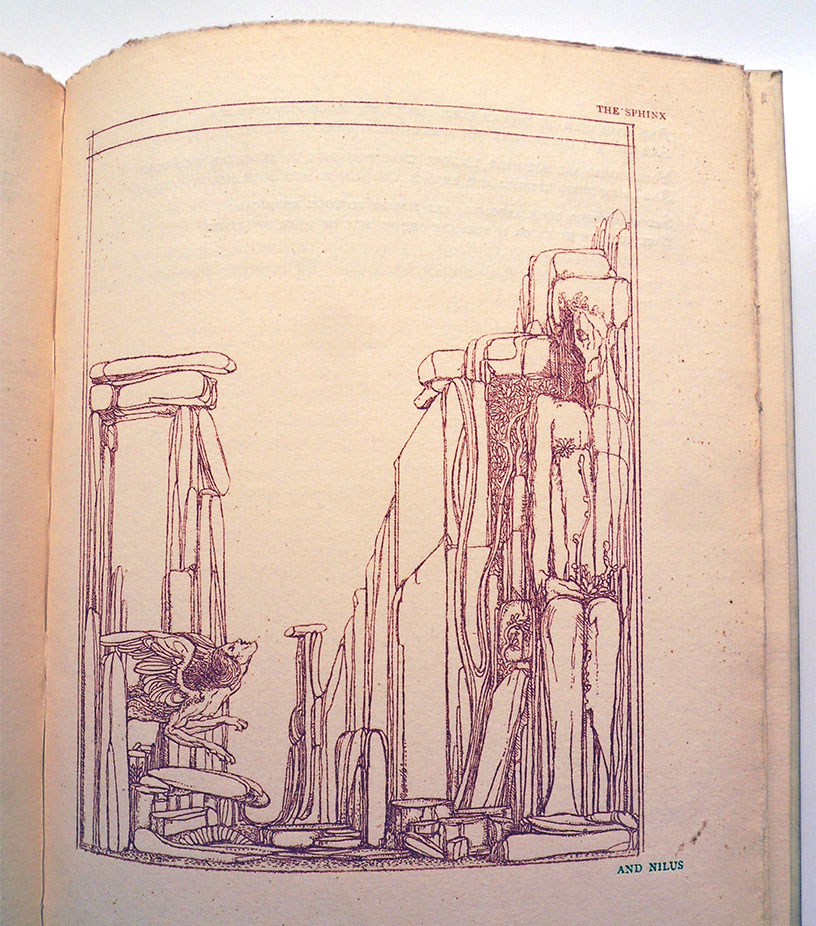
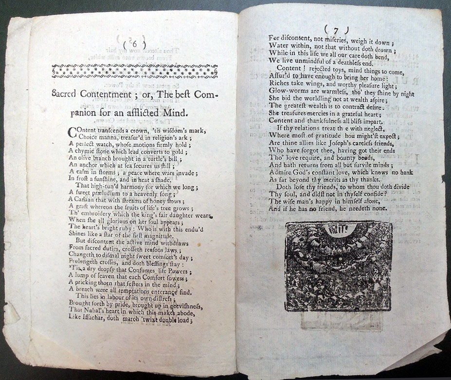
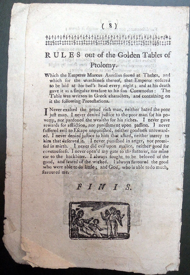
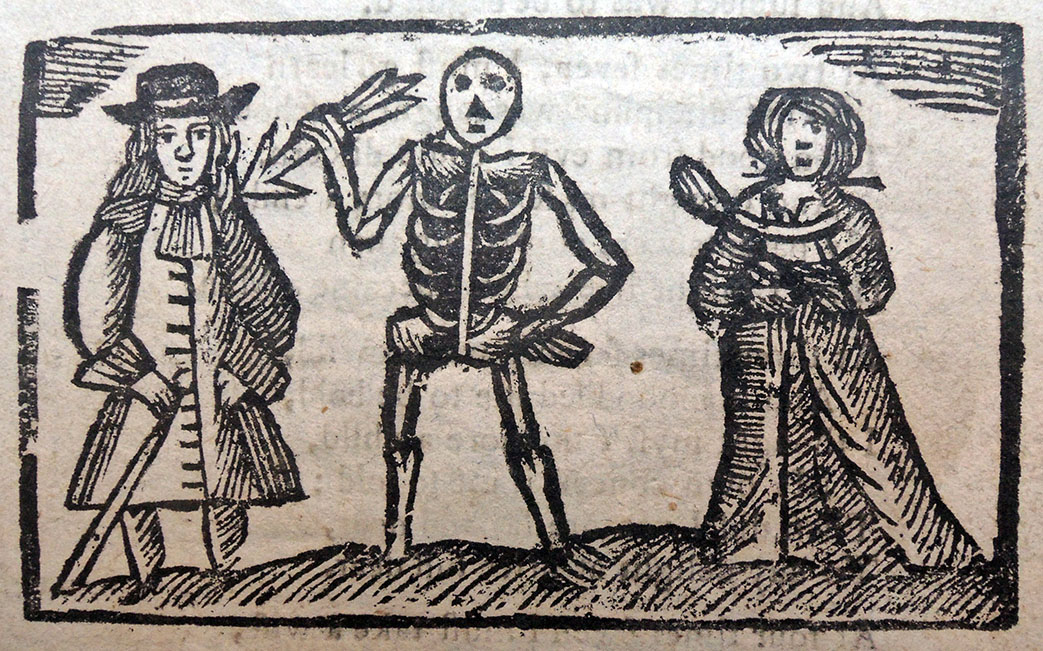
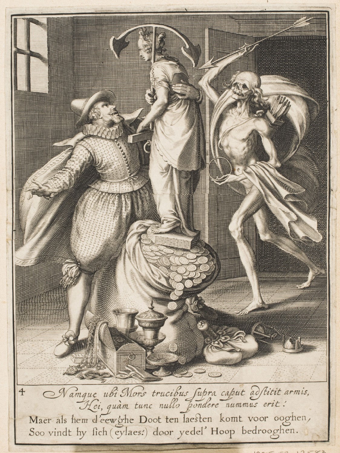
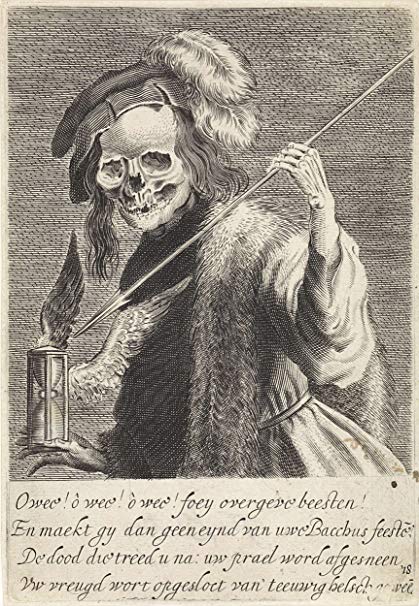
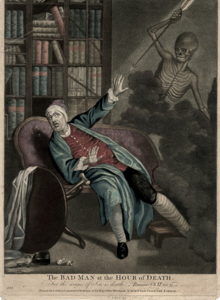
Still costing one penny, The Catholic Worker remains one of the best sources for black and white graphic art. Here are a few cuts from a recent issue. Browse or search for additional examples of CW art here: https://www.catholicworker.org/dorothyday/browse/index.html
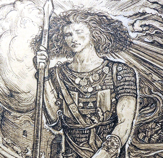
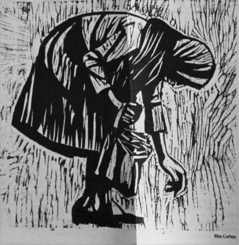 Rita Corbin
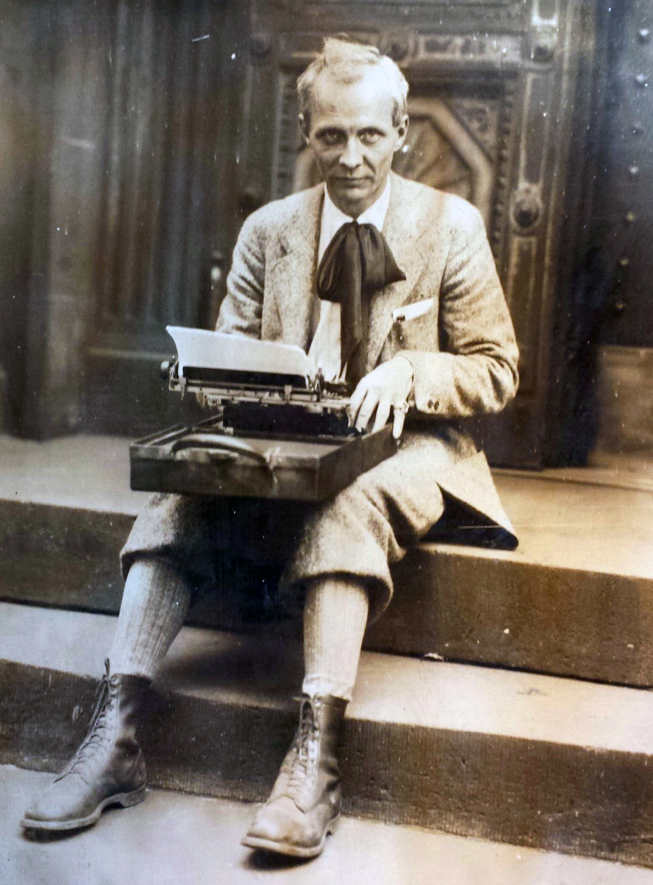
After realizing she had no interest in advertising, she then studied under printmaker Harold Sternberg at the Art Students league, followed by an apprenticeship with German-born abstract expressionist Hans Hoffman, though her studies with him came to end when she married. But her best art education, she said, came from spending afternoons visiting the art museums and galleries, and walking the streets and riding the subways drawing the ordinary people she saw.
Rita arrived at the Catholic Worker on Chrystie Street at the age of twenty. Although she wasn’t aware of it she was following in the footsteps of Ade Bethune. the first Catholic Worker artist. As Dorothy did with Ade fifteen years previously, she immediately set Rita to work illustrating the paper, and Rita became a life-long contributor as one of the three primary Worker artists along with Ade and Fritz Eichenberg. Of the three, Rita was the only one to have lived at the Catholic Worker, and she also raised five children while being an artist. –“In Memory of Rita Corbin 1930-2011” by Kate Hennessy in The Catholic Worker January 2012
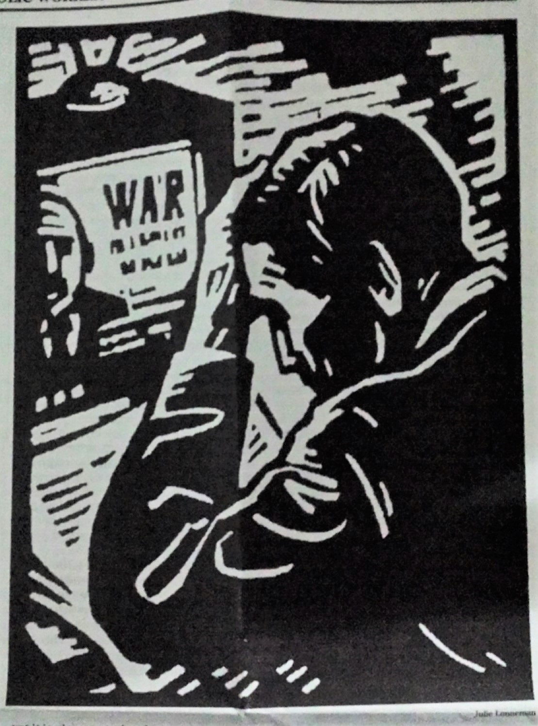 Julie Lonneman
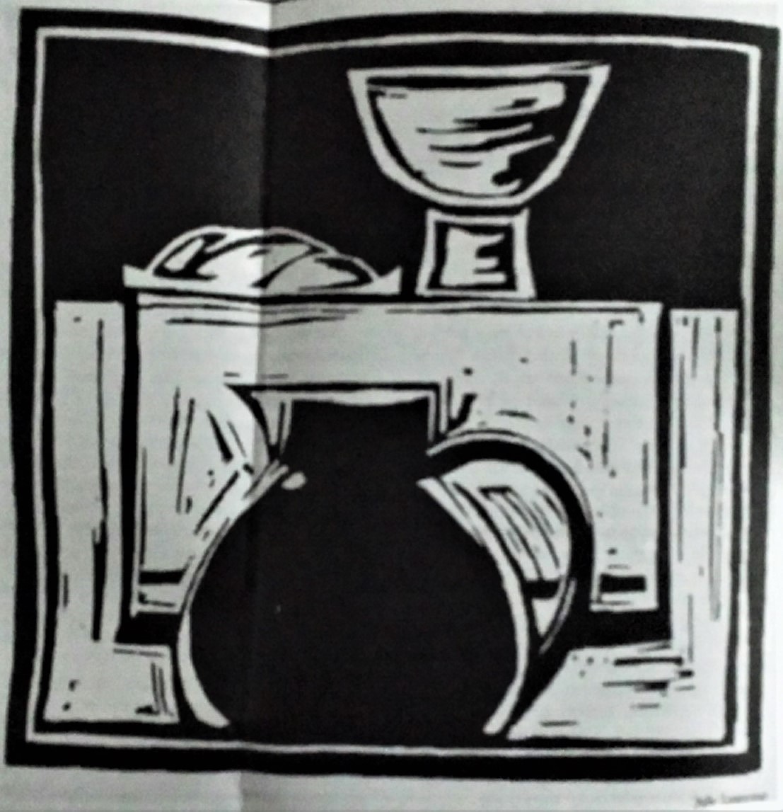
 Rita Corbin
 Julie Lonneman
 June Hildebrand
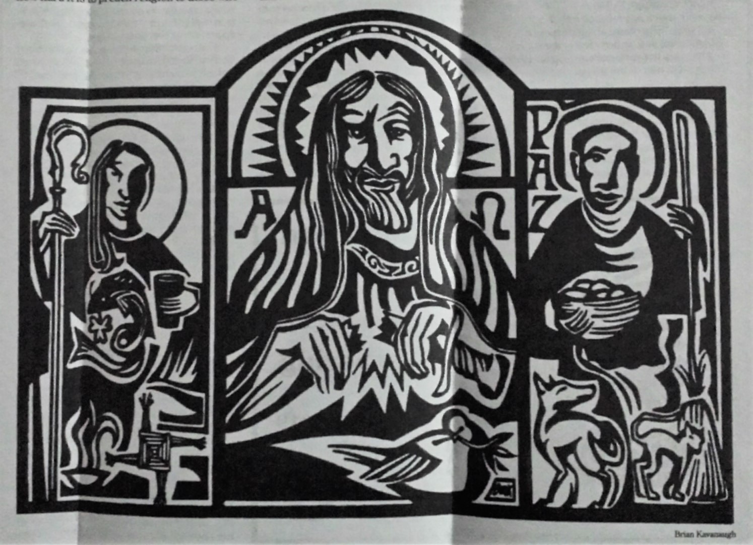 Brian Kavanagh
The Catholic Worker. Firestone Library Forrestal Annex 0921.247f
Subscriptions
36 East 1st Street
New York NY 10003
Phone: 212-777-9617