Category Archives: Acquisitions

new acquisitions

Ostafrikanische Gletscherfahrten

Hans Heinrich Joseph Meyer (1858-1929), Ostafrikanische Gletscherfahrten: Forschungsreisen im Kilimandscharo-Gebiet (Leipzig: Bibliographisches Institut for Duncker & Humblot, 1890). Mounted frontispiece and 12 heliogravure (=photogravure) plates after negatives by Meyer, 8 albumen silver prints after Meyer, 2 double-page lithographic maps, routes added by hand in red, and one large folding color lithographic map by Bruno Hassenstein, along with wood engraved illustrations and tailpieces in the text. Graphic Arts collection GAX 2020- in process.


Three times Hans Meyer attempted to climb to the summit of Mount Kilimanjaro. On the third try, he succeeded in being the first European to make the climb. The following year, he published a richly-illustrated first-person account of this ascent and in 1891, published an English translation with the same images (Across East African Glaciers. An account of the first ascent of Kilimanjaro). The Graphic Arts Collection is fortunate to have acquired the rare fist edition of his account with photographs and photogravure plates from the negatives Meyer made during the third expedition. Here’s a quick review of his climbs:

“In 1887, Professor Hans Meyer, a German geographer, made his first attempt upon the summit of Kibo. Accompanied by Baron Von Eberstein, Meyer was eventually defeated by a combination of thick snow, 30m ice walls and his partner’s altitude sickness. The following day, from the safety of The Saddle, Meyer estimated that the ice walls descended to just below the crater rim at an altitude of about 5,500m. The ice was continuous over the entire peak and it was evident that the summit could not be reached without some considerable ice climbing.

After an aborted expedition in 1888, Meyer returned the following year accompanied by the renowned Alpinist, Ludwig Purtscheller and a well organised support group determined to scale the peak. The climbers came prepared with state of the art equipment and established a base camp on the moorland from where porters ferried fresh supplies of food from Marangu. …[after various attempts] they returned to advance camp to try again after three days. This time the route was clearly marked and the previously cut ice steps had held their shape. The rim was reached in 6 hours and at exactly 10.30hrs Meyer became the first recorded person to set foot on the highest point in Africa. https://ntz.info/gen/b00840.html#id04807


Penitent Prostitutes, 1765

Magdalen Chapel by Thomas Rowlandson in Microcosm of London (London: R. Ackermann, [1808-11?]). Oversize Rowlandson 1808.02f


The Hymns Anthems & Tunes; with the Ode used at the Magdalen Chapel Set for the Organ Harpsichord, Voice, German-Flute or Guitar (London: Thompson, 1765?). Graphic Arts Collection 2020- in process

“The Magdalen House, for the reception of penitent female prostitutes, is situated on the east side of the road leading from Blackfriars-bridge to the obelisk in St. George’s-fields: it consists of four brick buildings, which inclose [sic] a quadrangle, with a basin in the center. The chapel is an octangular edifice, erected at one of the back corners; and to give the inclosed court uniformity, a building with a similar front is placed at the opposite corner.

This benevolent institution was projected in the year 1758, by Mr. Robert Dingley; it was at first kept in a large house, formerly the London Infirmary, in Prescot-street, Goodman’s-fields, and was called the Magdalen Hospital. The utility of this charity was so conspicuous, and so well supported, that the views of the benefactors extended t the building an edifice more enlarged and convenient for the purpose…” —Microcosm of London (continues below)

This book of hymns and tunes now in the Graphic Arts Collection was specifically written for the women at the Magdalen Hospital for the Reception of Penitent Prostitutes. It is one of two editions thought to have been published in 1765, the other by Henry Thorowgood. The frontispiece engraving features  “A Magdalen in Her Uniform” with Magdalen Chapel in the background (cf the Thorowgood edition without the building and the figure reversed),

One source credits this popular chapel for bringing a number of men back to Sunday services, given the women in the choir.


Vellucent bindings


Vellucent binding: “A method of decorating (and protecting) a bookbinding utilizing transparent vellum. The technique was developed by Cedric Chivers sometime around 1903, and is designed not only for the protection of leather bindings, but also to protect covers bearing colored designs (usually pictorial in nature) painted on paper, attached to the boards, and then covered with the vellum. The vellucent covering is also suitable for highly decorative designs because it is possible to further embellish the design by means of mother-of-pearl, iridescent shell, and the like, all of which may be covered and permanently protected by the vellum. The surface of the vellum itself can he tooled in gold, thus further enhancing the entire effect. See also: EDWARDS OF HALIFAX . (94 , 236 )”—CoOL URL: http://cool.conservation-us.org/don/dt/dt3692.html


Thanks to Stephen J Gertz for the following: http://www.booktryst.com/2010/07/cedric-chivers-art-vs-library-bindings.html

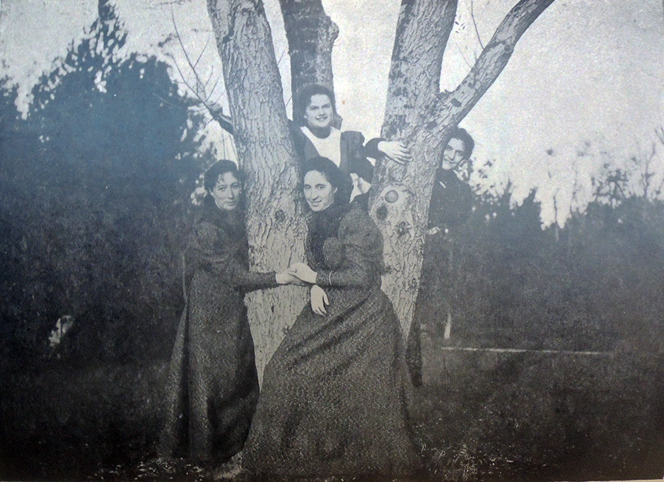
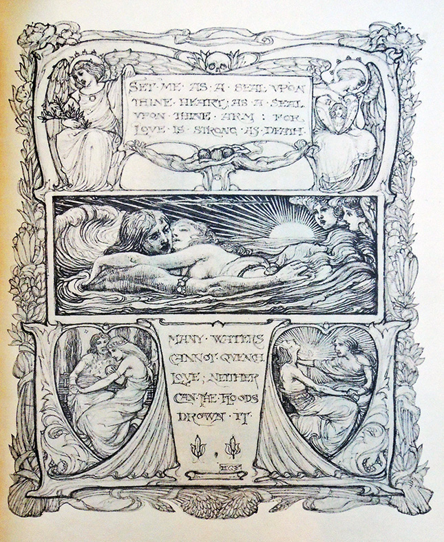
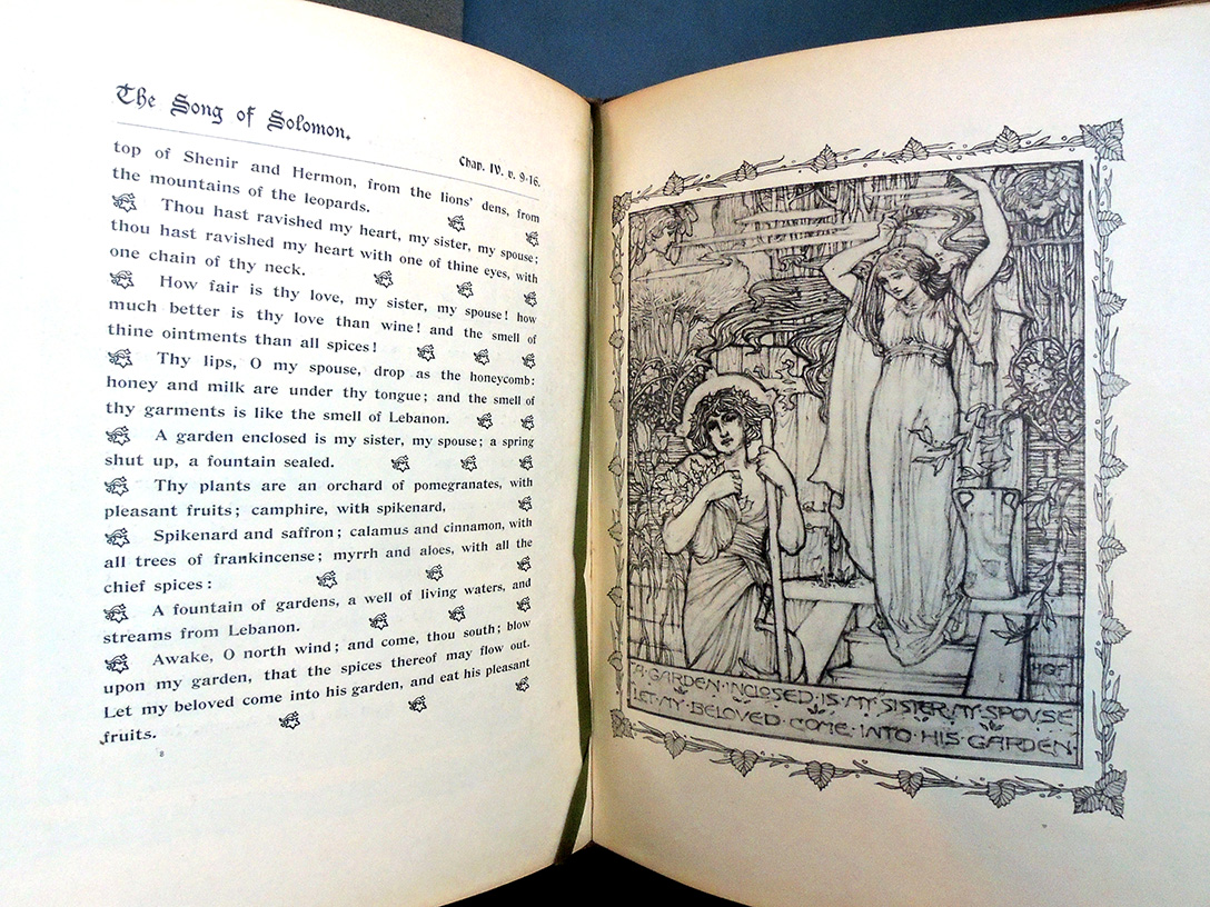
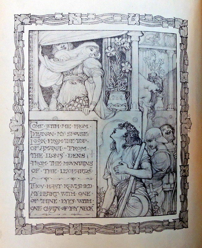
“In his large bindery at Portway, Bath, Chivers employed about forty women for folding, sewing, mending, and collating work, and in addition, five more women worked in a separate department, to design, illuminate, and colour vellum for book decoration, and to work on embossed leather. These five were Dorothy Carleton Smyth, Alice Shepherd, Miss J.D. Dunn, Muriel Taylor, and Agatha Gales. Most Vellucent bindings were designed by H. Granville Fell, but the woman most frequently employed for this kind of work was probably Dorothy Carleton Smyth” (Marianne Tidcombe, Women Bookbinders 1880-1920, p. 86).

“Smyth [1880-1933] was born in Glasgow, the daughter of a jute manufacturer. She studied art in Manchester and then attended the Glasgow School of Art from 1895 until 1905. Her stained glass piece Tristan and Iseult was exhibited at the International Exhibition in 1901, and in 1903 an anonymous female patron paid for Smyth to study in Europe. At first Smyth was best known as a portraitist, particularly for her sketches of theatre personalities. Later she specialised in theatre costume working in London, Paris and Sweden. She designed costumes for several of the Shakespearean Festivals held in Stratford-upon-Avon, beginning in 1906. Smyth was appointed Principal of Commercial Art at Glasgow School of Art in 1914, and began to concentrate more on teaching than costume design. However, in 1916 she designed costume and decoration for the Quinlan Opera Company’s world tour. In 1933 Smyth was appointed as the first woman director of the School of Art, but died before she could take up the post” (The Glasgow Story).

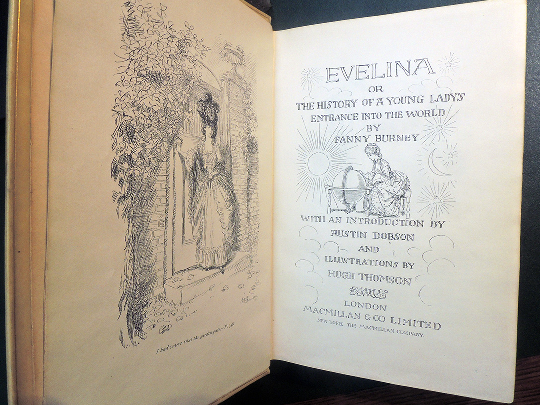
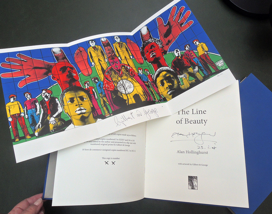
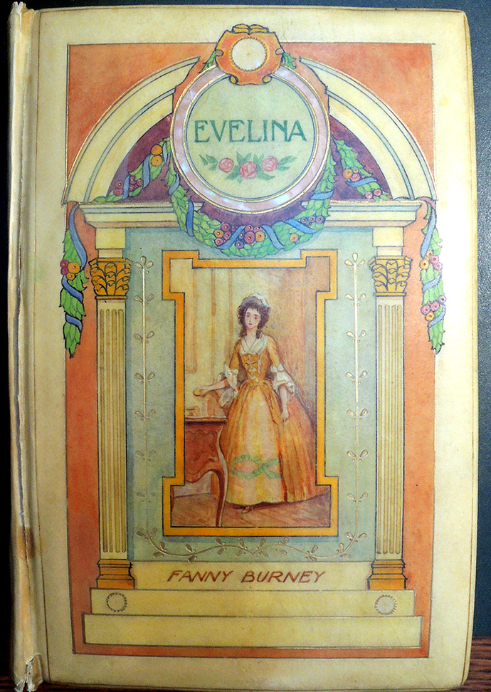
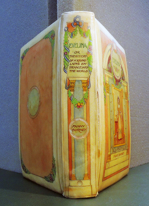
Fanny Burney (Madame D’Arblay), Evelina or The History of A Young Lady’s Entrance Into The World; With an Introduction by Austin Dobson and Illustrations by Hugh Thomson. Bound by Cedric Chivers (London: Macmillan & Co Limited, 1903). Graphic Arts Collection GAX 2020- in process

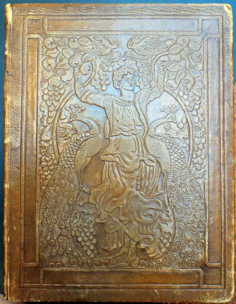
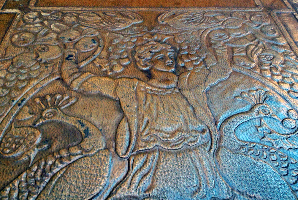
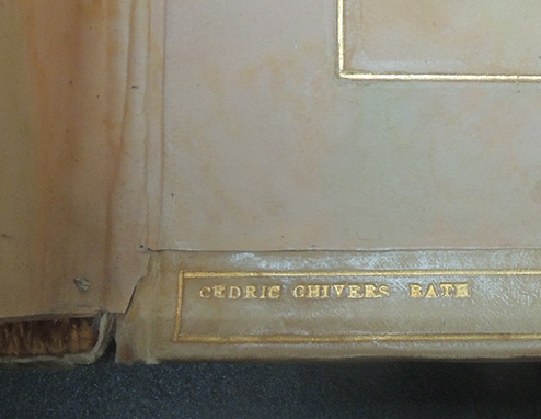
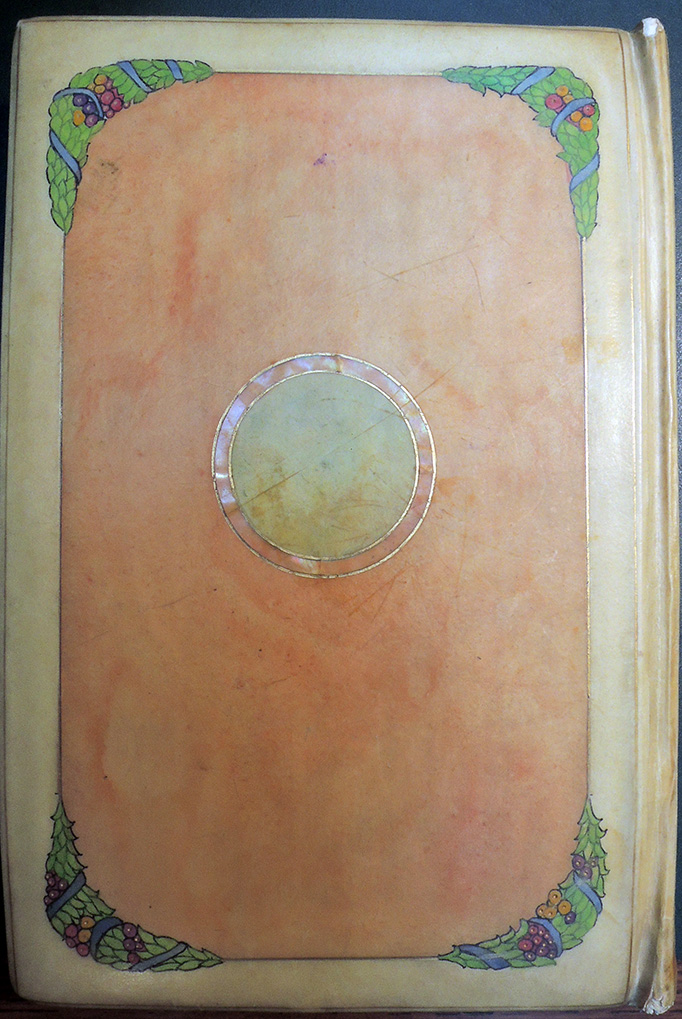
Our new acquisition is completed in a “vellucent” binding by Cedric Chivers of Bath, stamp-signed on the back turn-in, of transparent vellum over paper. Front cover with a multi-color painted architecturally frame with three mother of pearl inlays enclosing an original painting of Evelina after Hugh Thomson frontispiece, with the title and author hand-lettered. Spine with matching decoration, lettering and mother of pearl ring around Burney’s name. Back panel painted plus another mother of pearl ring and painted multi-color floral gatherings in the corners. Vellum and paper doublures ruled in gilt.

The British Library printed this biography of the author:

“Burney’s entry into the world of letters was elaborately strategised and much anguished over, much like the debuts into society through which she put the heroines of her most celebrated novels. After a childhood spent writing stories and plays, Burney anonymously published her first novel, Evelina, in 1778. Wary of the public eye and uncertain how her family would react to her writing for a mass audience, Burney sought to keep her authorship secret for as long as possible. But, after months of public speculation and the praise of literary figures such as Hester Thrale and Samuel Johnson, Burney owned the novel as her own.

…Burney’s father introduced her to important writers, actors and artists – David Garrick and Joshua Reynolds socialised at the Burney household – but was conservative in his estimation of what literary genres were suitable for women writers. Burney was discouraged by her father and close family friend Samuel Crisp from writing comedy and satire, particularly for the stage. Instead, she put her sharp insight into the foibles and mannerisms of society to good use in her next novel, Cecilia (1782), which sold widely and cemented Burney’s literary reputation and her status as a literary celebrity in London.”– https://www.bl.uk/people/frances-burney

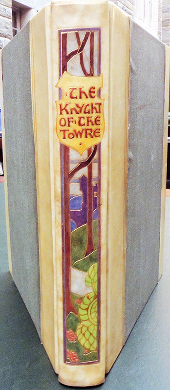
Princeton University Library also owns this half vellucent binding in the Cotsen Children’s Library:  Geoffroy de La Tour Landry (active 14th century), The booke of thenseygnementes and techynge that the Knyght of the Towre made to his doughters (London: George Newnes, 1902) (London & Edinburgh : Ballantyne Press) Cotsen Children’s Library Press 40742.


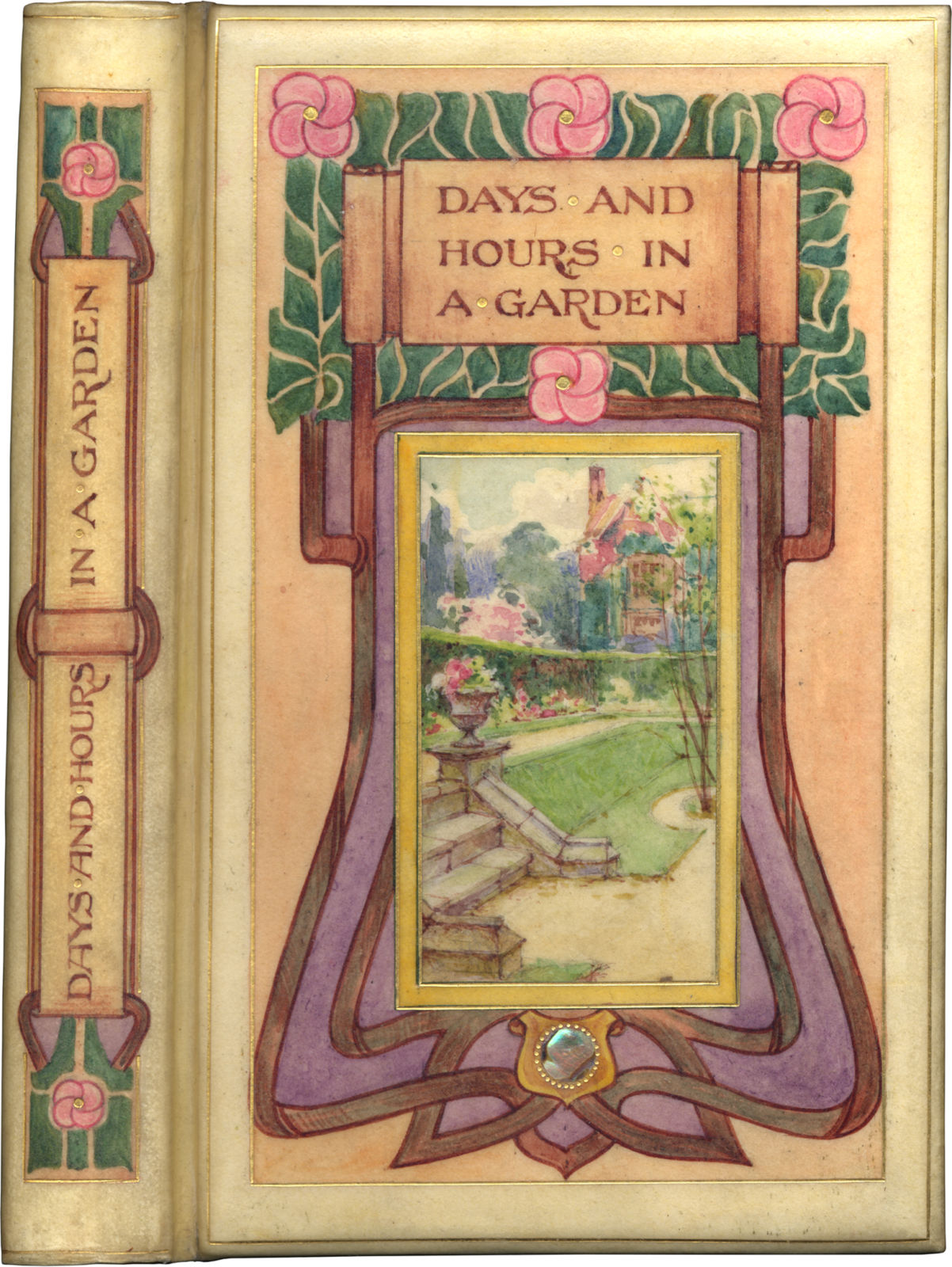
Thanks to Edward Levin for sharing his copy of Eleanor Vere Boyle, Days and Hours in a Garden (London: Elliot Stock, 1898) Chivers catalogue no. lxxxvi, with a similar binding.
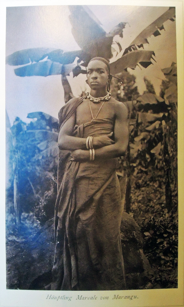
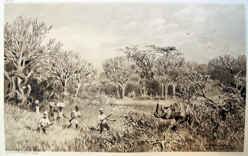
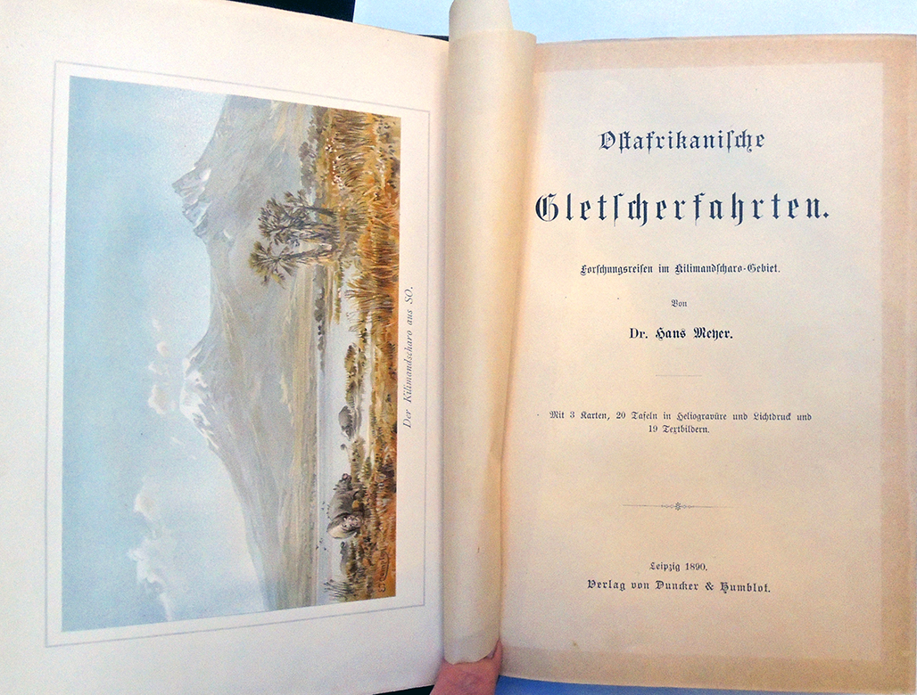
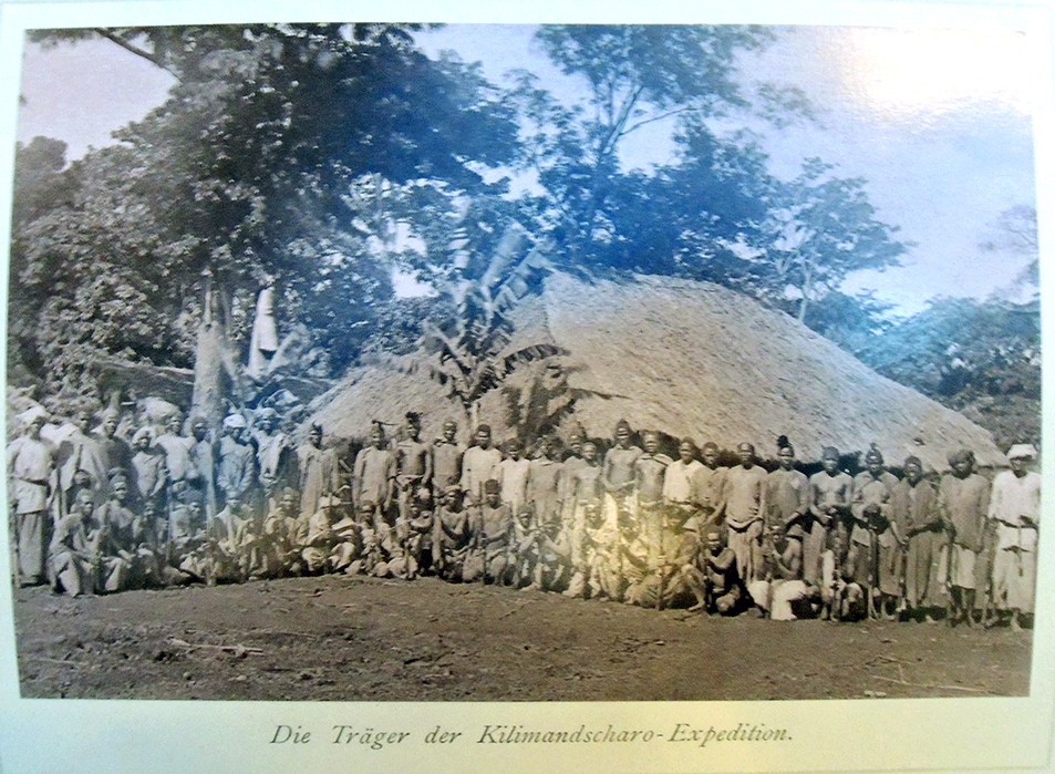
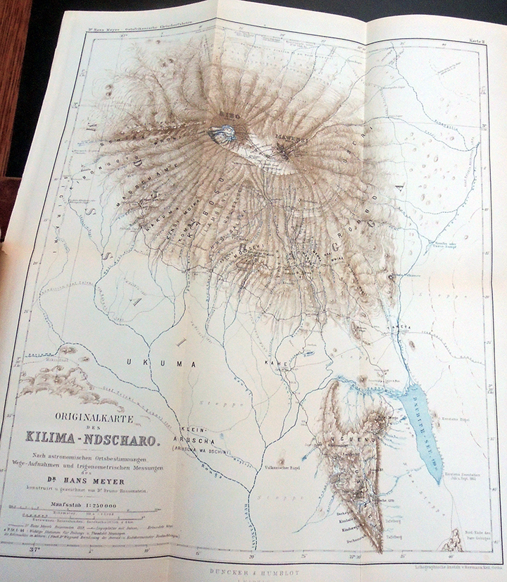
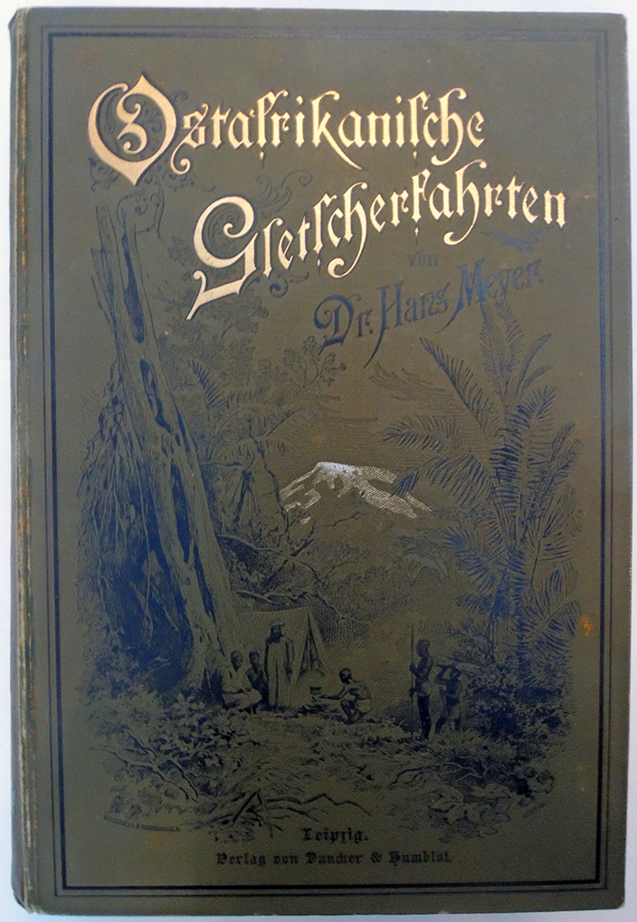
 

Oak Tree Press First Chapters


The Graphic Arts Collection acquired a nearly complete deluxe set of Oak Tree Press’s First Chapter Series of Booker Prize-winning novels and prints [8 of 10]. Not only are the individual numbered copies signed by the author on the title page and hand bound in cloth, but many include a signed print within the slipcase. The series began in 2006 with J.M. Coetzee’s Life and Times of Michael K, with a lithograph by the South African artist Colbert Mashile [above].

“Colbert Mashile was born in 1972 in Bushbuckridge, Mpumalanga and currently lives and works in Johannesburg. Mashile received his Diploma in Fine Arts from the Johannesburg Art Foundation in 1994 and later continued his studies at the University of Witwatersrand where he obtained a BA in Fine Arts in 2000 and a Post-Graduate Diploma in Heritage Studies in 2002. Since then Mashile has presented ten solo exhibitions, with the most recent being Messages from our Ancestors in 2013 at the Art Eye Gallery in Sandton, Johannesburg.” — Read more: https://smacgallery.com/exhibition/colbert-mashile-2015/


“Ezequiel Mabote [his work above] is a self-taught artist who grew up in an arts neighborhood in Maputo. He was influenced by the old masters of sculptures, paintings and batiks at the age of 10. He then took art lessons at Noroestel High School in Maputo. In 1998, Ezequiel moved to South Africa to fulfill his dreams in art. He stayed in Durban KwaZulu Natal with his cousin brother, Isaac Sithole. Isaac introduced him to the Bat Centre where he networked with local artists. In 1999, he attended a printmaking workshop at the Bat Centre with Samuel N Mbingilo from the John Muafangejo Art Centre in Namibia.

He held his first exhibition in 1999 at the Intensive Care Café at the Bat Centre and two years later attended printmaking workshops at the Caversham Press in the KwaZulu-Natal Midlands under well-known artists such as Malcolm Christian, Dr David Koloane, the late Gabi Nkosi, Kevin Sipp, Xolile Mtakatya and many more. Ezequiel now specializes in printmaking, woodcut colour reduction, oil pastels, paintings, sculptures, murals and bookbinding.”–https://www.maboteart.com/


Also part of this series is Midnight’s Children by Salman Rushdie with a lithograph by Thomas Howard; Holiday by Stanley Middleton with a watercolor by the author [above]; The Conservationist by Nadine Gordimer with an etching by Cyril Coetzee; Sacred Hunger by Barry Unsworth with a woodcut by Ezequiel Mabote; The Blind Assassin by Margaret Atwood with an ink drawing by Yoko Ono; The Line of Beauty by Alan Hollinghurst with a lithograph by Gilbert and George [at the top of the page]; and Possession A Romance by A.S. Byatt with a lithograph by David Royle.

Oak Tree Fine Press is a privately owned publishing company based in Oxfordshire, England. “We specialize in exceptionally high quality books featuring work by the world’s greatest authors and artists. All profits from the sales of all our books go to organisations assisting children living with or affected by HIV/AIDS.” http://www.oaktreefinepress.com/site/about.asp

Additional information from the press states, “The support of Nobel Prize winner J. M. Coetzee has been vital to the success of the series, and its second volume featured his Booker Prize winning novel of 1999, “Disgrace.” Since then, a wide range of authors have collaborated on the series, linked by their shared status as Booker Prize winners, and their mutual interest in contributing to a worthwhile cause through the creation of beautiful and thought provoking book. Each book is comprised of the first chapter of the title, accompanied by an illustration made especially for the series.”

Deuxième mémoire sur la lithographie et sur des procédés de retouche et d’effaçade

How to make a correction on a lithographic stone without starting over from the beginning.


Alphonse Chevallier (1793-1879) and Pierre Langlumé (1790-1830). Deuxième mémoire sur la lithographie et sur des procédés de retouche et d’effaçade. Paris, no imprint, 1828. 18 pp. (9 lithographic plates and 9 lithographic text). Lithographed index of plates, of which two signed D.R. and lith. Langlumé, and seven with lithographic manuscript signatures of Anselme Payen (1795-1871), Charles-Philibert de Lasteyrie (1759-1849) and Edme-Francois Jomard (1777-1862) dated 26 juillet 1828 in lower white margin of plates.

The Graphic Arts Collection has superb holdings in the history of printing, with lithography well represented. This acquisition brings a key missing piece not only to our collection but to public research holdings for the world.

In the nineteenth century, lithographic printing quickly spread throughout Europe and beyond, particularly after 1818 when Alois Senefelder published a comprehensive manual (English edition: Graphic Arts Collection Oversize Rowlandson 905q and Oversize NE2420 .S5q). Others followed in quick succession and through these we can trace the many technical innovations introduced during the 1820s and 1830s.


By 1819 printers could read not only Senefelder’s work, but also the leading French manual (Antoine Raucourt de Charleville, Mémoire sur les expériences litrographiques [sic] faites a l’École royale des ponts et chaussées de France. Graphic Arts Collection NE2420 .R2 1819) and the English translation prepared by the London lithographer Charles Hullmandell. (A Manual of Lithography, or, Memoir on the Lithographical Experiments Made in Paris. Graphic Arts Collection 2004-2934N).


Founded in Paris in 1801, the Société d’encouragement pour l’industrie nationale (Society for Encouraging National Industry) offered medals and prizes for many branches of science and industry, in an effort to promote research and development of “useful knowledge.” In 1826 the Société offered a prize of 100 francs to lithographers “pour la meilleure méthode de faire des retouches” and in 1828 the gold medal was awarded to the chemist Jean-Baptiste-Alphonse Chevallier and the lithographic printer Pierre Langlumé. That same year they published a description of their process Mémoire sur la lithographie et sur des procédés de retouche et d’effaçade.


By that time, many people had perfected printing on stone but no one had found a way to correct or change marks without regrinding the stones and starting from scratch. Chevallier developed the use of a solution of potassium hydroxide (potasse caustique) in varying degrees of strength according to whether the whole drawing was be removed or a small section re-sensitized for further drawing.

According to Michael Twyman “The liberating effect was on a more mundane level; it gave the artist more confidence in the medium. A tone that printed lighter than it looked on the stone could be worked darker after a proof had been taken, accidents in the printing could be repaired, extra foliage could be added to the foreground to improve a picturesque landscape;“ (Twyman, Lithography 1800-1850).

Chevallier and Langlumé wrote their submission to the Société d’Encouragement lithographically and only later, published a letterpress version to the public (see bibliography). It seems that the plates had been produced a month later after the lithographed text was submitted. It’s interesting to note that the dates on the plates are quite crudely corrected from 1826 to 1828. Another important fact is some kind of involvement of and contribution by Charles-Philibert de Lasteyrie in this project, who created the first lithography establishment in France, bringing the technology back from the German Aloys Senefelder.

This lithographically produced treatise is believed to be the only copy of the original edition of Chevallier’s complete work on lithography and represents an important moment in the history of printing.

The letterpress editions:
Alphonse Chevallier (1793-1879). Mémoire sur quelques améliorations apportées à l’art de la lithographie = Dissertation on some improvements made to the art of lithography, Paris: 1828. Mentioned in histories but no copy known to exist.

Alphonse Chevallier (1793-1879). Mémoire sur l’art du lithographe: amélioration à y apporter Paris: Impr. de Cosson, 1829. 45 p. 4 plates. Columbia University, University of Virginia, and Bibliothèque cent du muséum national d’histoire naturelle. *note, Coming to Paris as a youth, Chevallier worked as a laboratory assistant at the Museum of Natural History, so it is not surprising that library holds this rare text.

Alphonse Chevallier (1793-1879) and Pierre Langlumé (1790-1830). Traité complet de la lithographie, ou Manuel du lithographe… ; avec des notes de MM. Mantoux et Joumar... Paris: 1838. 1 vol. (XVI-270 p.) in-8. Multiple collections, no plates in most.

Le tombeau des secrets


1929/1930 marked an important moment in the history of Surrealism and for the French poet René Char (1907-1988) in particular. Early in 1929 while still living in L’Isle sur la Sorgue, Char began writing and publishing, founding the journal Méridiens (complete in three issues Marquand PQ 1141 .M47).

In August 1929, he sent copies of his book Arsenal to Paul Éluard (1895-1952) in Paris, who responded immediately and came to visit him in the south of France. They formed a bond that became a lifelong friendship and in late November Char moved to Paris where Éluard introduced him to André Breton (1896-1966) and the other surrealists.

Char’s Profession de foi du sujet was published in December 1929 in Breton’s journal La Révolution surréaliste, (Marquand NX600.S9 R3) along with Luis Buñuel’s script for Un Chien Andalou, written with Salvador Dalí. Also in December, Buñuel’s new film L’Age d’or was shown in a Paris cinema and Breton published his Second Manifesto of Surréalism, marking a new era for the movement. La Révolution surréaliste is renamed Le Surréalisme au service de la Révolution (special collections Oversize 0904.891) with the two first editions appearing early in 1930.

In the spring of 1930, Char, Breton, and Éluard went on a driving tour of Vaucluse in Southeastern France (located in the Provence-Alpes-Côte d’Azur region). It was on this trip the men collaborate on the small volume Ralentir Travaux (Slow Down Construction, Marquand PQ2603.R35 R313 1990), the title taken from a road sign. In addition, they played with photo-montage constructions using Char’s family photographs.

In April, Char published Le Tombeau des secrets (The Tomb of Secrets) and in each copy of the limited edition included an original collage [see ours at the top], using a photograph of Char’s godmother, Louise Roze but (on Char’s insistence), hiding her face in various ways.

Because of this unique element and Char’s beautiful writing at this pivotal moment in 1930, Le Tombeau des secrets is a rare treasure, now for the first time acquired by the Graphic Arts Collection. This major acquisition was made with the assistance of colleagues in French Literature, Art and Archeology, and European History, for which we are extremely grateful.


René Char (1907-1988), Le tombeau des secrets (The Tomb of Secrets) (Nîmes: Imprimerie A. Larguier, 1930). 12 photographic illustrations reproduced on full pages including the frontispiece. The last is an original collage with added hand color by Paul Éluard and André Breton hiding the face of Char’s godmother, Louise Roze. Our volume has a printed red cover with a modern case. It is copy no.10 of 10 on Japon Imperial paper, with a correction (probably by René Char) on page 11 [see below]. Graphic Arts Collection GAX 2020- in process

Le Tombeau des secrets had a single publication in 1930; as a separate volume of poems, this work is neglected by the critics, perhaps because six of the ten poems of this edition were revised for the 1934 edition of Le Marteau sans maitre in which they were included as a part of Arsenal. …The importance of Le Tombeau des secrets in Char’s poetic formation lies in the fact that, while Surrealism is further praised and explored, there is an indication that the unreal has no value unless it is firmly rooted in the concrete world of man. The quest for poetic truth is continued, but now for the first time Char recognizes that poetry must be joined to the cause of man.–Virginia A. La Charité, The Poetics and the Poetry of René Char (University of North Carolina Press, University of North Carolina at Chapel Hill for its Department of Romance Studies, 1968)


The decision to purchase this volume was made during “René Char: Poetry and War,” a colloquium at Princeton University February 27-28, 2015. It took a few years but we are now ready for the upcoming Char conference next February 2021 being organized by Prof. Bearman.

Madder Carmine

Preparing for a visit from Basile Baudez’s spring class: Color and Technology in the Arts ART 540, several new color manuals and sample books have been added to the Graphic Arts collection.

This early 20th-century color chart, in English and Spanish, has today been replaced with Weber’s online color guide http://www.weberart.com/permalba%c2%ae-oil-color-chart.html, where they also explain: “For over 150 years, the name Weber has been synonymous with quality art materials. Established in 1853 in Philadelphia, Pennsylvania, Martin F. Weber is one of the largest manufacturers of art materials in the United States. Originating in 1853 as Scholz & Company, a sales agency, the company evolved through a series of growth partnerships to become F. Weber & Company in 1887 under the leadership of its owner, Frederick Weber. Throughout the late 19th imported and manufactured products with a significant number of patents awarded to the company for innovation. After the death of Frederick Weber Sr. in 1919, his sons Frederick (Fred Jr.) and Ernest incorporated the company and renamed it F. Weber Co., Inc. Fred, along with other significant responsibilities in the organization, became Technical Director and continued to serve in this role until his retirement in 1967.” Given the change in names, this chart probably dates in the early 1920s.


https://babel.hathitrust.org/cgi/pt?id=gri.ark:/13960/t35204z6z&view=thumb&seq=1

Although this manual on oil painting is also available online [above link], the mounted color samples are presented on canvas swatches with various weaves and weight, which do not translate well to a digital format. Both this and Fischer’s guide to watercolor painting went through numerous editions into the 1920s.


Below is just one plate of the 175 color samples offered in Leidel’s guide to mixing colors. These plates are followed with descriptions of each variation and how each will react over time in various conditions.


“Madder Carmine is the coloring matter of the root of the madder plant, precipitated upon a base of alumina. The madder plant, “rubia tinctorium,” is largely grown in Germany, France, and Holland. The coloring matter obtained from the same is called “alizarin.” After some time, however, the roots undergo a process of fermentation and the rubian is decomposed thereby into alizarin and glucose. The madders are in color from the deepest rose to light pink, and in tones both warm and cold. They are not liable to change by the action of either light or impure air nor by admixture with other colors. They are, however, slow driers, work well in both oil and water and improve in tone in time. Madder carmine is the richest, deepest and most transparent of the madders. It is the only permanent carmine, either in oil or water.”


Weber Artist Water Color in Pans Tubes and Jars [chart] (Philadelphia: F. Weber Co., ca.1920). Graphic Arts Collection GAX 2020- in process
Ultramarines, Their History and Characteristics (Hull, UK: Reckett’s Colours ltd., ca. 1925). Graphic Arts Collection GAX 2020- in process
Henry Leidel, Hints on Tints and How to Mix Them Illustrated by One Hundred and Seventy-Five Specimens of Tints with an Introductory Essay on Color and Colors (New York: Henry Leidel, 1896). Graphic Arts Collection GAX 2020- in process
Ludwig Hans Fischer (1848-1915), Die Technik der Oelmalerei (Wien: Carl Gerold’s Sohn, 1898). Graphic Arts Collection GAX 2020- in process

Pairing Herbert Granville Fell with Annie S. MacDonald


The Graphic Arts Collection recently acquire a copy of The Song of Solomon designed and illustrated by Herbert Granville Fell (1872-1951) with a binding by Annie S. MacDonald (1849-1924) (London: Guild of Women Binders, Chapman and Hall, printed by William Clowes and Sons, 1897). “Of this special edition on Japanese paper only 100 copies have been printed, for the Guild of Women Binders.”–Page 1. This is copy 8 of 100.


The binding is signed in embossed leather with an ‘M M’ at the lower edge of the front cover, with the date ‘1898’ in embossed leather at the opposite edge. ‘M M’ refers to ‘Mrs. MacDonald,’ a member of the Guild of Women-Binders.

The founding of the Guild of Women-Binders and Annie MacDonald’s part in the organization has been repeated on many webpages and catalogues. Here it is from the American Bookbinders Museum post “The Bindings of To-morrow”:

The Guild of Women Binders was founded by Frank Karslake, a London bookseller and also founder of the Hampstead Bindery. Karslake was a bit of a rogue, who dabbled in multiple professions ranging from acting to ranch management, before trying his hand at bookselling and bookbinding. His interest in women binders emerged from his admiration of bindings exhibited at the Victorian Era Exhibition in 1897. Soon after seeing these examples, he invited several of the women binders to exhibit in his shop.

This exhibit, Exhibition of Artistic Bookbinding by Women, confirmed to Karslake that maybe women really could distinguish themselves in this industry. Perhaps he saw an opportunity to profit from the novelty of women binders, but soon after, Karslake acted as agent to prominent binders like Constance Karslake, Edith de Rheims, Florence de Rheims, Mrs. Macdonald, Helen Schofield, Frances Knight, and Lilian Overton (to name a few). In 1899, Karslake’s vision evolved into the workshop and business venture that became the Guild of Women Binders. Women involved in the guild were typically middle class and had a background in artistic education.

When Karslake first conceived of the idea to compile a book, publishers refused it because books on bindings were said to be unprofitable. A warning which Karslake ignored when he published The Bindings of To-morrow himself in 1902, with the assistance of W. Griggs who printed an edition of 500 copies. [Graphic Arts Collection 2008-2402N] This book provides a unique historical insight into the binding process and a glimpse into the under-represented work of women binders. A year after publication, Karslake was forced to offer the remaining 150 copies of the book to booksellers at a fraction of the original price.

In the catalog, The Bindings of To-morrow, Annie MacDonald’s entry includes autobiographical text: “Mrs. Macdonald writing in 1897, when her work was shewn at the “First exhibition of Bookbinding by Women”, said: ‘It began about six years ago, with myself and the late John M. Gray, curator of the Scottish National Portrait gallery. We took great pleasure in searching out and enjoying old bindings in libraries, both at home and abroad and felt that it was a beautiful art, but now fallen to be only a trade. Then we wishes to try it ourselves. . . . The embossed leather in which most of the work is done is an idea of my own. It is not cut, or raised by padding, but is quite solid leather, and is worked on the book after it is covered, with one small tool. It allows of great freedom of design, no two people work it alike.’”
https://archive.org/details/bindingsmorrow00Guil/page/n89/mode/2up

Thanks to Sarah Hovde, not only for the Folger Shakespeare Library post on MacDonald but the Wikipedia page she wrote to introduce MacDonald to the contemporary world. Read: https://collation.folger.edu/2017/03/guild-women-binders/

https://doi.org/10.1093/benz/9780199773787.article.B00062735
The Oxford Art Online describes Herbert Granville Fell as a painter first, then illustrator and stained glass painters. “Fell studied in London at Heatherley’s, in Brussels and in towns in Germany. He produced drawings for the Pall Mall Magazine, The Ludgate Monthly, The Windmill, the English Illustrated, the Ladies Field (of which he was artistic director) and other magazines.” The Song of Solomon is only one of many elaborately illustrated books by Fell.


FIRE!! Devoted to Younger Negro Artists

Wallace Thurman (1902-1934) editor, FIRE!! a Quarterly Devoted to the Younger Negro Artists. Facsimile edition (Metuchen, NJ: Fire!! Press, 1982, 1926). Graphic Arts Collection GAX 2020- in process. Cover design: Aaron Douglas. Illustrations: Richard Bruce and Aaron Douglas.

Vol 1, no. 1, Nov. 1926. “This facsimile edition … consists of fourteen hundred copies, of which one hundred twenty have been numbered and signed by Richard Bruce Nugent” p.48.


Contents:
Cordelia the Crude, a Harlem sketch by Wallace Thurman
Color Struck, a play in four scenes by Zora Neale Hurston
Flame from the Dark Tower, a section of poetry: From the Dark Tower by Counteé Cullen
A Southern Road by Helene Johnson
Jungle Taste by Edward Silvera
Finality by Edward Silvera
The Death Bed by Waring Cuney
Elevator Boy by Langston Hughes
Railroad Avenue by Langston Hughes
Length of Moon by Arna Bontemps
Little Cinderella by Lewis Alexander
Streets by Lewis Alexander
Wedding Day, a story by Gwendolyn Bennett
Smoke, Lilies and Jade, a novel, part 1 by Richard Bruce
Sweat, a story by Zora Neale Hurston
Intelligentsia, an essay by Arthur Huff Fauset
Fire Burns, editorial comment by Wallace Thurman
Lighting Fire!! by Richard Bruce Nugent (ca. 1982)
FIRE!! in Retrospect by Thomas H. Wirth (ca. 1982).

“Fire!! In Retrospect” by Thomas H. Wirth:

“More than fifty years have passed since FIRE!! Was published in November, 1926. Copies of the original are treasures beyond price. Langston Hughes reports in his autobiography The Big Sea that several hundred of them were consumed (quite literally) by a real fire in the basement where they ere stored. Then FIRE!! Went broke. Indeed, it never was solvent. Only the fist issue of this “Quarterly Devoted to Younger Negro Artists” ever appeared.

By definition, treasures are not simply rare. They are important. Its table of contents reveals instantly why FIRE!! Is important. Here is a roster of major names in the chronicles of Afro-American literature and art: Wallace Thurman, Zora Neale Hurston, Aaron Douglas, Langston Hughes. These, the most talented and creative of their generation, combined to generate…FIRE!!

…Unlike Alain Locke’s The New Negro, published the year before FIRE!! Was not conceived and assembled by a single impresario. FIRE!! Was the joint creation of these seven first-rate minds. A number of other significant talents also contributed to ti. It was a special time and a special place which made the collaboration possible. Hence FIRE!! Is, in a real sense, the Harlem Renaissance incarnate.”

 A copy of the original edition is archived in the Manuscripts and Rare Books Collection at the Schomburg Center for Research in Black Culture, 135 Street, New York City.

Mrs. Newsham the White Negress


According to the DNB, Amelia Lewsham or Newsham “a white negress, was born in Jamaica about 1748 to a black couple from whom she inherited a recessive gene causing albinism. She was described as being ‘as fair as the fairest among the Europeans’ (The White Negro Girl), although her features were those of her parents, of west African origin. Her mother was a house slave of Sir Simon Clarke, sixth baronet, who lived in Spanish Town.

In 1753 Clarke sent her to England, to his son Kingsmill Clarke of the Inner Temple. He sold Amelia to John Bennett or Burnet, who kept a bird and beast shop off St Martin’s Lane in London. Kingsmill Clarke asked for 400 guineas, although Amelia was probably bought for less. Amelia ‘had the Honour to be shewn to the Royal Family, and to the Royal Society’, as well as to ordinary people prepared to pay 1 shilling. She also toured the country and on 17 April 1766 was baptized in St Lawrence’s, Exeter, Devon, under the name Amelia Harlequin. She believed, like many black people, that baptism made her free and at this point she left John Burnet to exhibit herself.”  https://doi.org/10.1093/ref:odnb/98525

Lewsham continued to exhibit herself at many theaters. On the left is a description from the preface of Burt’s Delineation of Curious Foreign Beasts and Birds in their Natural Colours, which are to be seen alive at the great room over Exeter Change, and at the Lyceum, in the Strand (1791).

By 1795, she was working at the House of Curiosities run by Thomas Hall at No. 10 City Road in London. Several visitors made note of a verse she recited:

My nose, my lips, my features, all explore,
The just resemblance of a blackamore;
And on my head the silver-coloured wool
Gives further demonstration clear and full.
This curious age may with amazement view
What after ages won’t believe is true.


Here is an advertising ticket for Hall’s House of Curiosities, RMG, Retrieved January 31, 2020. Lettered with long advertisement for the tradesman: ‘To the curious observers of natural phœnomena, T. Hall, well known to the virtuosi… Specimens of his surprising art may be seen at the Finsbury Museum, opposite Finsbury Terrace, City Road, Finsbury Square, London. Now open for the inspection of those ladies and gentlemen who wish to favour him with their company; it contains 2000 specimens of birds, beasts, fish, reptiles and insects, from all parts of the known world… Admittance 1s. each… All sorts of curiosities bought and sold. Manufacturer of all kinds of artificial eyes.’; also with a poem ‘written by a lady, on seeing Hall’s Grand Zoonecrophylacium’, beginning: ‘What lovely plumage now arrests the eye, / All the variety of earth and sky…”

Thomas Hall, Mrs Newsham the White Negress. , 1795. Bronze token. Minted by W. Lutwtyche, Birmingham. Graphic Arts Collection GA 2020- in process