Category Archives: Acquisitions

new acquisitions

“Dear Son, My Beloved” will be acquired in 2114


As announced in The Korean Times ( http://www.koreatimes.co.kr/www/art/2019/05/142_269542.html) “Prize-winning South Korean novelist Han Kang has handed over a novel to the Norwegian public arts project “Future Library,” with her writing to remain unpublished and unread for nearly a century. The 2016 winner of the Man Booker International prize for her novel “The Vegetarian” has been chosen as the fifth writer for the Norwegian project along with 99 renowned authors including English writer David Mitchell. Their works will be kept in secret and published a century later on paper made from the trees of a special forest cultivated for the project.”

“At the ceremony held at a forest on the outskirts of Oslo, Norway, on Saturday, the writer handed over a manuscript covered with a white cloth to Scottish artist Katie Paterson, who initiated the “Future Library” project in 2014. . . . The novel, titled “Dear Son, My Beloved,” will be held in the Deichman Library in Oslo until its scheduled publication in 2114.”

“It’s like my script marrying the forest, or like a funeral where this script longs for a rebirth, or like a lullaby for a century-long sleep,” said Han, explaining what the white cloth refers to. She added that a piece of white fabric is used for side snap shirts for infants, mourning clothes and bedding in South Korea. “This is time to say goodbye,” the 48-year old novelist said, closing her speech.

Future Library 5th handover ceremony 25 May 2019.Framtidsbibliotekets 5. overrekkelse 25. mai 2019 from Future Library on Vimeo.

She also read a message that she wrote about the project last month. “So finally in the moment I write the first sentence, I have to believe in the world one hundred years from now, the unlikely possibility that there would still be people who will read what I write … as well as the thinly founded hope that this globe will have not yet become a massive ruin,” she said. “If we can call the moment when we have to take one step toward the light despite all the uncertainties a prayer, this project would probably be something close to a one-hundred-year-long prayer.”

She said she used the term “one-hundred-year-long prayer” to represent the efforts by people to get out of uncertainly over the course of a century. “If we say a prayer is a struggle in the midst of uncertainty, this project is a prayer and something that many people born and dying keep doing over 100 years,” she noted.

https://www.futurelibrary.no/

Race, Gender, and Anatomy

Most early anatomies focused their attention on the white male body, with female dissection included only to illustrate the stages of childbirth. Non-white cadavers might have been less expensive but were not considered proper models for published medical atlases.

When the practice of hands‐on anatomical dissection became popular in United States medical education in the late 18th and early 19th centuries, demand for cadavers exceeded the supply. Slave bodies and thefts by grave robbers met this demand. Members of the public were aware that graves were being robbed and countered with various protective measures. …Slave owners sold the bodies of their deceased chattel to medical schools for anatomic dissection. Stories of the “night doctors” buying and stealing bodies became part of African American folklore traditions. The physical and documentary evidence demonstrates the disproportionate use of the bodies of the poor, the Black, and the marginalized in furthering the medical education of white elites.

–Halperin EC. “The Poor, the Black, and the Marginalized as the Source of Cadavers in United States Anatomical Education,” Clin Anat. 2007; 20:489–495.


One significant except was Joseph Maclise’s Surgical Anatomy, first published in 1851 with 35 partially colored lithographic plates, followed by a revised and enlarged second edition in 1856, containing 52 plates. The lithographs were printed by M. & N. Hanhart lithographers, founded by Michael Hanhart, and the volume published by John Churchill, a medical bookseller in Soho.

Two plates [above] feature an adult African Englishman, “Two heads of men, showing dissection of muscles and blood-vessels of the subclavian region of the chest” and “Dissection of the trunk of a seated black man, showing major blood-vessels.” Although female models are illustrated, their faces are always obscured.


The Irish artist, Joseph Maclise (ca.1815-1880) was a younger brother of the painter Daniel Maclise (1806-1870), with whom he sometimes shared a house in Bloomsbury and Chelsea when they were both in London. Joseph was both a professional surgeon and artist, illustrating a number of medical texts.


Joseph Maclise (ca.1815-1880), Surgical Anatomy (London: Churchill, 1856). Graphic Arts Collection GAX 2019- in process

Boundaries


The Graphic Arts Collection recently acquired Boundaries, a collaborative project between presidential inaugural poet Richard Blanco and contemporary landscape photographer Jacob Bond Hessler. The project was first presented at the Coral Gables Museum, Florida, in Fall 2017 where the exhibition was accompanied by a limited edition book published by Two Ponds Press in an edition of 300.

The prospectus states:

“Blanco’s poems and Hessler’s photographs together investigate the visible and invisible boundaries of race, gender, class, and ethnicity, among many others. Boundaries challenges the physical, imagined, and psychological dividing lines—both historic and current—that shadow America and perpetuate an us vs. them mindset by inciting irrational fears, hate, and prejudice.

In contrast to the current narrowing definition of an America with very clear-cut boundaries, Blanco and Hessler cross and erase borders. As artists, they tear down barriers to understanding by pushing boundaries and exposing them for what they truly are—fabrications for the sake of manifesting power and oppression pitted against our hopes of indeed becoming a boundary-less nation in a boundary-less world.”

Jacob Hessler is a fine art photographer specializing in the contemporary landscape. He is a graduate of the Brooks Institute of Photography, Santa Barbara, CA, and attended Parsons, The New School for Design, NYC. He lives in Camden, ME, and is represented by Dowling Walsh Gallery, Rockland, ME.

Richard Blanco is the fifth presidential inaugural poet in U.S. history—the youngest, first Latino, immigrant, and gay person to serve in such a role. Born in Madrid to Cuban exiled parents and raised in Miami, the negotiation of cultural identity and place characterize his body of work. In 2015, the Academy of American Poets named him its first Education Ambassador. Blanco lives in Bethel, ME.


Hulu Selam (Peace Only)


Peter Bogardus, Ba Suri A-Challi!! (New York: Khelcom Press, 2013). Graphic Arts Collection GAX 2019- in process
Peter Bogardus, Meskel Demera (New York: Khelcom Press, 208). Graphic Arts Collection GAX 2019- in process

In 2012, Peter Bogardus was awarded a Guggenheim Fellowship in photography to “make limited-edition books that are handprinted, and include photogravures, text printed from metal type or xylographically, and sometimes color woodcuts.”

The application essay continues, “The photogravures I make from black-and-white photographs that I have taken in the field. The text in certain volumes is accomplished through collaboration, while in others I have composed it. Setting out on the course of an artistic career, I preferred to attend a liberal-arts college, in this case Hampshire. This allowed me a broad education in the humanities, ranging beyond fine art per se to such pursuits as anatomy, English literature, theology, and anthropology, all under the aegis of my tutor, Leonard Baskin, the coordinator of the “alembic” constituting artistic development.”

“… I returned to photography, the earliest artistic pursuit of my life, which I had studied under Nik Millhouse at St. Bernard’s School. Happily I was able to attend the International Center of Photography to learn about large-format and documentary photography, and then study photogravure with Lothar Osterberg and Jon Goodman, finally returning to the bookmaking I had begun at college. Living in New York has provided a great springboard for the research undertaken in Africa. Leaving the sanctuary of my studio with a camera and the hope to learn from other people and cultures has led to innumerable encounters, which have engendered the books made to date as well as the proposed volumes.”


As an early example of work, Bogardus provided Meskel Demera (2008), and proposed this as part one of a trilogy titled Hulu Selam (Peace Only) featuring different aspects of spiritual life in Ethiopia. Volume two of the trilogy, Ba Suri A-Challi!! came in 2013 thanks to the Guggenheim fellowship and number three is scheduled to appear late 2019 or early 2020.


Hulu Selam (Peace Only) is the title of a trilogy of hand-printed books inspired by spiritual life in Habesha, Ethiopia. The three major religions of Semitic origin came early to the only never-colonized nation of Africa. …Peter Bogardus has visited this mountainous land over the last twelve years…witnessing ritual gatherings and making photographs…” https://ateliercontakos.com/library/ba-suri-a-challi/


In the Aberlian manner

Johann Heinrich Meynier, Die Kunst zu Tuschen und mit Wasserfarben: sowohl in Miniatur, als in Gouache und in Aberlischer-oder Aquarell-Manier, Landschaften, Porträte, und andere Gegenstände zu mahlen: nebst Vorausgeschickten Bemerkungen über die Kunst zu zeichnen (Leipzig: Bey Heinrich Gräff, 1799). Graphic Arts Collection GAX 2019- in process

As an added incentive to the young artists using this late-18th-century painting manual, a final hand-colored plate purports to offer 784 different color options. This is particularly interesting because Meynier’s text promoted coloring “in the Aberlian manner.” The technique was made famous by the Swiss painter Johann Ludwig Aberli (1723-1786) who designed line etchings printed in black ink and then, hand colored the scene to make each print seem unique. The method was quick and easy, not unlike modern color by numbers. These paintings were promoted to the popular print market.

Meynier went on to write and published a number of dictionaries, grammars, and training manuals. Sources indicate he wrote under various pseudonyms that included the surnames Jerrer, Sanguin, and Renner.

See also: Johann Heinrich Meynier, Erzählungen für Kinder : zur Erweckung eines feineren moralischen Gefühls und zur Bildung milderer Sitten (Nürnberg: bei Friedrich Campe, 1817). Cotsen Children’s Library Euro 18 46196

Mikhail Kotsov’s “Chudak”


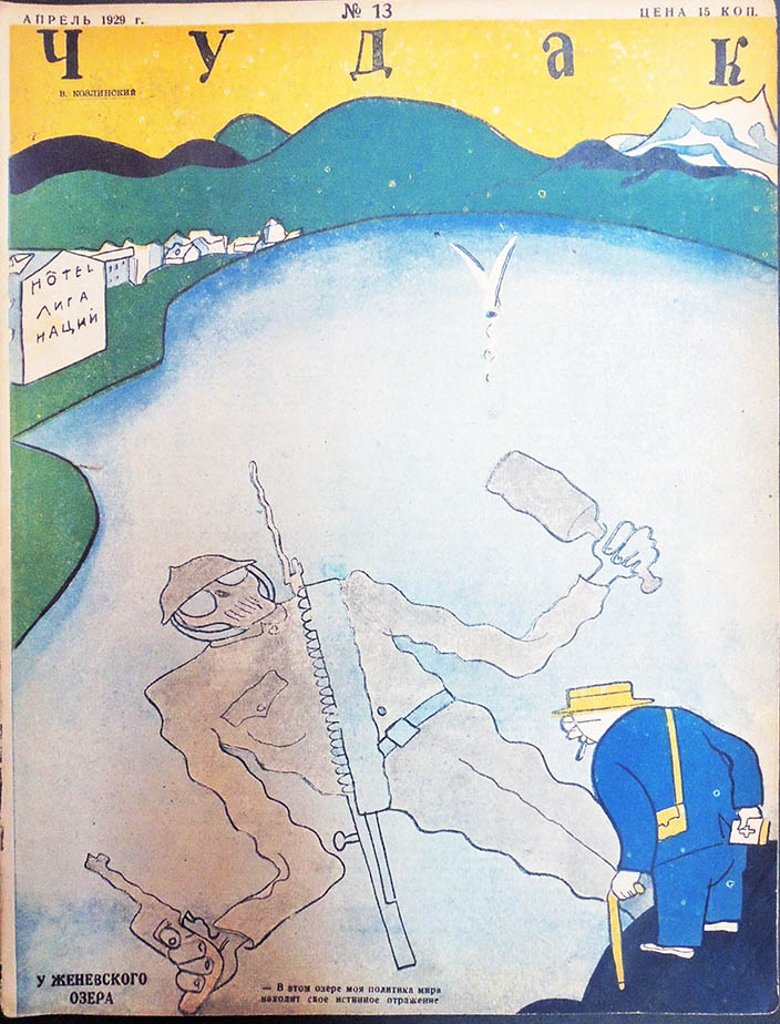
Chudak = The Oddball or Poor Guy (Moscow: Ogonek, 1928-1929). Graphic Arts Collection GAX 2019 in process. No. 1 (1928), nos. 2-50 (1929); 23.0 x 30.0 cm; each issue pp. 16.

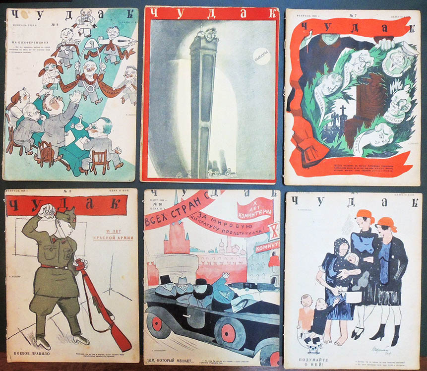
Together with Thomas Keenan, Slavic East European and Eurasian Studies Librarian, the Graphic Arts collection recently acquired 50 of 56 rare issues of the satirical Soviet magazine Chudak (The Oddball), including the banned and retracted issue no. 36. No other library has these physical volumes, with the exception of two issues at Cambridge University. Issue no. 36 is not held at either the Russian State Library or the Russian National Library.

Given the lack of information on this ephemeral publication, our dealer’s note is quoted at length:

“During its brief and troubled, yet brilliant existence, Chudak brought together the Soviet Union’s sharpest satirical talents, both writers and caricaturists. Its literary staff and contributors included the team Ilf and Petrov, Kataev, Mayakovsky, Zoshchenko, Demyan Bedny, Gorky, Olesha, Svetlov, Arkhangelsky, Volbin, Zabolotsky, Ryklyin, Tvardovsky, and Utkin. Among its illustrators were Deni, Efimov, Bodraty, Kozlinsky, Ratov, Radlov, Malyutin, Deyneka, and the Kukryniksy.

This eminent ensemble was led by editor-in-chief Mikhail Koltsov, one of the foremost Soviet journalists of the 1930s and the inspiration for the character Karkov in Hemingway’s For Whom the Bell Tolls. Like its Leningrad-based contemporary Revizor, Chudak was born of the Central Committee’s April 1927 decree “On Satirical and Humorous Magazines,” which aimed to rein in rogue publications by replacing staff, merging enterprises, or shutting down papers outright.

As a consequence of this campaign, Koltsov inherited editorship of the satirical magazine Smekhach (February 1924–December 1928), which had seen its staff and readership gutted. Together with Ilf and Petrov, Vasily Reginin, Grigory Rylkin, and the others, Koltsov envisioned a complete rebranding of the magazine. He described this new publication in a letter to Maxim Gorky, who would pledge his support and contribute to the first issue:

“We have gathered a good group of writers and artists, and we have decided–whatever it takes–to give our magazine a new identity, completely breaking with faded satirical traditions. We are convinced that, contrary to all the yammering about ’the official seal’, a good satirical journal can exist in the USSR, excoriating bureaucratism, sycophancy, philistinism, duplicity, and active and passive sabotage.

The title Chudak did not come about by accident. We picked up this word as if it were the gauntlet that the average man bewilderedly and aloofly throws when he sees a deviation from himself, from the safe path: “He believes in Socialist Construction? There’s an Oddball!” “He’s subscribed to a bond drive? That’s an Oddball” “He thinks nothing of a good salary? What an Oddball!” We paint this disparaging name in romantic and vivacious colors. Chudak is no voice of acrimonious satire; it is sanguine, healthy, and happy. Neither is Chudak a high-toned abuser; to the contrary, it scrappily defends the many unjustly abused and willingly turns its bristling quill against the juries of skeptics and whiners.
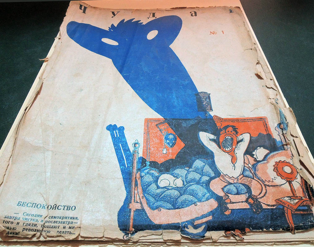
Issue no. 36

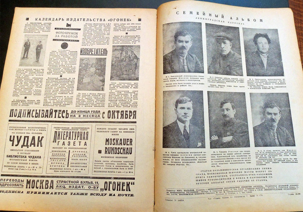
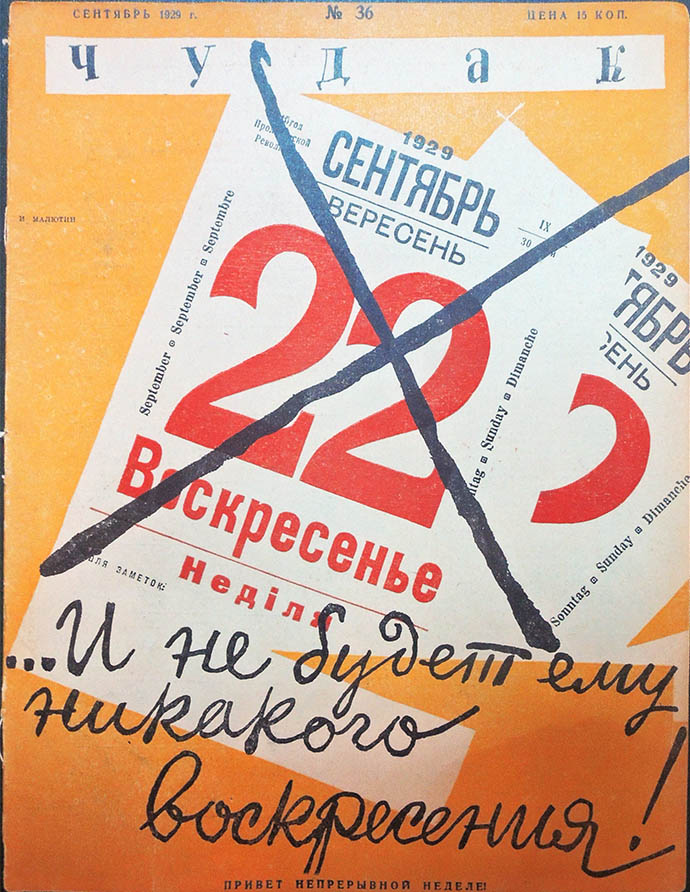
Chudak was considered bolder and more literary than its competitors, corresponding with caliber of its contributors. However, it rode the line of political acceptability and eventually overstepped its bounds. The 36th issue (September 1929) incited the Party’s wrath by lampooning the “Leningrad Carousel” of officials in charge of an anti-Trotskyist campaign. This triggered the Central Committee decree of September 20, 1929, “On the Magazine Chudak,” which decried the “blatantly anti-Soviet character” of the material and removed Koltsov from his post. It further “charge[d] the OGPU to urgently investigate the matter of the insertion of these materials into the magazine Chudak and take measures to retract issue No. 36 of the magazine.

Koltsov was forced to issue a groveling apology (not without finger-pointing; he alleged that he had succumbed to hysteria propagated by the general press). While he was reinstated a month later due to the intervention of Kliment Voroshilov and Lazar Kaganovich, this was too little too late. The rival, state sponsored satirical magazine Krokodil had used the intervening time to organize a hostile takeover. Chudak was forcibly merged with Krokodil in February 1930.

Chudak’s literary legacy includes poems by Mayakovsky (“Govoriat” in No. 3, “Mrachnoe o iumoristakh” in No. 5, “Chto takoe” in No. 9, and others) and more than 70 pieces by Ilf and Petrov under their own names or a variety of pseudonyms, such as “F. Tolstoyevsky.” Many unsigned works have also been attributed to the duo.

However, their most important writings were the unfinished, serialized novellas Neobyknovennye istorii iz zhizni goroda Kolokolamska (Unusual Tales from the Life of the City Kolokalamsk) and Tysiacha i odin den’, ili Novaia Shakherezada (A Thousand and One Days, or the New Scheherazade), both of which foreshadowed their classic book Zolotoi telionok (The Little Golden Calf).

See additional information on Koltsov: https://www.economist.com/books-and-arts/2008/10/16/a-call-to-arms

Lectures for the Magic Lantern and Pleasant Readings for Leisure Hours by The Wizard (title copyrighted)


Lectures for the Magic Lantern and Pleasant Readings for Leisure Hours by The Wizard [cover title] (London: Millikin & Lawley, [1874?]). Graphic Arts Collection Q-000611

What do you say while presenting magic lantern slides? Do not improvise. The text has been written out in full thanks to booklets like this scarce, later edition of scripts for all types of Victorian magic lantern shows. Also included are instructions to how fast or slow to move each slide, and an indication of how to handle Dissolving View Lanterns, Comic Slipping Slides, Lever Action Slides, along with equipment such as the Nightingale Whistle and various Musical Boxes.


The author, known as The Wizard, promises that “the monotony of Evenings at Home is charmed away” through the amusement and instruction of the magic lantern. The seal of approval is made in a report that the Prince of Wales (later Edward VII) ordered a magic lantern, lantern slides, and a copy of lectures from Millikin & Lawley, for his children at Sandringham. The report states that he “was much amused at the comical character of the various laughable slides” (p. 26).

Our volume is missing the complimentary blank slide that is to be used for your personal greeting, allowing you to project a unique thank you to your audience.


A Western Gentleman

Thanks to the generosity of Alfred Bush, the Graphic Arts Collection has acquired a new quarter plate ambrotype, approximately 3.25 x 4.25 inches (8 x 11 cm), of a Western gentleman.

The vast majority of ambrotypes in the world are recorded as: Photographer unknown. Portrait of unidentified man. ca. 1880. Richard Benson noted in his exhibition catalogue The Printed Picture:

Most photographers who have worked in the darkroom are aware that negatives can sometimes appear as positives. Often we will lift an underexposed negative out of the fixer, disappointed that it is of insufficient density, and find that it suddenly appears as a positive. This occurs when the silver deposit is illuminated by the overhead light but we see it against a dark background, perhaps the old darkroom trays made of black rubber. The silver, which appears light gray, shows as a positive instead of a negative, since it is much lighter than the background against which we see it. This phenomenon was noticed early on, and some wet-plate photographers turned it to use by intentionally underexposing their plates, then coating the back of the glass with black paint. The resulting pictures—unique, direct-positive images— were called ambrotypes. Usually small, they were put in cases and entered the same market as the dying daguerreotype.


To hear Benson talk further on tintypes and ambrotypes, see:
http://printedpicture.artgallery.yale.edu/videos/ambrotypes-and-tintypes

The Hanging of Gregory V in Constantinople

When in 1821, the Greeks rose in violent revolution against the rule of the Ottoman Turks, thousands of Greek Christians were raped, murdered, and hanged. In William St. Clair’s history, That Greece Might Still be Free: The Philhellenes in the War of Independence (Firestone DF807 .S25 1972), he chronicles the many Turkish and Greek campaigns:


“The Ottoman Government in Constantinople, faced with violent revolutions in different parts of the Empire, decided to answer terror with terror. A policy of exterminating all Greeks in the Ottoman Empire seems to have been seriously considered, as it had been at earlier periods of Turkish history, but when the Sultan remembered how great a proportion of the imperial revenues was derived from his Christian subjects, he decided upon a more selective policy.

The Patriarch of Constantinople occupied a special place in the administration of the Empire. He was regarded as their leader by all the Greek Orthodox community, but at the same time he was a high Ottoman official responsible to the Government for a wide range of administrative, legal, and educational subjects. . .

On Easter Sunday, the reigning Patriarch, Gregorios, was formally accused of being implicated in the Greek rebellion and was summarily hanged. His body remained for three days suspended form the gate of the Patriarchate, and was then dragged through the streets and thrown into the sea.”


Thanks to a gift of the Program in Hellenic Studies with the support of the Stanley J. Seeger Hellenic Fund, the Graphic Arts Collection has a tightly trimmed German print depicting the massacre in Constantinople in April 1821. Ours is a variant of the Greek print in the Athens Gennadios Library, seen on Wikipedia and elsewhere on the internet with the English and Greek title:

“Attrocities committed by Ottoman religious fanatics and Janisaries in Constantinople/Istanbul in the Greek quarter, April 1821” = “Ελληνικά: Βιαιότητες των Τούρκων εναντίον των Ελλήνων στην Κωνσταντινούπολη, μετά την κύρηξη της Επανάστασης του 1821, Απρίλιος 1821”. [A closer translation might be: “Violent acts of the Turks against the Greeks in Constantinople (Istanbul) after the Declaration of the Greek War of Independence (also known as the Greek Revolution) of 1821, April 1821”].


There is no title on our print, only a description in German of the massacre, crediting the German engraver Johann Koch for the scene.


Architectural ‘papier peint’ or wallpaper

One section approximately five feet in length.


Chiaroscuro woodblock printed wallpaper, four sheets of paper pasted together and printed in seven colors, ca. 1830, 570 x 1570 mm. Numbered on verso 481 (or 184 if the 4 is upsidedown). Graphic Arts Collection GAX 2019- in process

A fine large piece of architectural ‘papier peint’ or wallpaper with a block printed design featuring a Neo-classical arcade made up of columns leading into a landscape. It is assumed to be French, probably meant as a frieze or border around a room. This ‘impression â la planche’ used seven separate color blocks, requiring tremendous labor and skill in registration.

‘The design was engraved onto the surface of a rectangular wooden block. Then the block was inked with paint and placed face down on the paper for printing. Polychrome patterns required the use of several blocks – one for every color. Each color was printed separately along the length of the roll, which was then hung up to dry before the next color could be applied. ‘Pitch’ pins on the corners of the blocks helped the printer to line up the design. The process was laborious and required considerable skill’ (V & A website, History of wallpaper https://www.vam.ac.uk/event/omWR1Paz/the-history-of-wallpaper).

Our sample bears a striking resemblance to another held at the Cooper Hewitt Museum: https://collection.cooperhewitt.org/objects/18319417/

Their “Frieze (France),” is dated 1835–45 and was acquired it in 1931. Its medium is block-printed and stenciled on machine-made paper. It is a part of the “Wallcoverings” department.

This deep perspective is rather unusual for a frieze paper and this effect was usually reserved for scenic wallpapers until landscape friezes were popularized in the very late 19th century. This strong perspective draws your eyes into the distance, visually opening up the room and making the space appear larger. The view looks dead on into a colonnaded courtyard or cloister, opening in the distance to a growth of trees. This opens up to a sky that is beautifully shaded from a light terra cotta to a crisp blue. The courtyard is filled with a cast of characters dressed in brightly colored Shakespearean costume as well as a single monk or friar. This is woodblock printed in about 15 colors, not including the sky. Interesting to note is that the large expanses of white and the blue filling the arches have been over painted with brush and stencil.