Primer centenario de la abolición de la esclavitud en Puerto Rico, 1873-1973


One of the pleasures of welcoming classes to view the Graphic Arts Collection is rediscovering forgotten or under-used resources. During our session with SPA 387/AAS 387 “Puerto Ricans Under U.S. Empire: Memory, Diaspora, and Resistance” taught by Cesar Colon-Montijo and Arcadio Díaz-Quiñones, we rediscovered Primer centenario de la abolición de la esclavitud en Puerto Rico, 1873-1973 or The First Centenary of the Abolition of Slavery in Puerto Rico 1873-1973. This limited edition of 9 fine art prints includes the following:
Rescate by José R. Alicea
Dos caras by Myrna Baez
Abolición? by Rafael López del Campo
22 de marzo by Antonio Maldonado
1873-1973 by Augusto Marín
Y tu abuela, dónde está? by Antonio Martorell
Cumbé by Jaime Romano
1873-1973 by José A. Rosa Castellanos
Quien compra a quien by José Antonio Torres Martinó

Here are a few images:
 

“This seminar examines the ethical and historical dimensions of the 2019 Summer Puerto Rican Protests. Developing within an ongoing financial catastrophe and the trauma of Hurricane María, most issues raised today are deeply rooted in the history of U.S. imperial domination since 1898. The course aims to rethink questions of second-class citizenship, colonial capitalism, militarization, ecocide and massive migrations, as well as gender, sexual and racial inequalities. Special focus on how musical, artistic, religious, political, and literary traditions shape memory and resistance in Puerto Rico and in its vast diasporic communities.”

Primer centenario de la abolición de la esclavitud en Puerto Rico, 1873-1973: portafolio conmemorativo =[First centenary of the abolition of slavery in Puerto Rico, 1873-1973: Commemorative portfolio] (San Juan de Puerto Rico: Fondo de Becas para las Artes Plásticas, 1973). [2] leaves, [9] leaves of plates. Graphic Arts Collection Oversize 2009-0001F. “Edición única de 125 ejemplares … 115 numerados en arábigo y 10 en romano.” The Graphic Arts copy is no. 94.

Mere Bubbles from The Scourge


When it began, The Scourge or Monthly Expositor of Imposture and Folly specialized in exposing patent medicines, with a chart of fakes in each issue. Each issue had a folding plate, a hand colored etching, that served as illustrations to various articles, only later evolving to single theme political caricature. The plates in the first volume were all by Samuel De Wilde, known for his theatrical portraits exhibited at the Royal Academy from 1792 until 1821. Later issues include plates by George Cruikshank, Charles Williams, and others.

The First Series was published in 66 monthly numbers 1811 to 1816, bound with a yellow pictorial wrappers. Volumes 1-2 were published by the unidentified M. Jones at 5 Newgate Street and sold by J. Johnston, Cheapside and Goddard, Pall Mall. Beginning with volume 3,William Naunton Jones took over as publisher from the same address. The magazine’s title was altered with volume 7 to The Scourge or Literary, Theatrical, and Miscellaneous Magazine. The Graphic Arts Collection is fortunate to hold a complete set.

January 1811
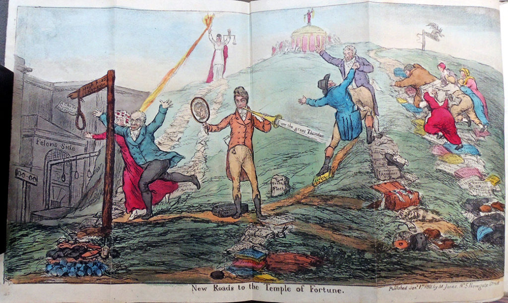
Samuel De Wilde (1751-1832), “New Roads to the Temple of Fortune” in The Scourge or Monthly Expositor of Imposture and Folly v.1, frontispiece (London: M Jones, January 1, 1811). An illustration to four articles in the magazine: (1) “John King,” pp. 1-27. (2) “James Henry Leigh Hunt,” pp. 46-64. (3) “Anthony Daffy Swinton,” pp. 27-46: (4) “Rev. William Huntington, S.S.,” pp. 64-77.


“Our Artist has omitted the title of the Caricature, which ought to be MERE BUBBLES.”

February 1811
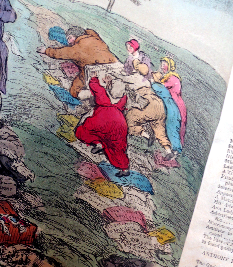
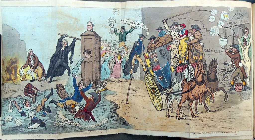
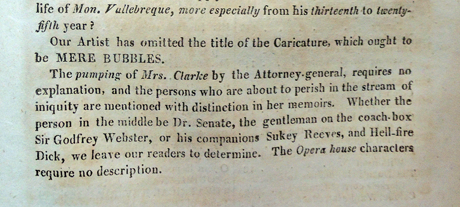
Samuel De Wilde (1751-1832), [Mere Bubbles] in The Scourge or Monthly Expositor of Imposture and Folly, v.1, before page 85 (London: M Jones, February 1, 1811). An illustration to four articles in the magazine: [1] An account of Mrs. Clarke (pp. 102-36); [2] An account of Sir Godfrey Webster; [3] An account of Mr. William Taylor of the Opera House (pp. 146-64); [4] An account of a quack, Edward Senate, pp. 137-46.
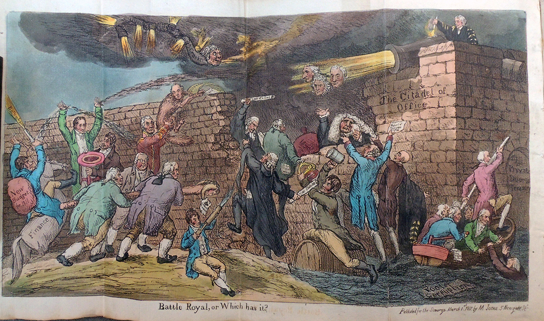
 

March 1811
Samuel De Wilde (1751-1832), “Battle Royal, or Which Has It” in The Scourge or Monthly Expositor of Imposture and Folly v.1, before p. 175 (London: M Jones, March 1, 1811).
A satire on the hopes of the Opposition that the Prince would dismiss the Perceval Ministry on the establishment of the Regency.

April 1811
Samuel De Wilde (1751-1832), “Truth in Jeopardy, or Power, Versus Freedom” in The Scourge or Monthly Expositor of Imposture and Folly v.1 (London: M Jones, April 1, 1811). On 4 Mar. 1811 Lord Holland moved for an account of all ‘Information “Ex Officio”‘ in libel cases from 1 Jan. 1801 to the end of 1810.
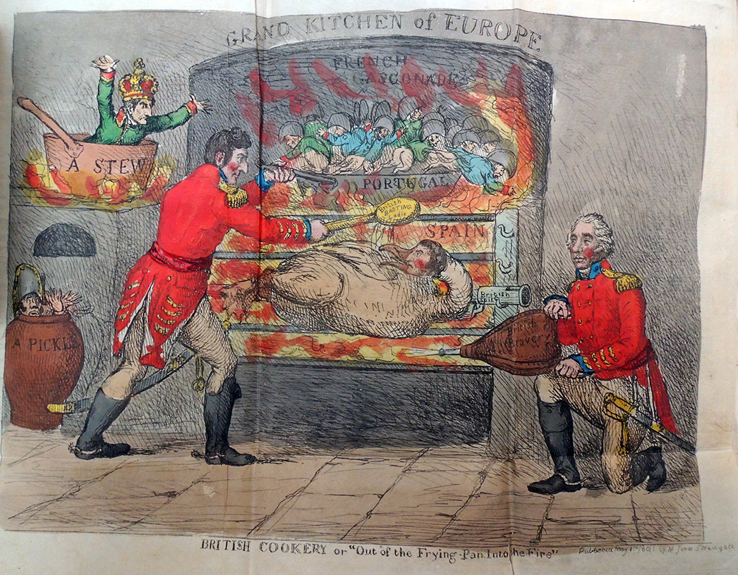
 

May 1811
Samuel De Wilde (1751-1832), “British Cookery or ‘Out of the Frying-Pan into the Fire’” in The Scourge or Monthly Expositor of Imposture and Folly v.1 (London: M Jones, May 1, 1811). The plate is explained; “That Ney should be in a pickle and Buonaparte in a stew John Bull will think very natural. General Graham . . . [gives] new vigor to the flame of patriotism.” The spitted goose is Massena.


June 1811
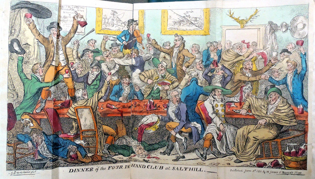
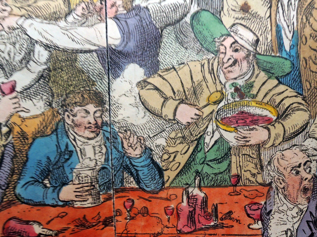
George Cruikshank (1792-1878), “Dinner of the Four in Hand Club at Salthill” in The Scourge or Monthly Expositor of Imposture and Folly, v.1, before p. 431. (London: M Jones, June 1, 1811). Illustration to an article ‘The Dinner at Salt Hill’ in The Satirist, March 1, 1811. The Four-in-hand Club met in Cavendish Square, seven members only. The president was C. Buxton (probably Charles, 1787-1817). There is a second state, with the title Bang-up Dinner or Love and Lingo, a frontispiece to Lexicon Balatronicum, A Dictionary of Buckish Slang University Wit, and Pickpocket Eloquence, compiled originally by Captain Grose . . .’, 1811.


July 1811
George Cruikshank (1792-1878), “The Return to Office” in The Scourge or Monthly Expositor of Imposture and Folly v.2, frontispiece (London: M Jones, July 1, 1811). Also an illustration to The Duke of York, the Whigs and the Burdettites, pp. 1-5.

August 1811
George Cruikshank (1792-1878), “The Blessing of Paper Money, or King a Bad Subject” in The Scourge or Monthly Expositor of Imposture and Folly v.2, p. ? (London: M Jones, August 1, 1811).

September 1811
George Cruikshank (1792-1878), “Quadrupeds; or the Managers Last Kick. Last Scene” in The Scourge, or Monthly Expositor of Imposture and Folly v.2, before p. 177 (London: M Jones, September 1, 1811). [On 18 July 1811 a heroic, tragic, operatic drama with the title of the print was played for the first time by the English Opera Company at the Lyceum.]


October 1811
George Cruikshank (1792-1878), “The Examination, of a Young Surgeon” in The Scourge or Monthly Expositor of Imposture and Folly, v.2, before p. 263 (London: M Jones, October 1, 1811). The plate illustrates ‘Medical Science Exemplified’, pp. 263-8, ridiculing the education and examination of surgeons with special reference to two Scottish examiners, clearly David Dundas and Everard Home, both Serjeant-surgeons to the King.

November 1811
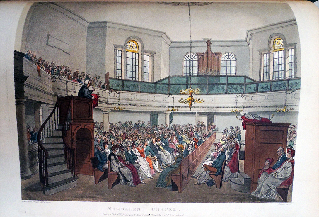
George Cruikshank (1792-1878), “Interior View of the House of God” in The Scourge or Monthly Expositor of Imposture and Folly, v.2, before p. 349 (London: M Jones, November 1, 1811). A savage account of Carpenter, a paper-maker of Neckinger House, appeared in the August number of The Scourge v.2. 94-102. The ‘tickets’ must be the half-sheets signed and sealed by Joanna Southcott, by which the faithful were ‘sealed’ or certificated for the millennium.

December 1811
George Cruikshank (1792-1878), “Princely Piety, or the Worshippers at Wanstead” in The Scourge or Monthly Expositor of Imposture and Folly v. 2, before p. 473. (London: M Jones, December 1, 1811).

Vol. 3
No. 13. The Rehearsal, or the Baron and the Elephant. January 1st, 1812.
No. 14. The Mountebanks, &c., &c. February 1st, 1812.
No. 15. Princely Amusements, &c., &c. March 1st, 1812.
No. 16. Princely Predictions, &c., &c. April 1st, 1812.
No. 17. The Prince of Wales, &c., &c. May 1st, 1812.
No. 18. The Antiquarian Society. June 1st, 1812.
Vol. 4
No. 19. The Political Medley, &c., &c. July 1st, 1812.
No. 20. The Cow Pox Tragedy. 1812.
No. 21. The Coronation of the Empress of the Nairs. September 1st, 1812.
No. 22. An Excursion to R Hall. October 1st, 1812.
No. 23. The Court of Love, &c., November 12th, 1812.
No. 24. Management of Butts and Hogsheads. December 1st, 1812.
Vol. 5
No. 25. Quadrupeds, or, Little Bonev’s Last Kick. January 1st, 1813.
No. 26. The Storming of Monopoly Fort. February 1st, 1813.
No. 27. John Bull in the Cellar, &c., kc. March 1st, 1813.
No. 28. State Mysteries, or, a Vision of Pall Mall. April 1st, 1813.
No. 29. The Delicate Investigation. May 1st, 1813.
No. 30. A Sepulchral Enquiry into English History. June 1st, 1813.
Vol. 6
No. 31. John Bull in the Council Chamber. July 1st, 1813.
No. 32. Preparing John Bull for General Congress. August 1st, 1813.
No. 33. The Regency Park. September 1st, 1813.
No. 34. Rival Candidates for the Vacant Bays. Oct. 1st, 1813.
No. 35. Benefits of a Plentiful Harvest, November. 1st, 1813.
No. 36. The Sale of the Coal Heaver’s Scraps. Decr.1st, 1813.
Vol. 7—”The Scourge or Literary, Theatrical, and Miscellaneous Magazine.”
No. 37. Smuggling in High Life. January 1st, 1814.
No. 38. The Divine and the Donkey, or Petworth Frolicks. February 1st, 1814.
No. 39. Imperial Botany, &c., &c. March 1st, 1814.
No. 40. Modern Idolatry, or, Editors and Idols. April 1st, 1814.
No. 41. Nic, alias Nap’s March to Elba. May 1st, 1814.
No. 42. Royal Munificence, &c., &c. June 1st, 1814.
Vol. 8
No. 43. Spirits at Work—Joanna Conceiving. July 1st, 1814.
No. 44. The R 1 Pedagogue and his Ushers. August 1st, 1814.
No. 45. A Paradise for Fools, &c. In three compartments. September. 1st, 1814.
No. 46. Hocus Poems, or, Conjurers Raising the Wind. October 1st, 1814.
No. 47. Delivering a Prophetess. Nov. 1st, 1814.
No. 48. The Siege of St. Quentin. December. 1st, 1814.

Vol. 9
No. 49. The Property Tax—Civic Champions, or, the Darling in Danger. January 2, 1815.
No. 50. Amusements at Vienna, &c., &c. Feb. 1st, 1815.
No. 51. John Bull’s Three Stages. In three compartments. March 1st, 1815.
No. 52. The High Winds of March blowing Events from all quarters. April 1815.
No. 53. The Phomix of Elba resuscitated by Treason. May 1st, 1815.
No. 54. Preparing for War. June 1st, 1815.
Vol. 10
No. 55. Nebuchadnazzars Dream. July 1st, 1815.
No. 56. A Financial Survey of Cumberland, &c. August 1st, 1815.
No. 57. Napoleon’s Trip from Elba to Paris, and from Paris to St. Helena. Sept. 1st, 1815.
No. 58. Boxiana, or, The ‘Fancy. October. 1st, 1815.
No. 59. The Progress of Disappointment, or the Hopes of a Day. November 1st, 1815.
No. 60. State of Politicks at the close of the year 1815. December 1st, 1815.
Vol. 11
No. 61. Royal Christmas Boxes and New Year’s Gifts, 1815 & 16. January 1st, 1816.
No. 62. Odds and Ends for February, 1816. In three compartments. Feb. 1st, i816.
No. 63. The Pall Mall Apollo, or, R tv in a Blaze. March 1st, 1816.
No. 64. Royal Nuptials. April 1st, 1816.
No. 65. Economy—Anticipation. Two compartments. May 1st, 1816.
No. 66. A Bazaar. June 1st 1816.
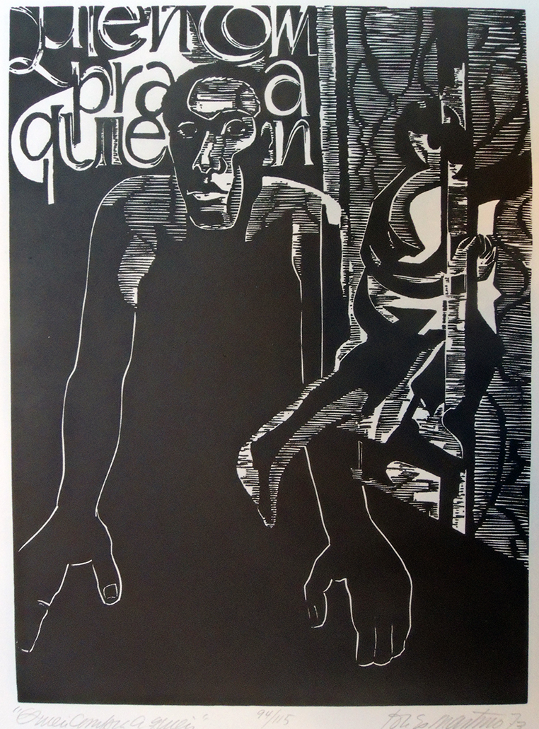
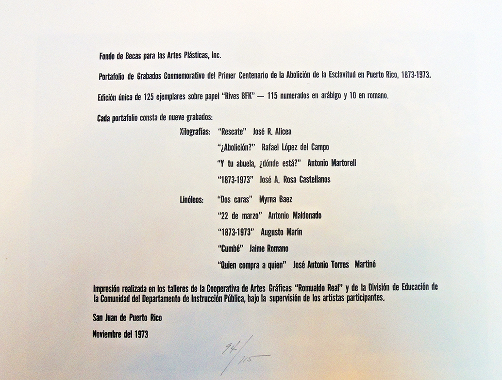
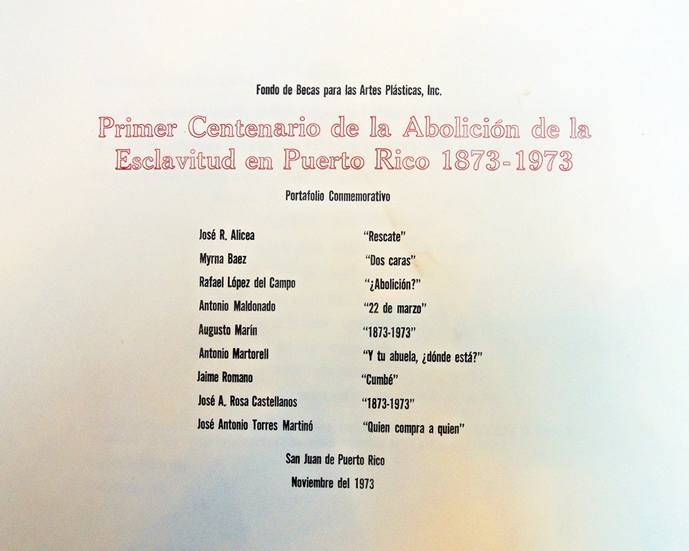
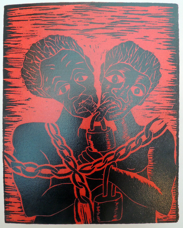
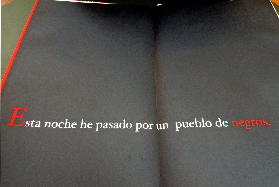
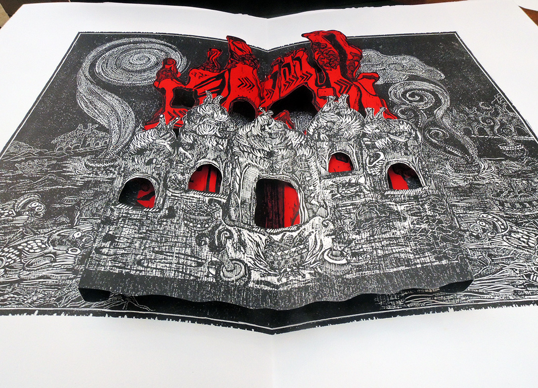
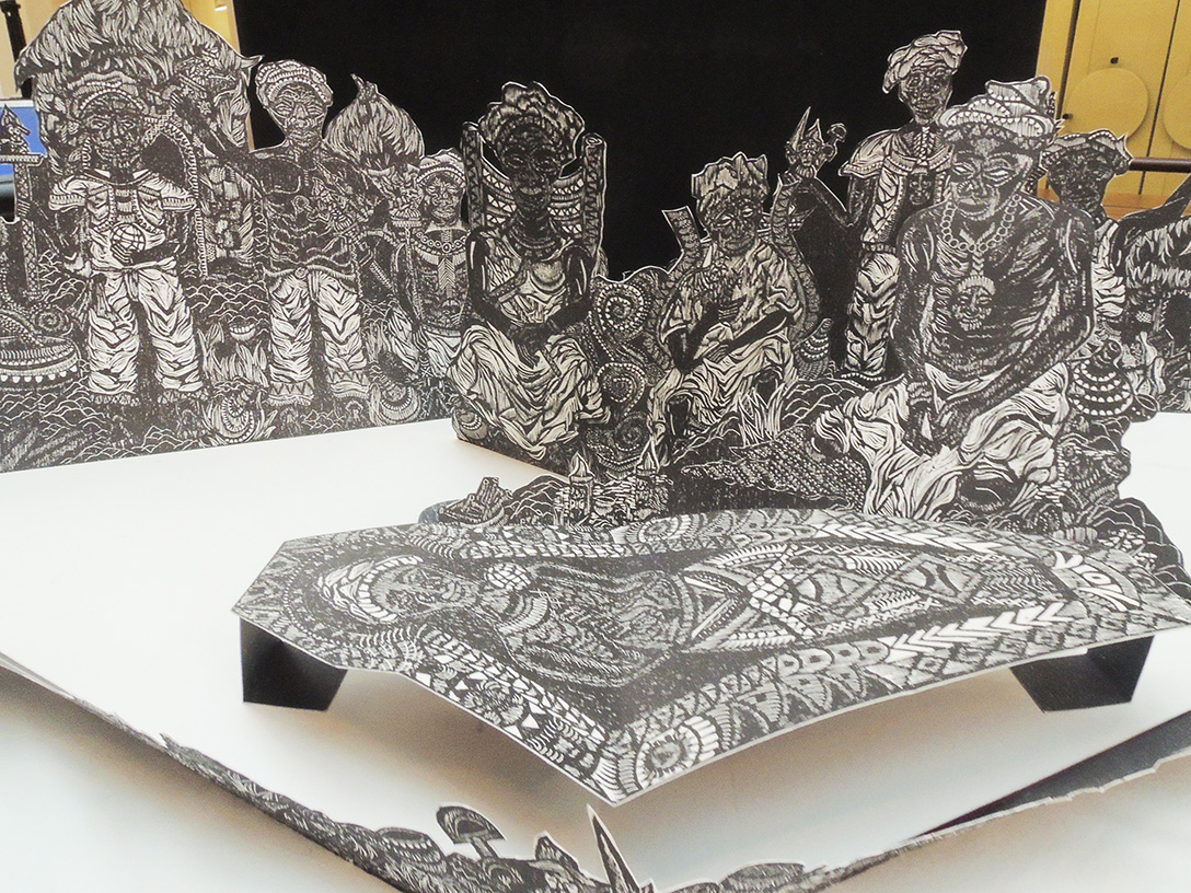
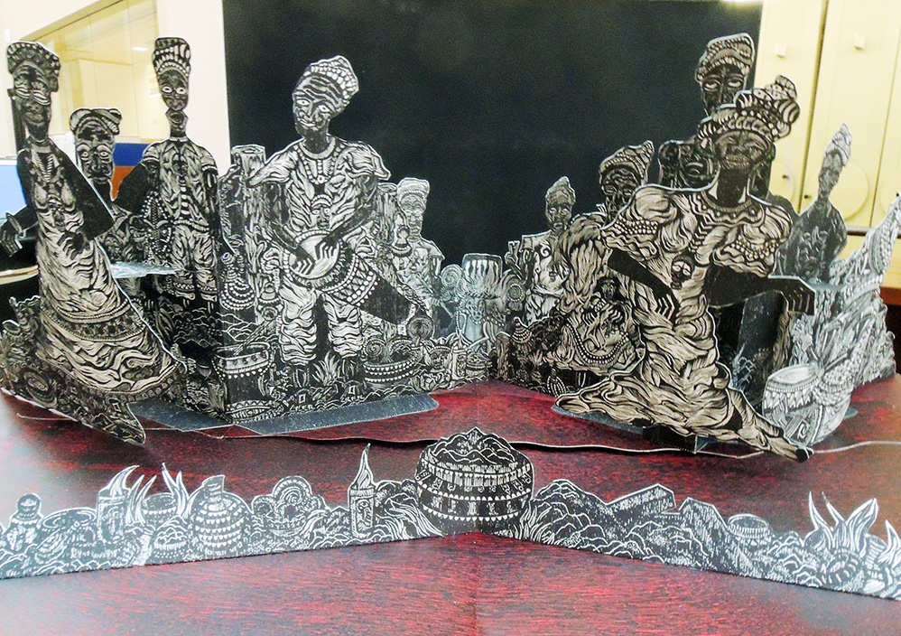
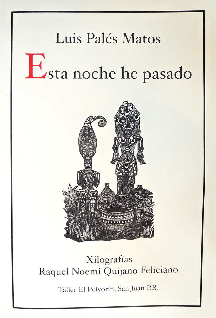
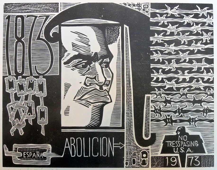


Ostafrikanische Gletscherfahrten

Hans Heinrich Joseph Meyer (1858-1929), Ostafrikanische Gletscherfahrten: Forschungsreisen im Kilimandscharo-Gebiet (Leipzig: Bibliographisches Institut for Duncker & Humblot, 1890). Mounted frontispiece and 12 heliogravure (=photogravure) plates after negatives by Meyer, 8 albumen silver prints after Meyer, 2 double-page lithographic maps, routes added by hand in red, and one large folding color lithographic map by Bruno Hassenstein, along with wood engraved illustrations and tailpieces in the text. Graphic Arts collection GAX 2020- in process.


Three times Hans Meyer attempted to climb to the summit of Mount Kilimanjaro. On the third try, he succeeded in being the first European to make the climb. The following year, he published a richly-illustrated first-person account of this ascent and in 1891, published an English translation with the same images (Across East African Glaciers. An account of the first ascent of Kilimanjaro). The Graphic Arts Collection is fortunate to have acquired the rare fist edition of his account with photographs and photogravure plates from the negatives Meyer made during the third expedition. Here’s a quick review of his climbs:

“In 1887, Professor Hans Meyer, a German geographer, made his first attempt upon the summit of Kibo. Accompanied by Baron Von Eberstein, Meyer was eventually defeated by a combination of thick snow, 30m ice walls and his partner’s altitude sickness. The following day, from the safety of The Saddle, Meyer estimated that the ice walls descended to just below the crater rim at an altitude of about 5,500m. The ice was continuous over the entire peak and it was evident that the summit could not be reached without some considerable ice climbing.

After an aborted expedition in 1888, Meyer returned the following year accompanied by the renowned Alpinist, Ludwig Purtscheller and a well organised support group determined to scale the peak. The climbers came prepared with state of the art equipment and established a base camp on the moorland from where porters ferried fresh supplies of food from Marangu. …[after various attempts] they returned to advance camp to try again after three days. This time the route was clearly marked and the previously cut ice steps had held their shape. The rim was reached in 6 hours and at exactly 10.30hrs Meyer became the first recorded person to set foot on the highest point in Africa. https://ntz.info/gen/b00840.html#id04807


Saint-Gaudens rejected


[Above] Louis Saint-Gaudens (1854-1913), previously attributed to Augustus Saint-Gaudens (1848-1907), Study for World’s Columbian Exposition Commemorative Presentation Medal, reverse, no date. Inscripcast bronze with hand-painted corrections, presumably by Saint-Gaudens. American Numismatic Society Collection.
[Below] Louis Saint-Gaudens (1854-1913), previously attributed to Augustus Saint-Gaudens (1848-1907), Study for World’s Columbian Exposition Commemorative Presentation Medal, reverse, 1892-1893. Cast plaster. 1974.63. Harvard Art Museum. Inscription, on recto: “The Columbian Exhibition in commemoration of the Four Hundredth Anniversary of the Landing of Columbus *** to Williams Bradford. On shield: E Pluribus Unum. On verso: PHI”
In 1892, Augustus Saint-Gaudens accepted a commission to design the official award medal for the Chicago World’s Columbian Exposition. The United States Senate Quadro-Centennial Committee loved the design for the obverse or front, with Columbus taking his first step on the shores of the New World. Unfortunately, the nude male figure Saint-Gaudens called “the Spirit of America” on the reverse was deemed improper and replaced with a design by Charles E. Barber, chief engraver at the United States Mint. The medal was finally awarded to recipients in 1896.

Saint-Gaudens’ brother Louis is thought to have modeled the nude figure, for which the Harvard Art Museums has an 8 inch plaster and the Numismatics Society has a double-sided bronze. Only a few copies of the rejected medal were cast by Parisian medal engraver Ernest Paulin Tasset as a favor to Saint-Gaudens, who gave one to the Musée d’Orsay in Paris.

Princeton’s medal was paged to the reading room this week, to see if ours has a design by Saint-Gaudens or Barber. For better or worse, ours is the official medal, with only one side designed by Saint-Gaudens.

See more: Michael F. Moran, Striking Change (2008).
See more: https://www.metmuseum.org/art/collection/search/14941


World’s Columbian Exposition Commemorative Presentation Medal 1892–94, cast by 1896. Princeton Numismatics Collection. Note: naked women were not rejected.

See also in Firestone Library: Augustus Saint-Gaudens (1848–1907), James McCosh (1811-1894), 1889. Bronze. PP35. Inscribed on front face of base: JAMES MCCOSH DD.LL D / BY / AUGUSTUS ST GAUDENS / WHEN THOU WALKEST THROUGH / THE FIRE THOU SHALT NOT BE / BURNED NEITHER SHALL THE / FLAME KINDLE UPON THEE

Willa Cather’s April Twilights

In June 1931, Willa Cather received the first honorary degree awarded to a woman by Princeton University. It was only one of many awards she received, including the Pulitzer Prize in 1923 for her novel One of Ours. Also that year, Cather published a second edition of her first book of poems April Twilight, originally appearing in 1903 (Ex 3670.29.312.1903). This had a special importance to Princeton, as it was printed by Elmer Adler, later to be Princeton’s first curator of graphic arts.

Alfred Knopf wrote to Cather in July of 1922 that he had attracted the interest of “one of the finest printers I know” with the idea of producing “a quite handsome de luxe edition” of Cather’s April Twilights … . He continued, “I can’t point to much work they have done for us except the one full-page advertisement that we had in the New York Times a couple of months ago which attracted a good deal of favorable attention.” The printers in question were Adler’s Pynson Printers, and the deluxe edition they produced was April Twilights and Other Poems (1923). –read more Matthew Lavin “Material Memory,” Studies in the Novel 445, no. 3 (Fall 2013).

Willa Cather (1873-1947), April Twilights and Other Poems (New York: Alfred A. Knopf, 1923). Graphic Arts RCPXG-5905085 “Of this book, there were printed … by the Pynson Printers … four hundred and fifty numbered copies, each signed by the author”–P. [68].  This edition includes 13 new poems, eliminating 13 from the original volume.

Knopf warned Cather, who insisted on typographic perfection, “Now the point is just this, and I am going to be quite frank with you and expect you to be equally frank with me. The whole job in all its details would have to be left to these printers. In a work, I get the manuscript and we both get finished books. For myself, I am satisfied that I would like the job they turn out. …”


Adler had only recently opened his press but already had a reputation as a perfectionist, as outlined in ‘A Talk of the Town’ piece for the New Yorker in November 12, 1932:

“Mr. Elmer Adler worked in the family clothing-manufacturing business—Rochester-Adler Clothiers of Rochester, N.Y.—for twenty years before, at the age of thirty-eight, he came to the definite conclusion that it was boring him stiff. Then, without any intermediate steps to speak of, he came to New York and started Pynson Printers, Inc., naming it after Richard Pynson, the famous printer of the sixteenth century. It has been one of the few shops in the city doing fine handwork exclusively, and from its presses come the most de-luxe of special editions; the Random House “Candide,” for example.

Mr. Adler had long been interested in fine printing, apparently acquiring the taste when preparing ads for his family’s business; now he is one of the most important experts in the country, advising the Times, Alfred Knopf, and many others about formats and type faces. He had three partners when he started, but two dropped out shortly afterward. He was about to close up the business then, and would have if he hadn’t hired a Miss Greenberg to give him a hand through the last few days. Miss Greenberg was pretty peeved when she discovered the business was folding up just when she arrived and, after looking around a day or two, said: “why fold it up? It’s a nice little business.” So Mr. Adler decided to continue, with Miss Greenberg as business manager that was in 1922.

Two years later, Adolph Ochs picked Pynson as the best printing house and invited it to move into his Times Annex, where he had planned to collect the best practitioners of all the graphic arts. He abandoned this plan later, finding the Times needed all the room itself, but Pynson stayed. It’s still there, occupying a gallery full of bells, a library full of old books, an office, and a large light room full of nine printers, hand-setting. In the printshop is a hundred-year-old press upon which proofs are pulled. In the book room are many rare and typographically interesting books.; firsts of the fifteenth century, and things like that.

Mr. Adler is short, single, clean-shaven, and wears Adler ready-mades. He doesn’t set type himself. It doesn’t interest him, and if it did he’d be out of luck, as the owner of a shop can’t join the union. He designs the books, corrects proof, and the like, Has no salesmen, never solicits work, and takes jobs only on the understanding that he’s the boss so far as printing goes. His shop turns out three or four books a year that people hear about, always in small quantities.

It also prints books privately for amateur poets and such. When the Times’ employees gave Mr. Ochs a testimonial book on his seventieth birthday, Adler printed it: one copy, at a cost of $4,000. He has done special editions of Willa Cather, Lord Dunsany, Arthur Machen, Elinor Wylie, James Stephens, and others. He doesn’t care about the literary quality of his books, however; they’re just fine typography and handmade paper to him. Given a free hand, he’s enjoy getting out an issue of the congressional record. He’s the chief editor, and chief everything else, of the Colophon, the Book-Collector’s Quarterly. It started up two years ago and has done very well, everything considered; editions limited, of three thousand this year. He prints parts of each issue and the rest is done in half a dozen other fine printshops in this country and England.”


Penitent Prostitutes, 1765

Magdalen Chapel by Thomas Rowlandson in Microcosm of London (London: R. Ackermann, [1808-11?]). Oversize Rowlandson 1808.02f


The Hymns Anthems & Tunes; with the Ode used at the Magdalen Chapel Set for the Organ Harpsichord, Voice, German-Flute or Guitar (London: Thompson, 1765?). Graphic Arts Collection 2020- in process

“The Magdalen House, for the reception of penitent female prostitutes, is situated on the east side of the road leading from Blackfriars-bridge to the obelisk in St. George’s-fields: it consists of four brick buildings, which inclose [sic] a quadrangle, with a basin in the center. The chapel is an octangular edifice, erected at one of the back corners; and to give the inclosed court uniformity, a building with a similar front is placed at the opposite corner.

This benevolent institution was projected in the year 1758, by Mr. Robert Dingley; it was at first kept in a large house, formerly the London Infirmary, in Prescot-street, Goodman’s-fields, and was called the Magdalen Hospital. The utility of this charity was so conspicuous, and so well supported, that the views of the benefactors extended t the building an edifice more enlarged and convenient for the purpose…” —Microcosm of London (continues below)

This book of hymns and tunes now in the Graphic Arts Collection was specifically written for the women at the Magdalen Hospital for the Reception of Penitent Prostitutes. It is one of two editions thought to have been published in 1765, the other by Henry Thorowgood. The frontispiece engraving features  “A Magdalen in Her Uniform” with Magdalen Chapel in the background (cf the Thorowgood edition without the building and the figure reversed),

One source credits this popular chapel for bringing a number of men back to Sunday services, given the women in the choir.


Vellucent bindings


Vellucent binding: “A method of decorating (and protecting) a bookbinding utilizing transparent vellum. The technique was developed by Cedric Chivers sometime around 1903, and is designed not only for the protection of leather bindings, but also to protect covers bearing colored designs (usually pictorial in nature) painted on paper, attached to the boards, and then covered with the vellum. The vellucent covering is also suitable for highly decorative designs because it is possible to further embellish the design by means of mother-of-pearl, iridescent shell, and the like, all of which may be covered and permanently protected by the vellum. The surface of the vellum itself can he tooled in gold, thus further enhancing the entire effect. See also: EDWARDS OF HALIFAX . (94 , 236 )”—CoOL URL: http://cool.conservation-us.org/don/dt/dt3692.html


Thanks to Stephen J Gertz for the following: http://www.booktryst.com/2010/07/cedric-chivers-art-vs-library-bindings.html

“In his large bindery at Portway, Bath, Chivers employed about forty women for folding, sewing, mending, and collating work, and in addition, five more women worked in a separate department, to design, illuminate, and colour vellum for book decoration, and to work on embossed leather. These five were Dorothy Carleton Smyth, Alice Shepherd, Miss J.D. Dunn, Muriel Taylor, and Agatha Gales. Most Vellucent bindings were designed by H. Granville Fell, but the woman most frequently employed for this kind of work was probably Dorothy Carleton Smyth” (Marianne Tidcombe, Women Bookbinders 1880-1920, p. 86).

“Smyth [1880-1933] was born in Glasgow, the daughter of a jute manufacturer. She studied art in Manchester and then attended the Glasgow School of Art from 1895 until 1905. Her stained glass piece Tristan and Iseult was exhibited at the International Exhibition in 1901, and in 1903 an anonymous female patron paid for Smyth to study in Europe. At first Smyth was best known as a portraitist, particularly for her sketches of theatre personalities. Later she specialised in theatre costume working in London, Paris and Sweden. She designed costumes for several of the Shakespearean Festivals held in Stratford-upon-Avon, beginning in 1906. Smyth was appointed Principal of Commercial Art at Glasgow School of Art in 1914, and began to concentrate more on teaching than costume design. However, in 1916 she designed costume and decoration for the Quinlan Opera Company’s world tour. In 1933 Smyth was appointed as the first woman director of the School of Art, but died before she could take up the post” (The Glasgow Story).

Fanny Burney (Madame D’Arblay), Evelina or The History of A Young Lady’s Entrance Into The World; With an Introduction by Austin Dobson and Illustrations by Hugh Thomson. Bound by Cedric Chivers (London: Macmillan & Co Limited, 1903). Graphic Arts Collection GAX 2020- in process

Our new acquisition is completed in a “vellucent” binding by Cedric Chivers of Bath, stamp-signed on the back turn-in, of transparent vellum over paper. Front cover with a multi-color painted architecturally frame with three mother of pearl inlays enclosing an original painting of Evelina after Hugh Thomson frontispiece, with the title and author hand-lettered. Spine with matching decoration, lettering and mother of pearl ring around Burney’s name. Back panel painted plus another mother of pearl ring and painted multi-color floral gatherings in the corners. Vellum and paper doublures ruled in gilt.

The British Library printed this biography of the author:

“Burney’s entry into the world of letters was elaborately strategised and much anguished over, much like the debuts into society through which she put the heroines of her most celebrated novels. After a childhood spent writing stories and plays, Burney anonymously published her first novel, Evelina, in 1778. Wary of the public eye and uncertain how her family would react to her writing for a mass audience, Burney sought to keep her authorship secret for as long as possible. But, after months of public speculation and the praise of literary figures such as Hester Thrale and Samuel Johnson, Burney owned the novel as her own.

…Burney’s father introduced her to important writers, actors and artists – David Garrick and Joshua Reynolds socialised at the Burney household – but was conservative in his estimation of what literary genres were suitable for women writers. Burney was discouraged by her father and close family friend Samuel Crisp from writing comedy and satire, particularly for the stage. Instead, she put her sharp insight into the foibles and mannerisms of society to good use in her next novel, Cecilia (1782), which sold widely and cemented Burney’s literary reputation and her status as a literary celebrity in London.”– https://www.bl.uk/people/frances-burney

Princeton University Library also owns this half vellucent binding in the Cotsen Children’s Library:  Geoffroy de La Tour Landry (active 14th century), The booke of thenseygnementes and techynge that the Knyght of the Towre made to his doughters (London: George Newnes, 1902) (London & Edinburgh : Ballantyne Press) Cotsen Children’s Library Press 40742.


Thanks to Edward Levin for sharing his copy of Eleanor Vere Boyle, Days and Hours in a Garden (London: Elliot Stock, 1898) Chivers catalogue no. lxxxvi, with a similar binding.


Oak Tree Press First Chapters


The Graphic Arts Collection acquired a nearly complete deluxe set of Oak Tree Press’s First Chapter Series of Booker Prize-winning novels and prints [8 of 10]. Not only are the individual numbered copies signed by the author on the title page and hand bound in cloth, but many include a signed print within the slipcase. The series began in 2006 with J.M. Coetzee’s Life and Times of Michael K, with a lithograph by the South African artist Colbert Mashile [above].

“Colbert Mashile was born in 1972 in Bushbuckridge, Mpumalanga and currently lives and works in Johannesburg. Mashile received his Diploma in Fine Arts from the Johannesburg Art Foundation in 1994 and later continued his studies at the University of Witwatersrand where he obtained a BA in Fine Arts in 2000 and a Post-Graduate Diploma in Heritage Studies in 2002. Since then Mashile has presented ten solo exhibitions, with the most recent being Messages from our Ancestors in 2013 at the Art Eye Gallery in Sandton, Johannesburg.” — Read more: https://smacgallery.com/exhibition/colbert-mashile-2015/


“Ezequiel Mabote [his work above] is a self-taught artist who grew up in an arts neighborhood in Maputo. He was influenced by the old masters of sculptures, paintings and batiks at the age of 10. He then took art lessons at Noroestel High School in Maputo. In 1998, Ezequiel moved to South Africa to fulfill his dreams in art. He stayed in Durban KwaZulu Natal with his cousin brother, Isaac Sithole. Isaac introduced him to the Bat Centre where he networked with local artists. In 1999, he attended a printmaking workshop at the Bat Centre with Samuel N Mbingilo from the John Muafangejo Art Centre in Namibia.

He held his first exhibition in 1999 at the Intensive Care Café at the Bat Centre and two years later attended printmaking workshops at the Caversham Press in the KwaZulu-Natal Midlands under well-known artists such as Malcolm Christian, Dr David Koloane, the late Gabi Nkosi, Kevin Sipp, Xolile Mtakatya and many more. Ezequiel now specializes in printmaking, woodcut colour reduction, oil pastels, paintings, sculptures, murals and bookbinding.”–https://www.maboteart.com/


Also part of this series is Midnight’s Children by Salman Rushdie with a lithograph by Thomas Howard; Holiday by Stanley Middleton with a watercolor by the author [above]; The Conservationist by Nadine Gordimer with an etching by Cyril Coetzee; Sacred Hunger by Barry Unsworth with a woodcut by Ezequiel Mabote; The Blind Assassin by Margaret Atwood with an ink drawing by Yoko Ono; The Line of Beauty by Alan Hollinghurst with a lithograph by Gilbert and George [at the top of the page]; and Possession A Romance by A.S. Byatt with a lithograph by David Royle.

Oak Tree Fine Press is a privately owned publishing company based in Oxfordshire, England. “We specialize in exceptionally high quality books featuring work by the world’s greatest authors and artists. All profits from the sales of all our books go to organisations assisting children living with or affected by HIV/AIDS.” http://www.oaktreefinepress.com/site/about.asp

Additional information from the press states, “The support of Nobel Prize winner J. M. Coetzee has been vital to the success of the series, and its second volume featured his Booker Prize winning novel of 1999, “Disgrace.” Since then, a wide range of authors have collaborated on the series, linked by their shared status as Booker Prize winners, and their mutual interest in contributing to a worthwhile cause through the creation of beautiful and thought provoking book. Each book is comprised of the first chapter of the title, accompanied by an illustration made especially for the series.”

Esta noche he pasado

Luis Palés Matos, Esta Noche He Pasado; xilografías Raquel Noemi Quijano Feliciano (San Juan, Puerto Rico: Taller El Polvorín, 2003). Copy: No. 6. Graphic Arts Collection Oversize 2006-0076E


One of the items pulled for a visit by the students in “Arts & Activism in Puerto Rico,” an intersession immersion trip organized through Princeton’s Pace Center for Civic Engagement, was Esta Noche He Pasado (2003), a three-dimensional artists’ book designed, printed, and constructed by Raquel Quijano Feliciano with poetry by Luis Palés Matos (Graphic Arts Collection Oversize 2006-0076E).

We tried translating the text (Tonight I Have Passed) as we turned the pop-up pages but the poetry is rich and lyrical, with multiple layers and serious word play, such as “He Pasado” meaning he both passes through the black town and “passes for” black.


A translation was attempted by Julio Marzan in The Numinous Site: The Poetry of Luis Palés Matos (Fairleigh Dickinson University Press, 1995). Here are a few lines:

No! La pompa jocunda de estas tribus ha muerto.
Les queda una remota tristeza cuadrumana,
Una pasión ardiente por los brazos alcohols,
El odio milenario del blanco, y la insaciable
Lujuria de las toscas urgencias primitivas.

No! The cheerful pomp of those tribes has died.
All that remains is a remote four-hooved sadness,
A sweltering passion for strong liquor,
An ancient hatred of whites, and the unsated
Indulgence of raw, primitive drives.

Ante este pueblo negro y estas casas de podre
Y esta raza ya hundido para siempre, yo tengo
La vision de espantosos combustibles; la brea,
El diamante, el carbon, el odio y la montaña…

Before this black town and these houses of pus
And this race now sunken forever, I visualize
Spontaneous combustibles; tar,
Diamond, carbon, hatred and the mountain.


Printmaker Raquel Quijano began her studies in 1993 at the workshops of Liga de Estudiantes de Arte de San Juan and received a B.A. in Graphic Arts at Escuela de Artes Plásticas de San Juan in 2003. Quijano is now a professor at the Liga de Estudiantes de Arte, while also teaching at the Centro para el Grabado y las Artes del Libro de Puerto Rico http://www.puertadetierra.info/noticias/biblio/centro_grabado.htm.

Founded by Consuelo Gotay in June 218, the Center for Engraving and Book Arts of Puerto Rico is located in the renovated Carnegie Library (Biblioteca Carnegie) in San Juan. https://www.facebook.com/GrabadoPR/. It will be one of the spaces you will visit if you are lucky enough to attend Puertográfico 2020 the first week of April, under the auspice of the Southern Graphics Conference https://www.sgcinternational.org/puertografico-2020/


“El libro … fue impreso en el Taller El Povorín de la Escuela de Artes Plásticas de Puerto Rico en Mayo del 2003. La encuadernación tipo acordeón de este libro ‘pop up’, fue confeccionada en cartón ‘acid free’. Las ilustraciones son Xilografías originales impresas en papel Rive BFK y Classic Linen. El texto fue realizado con tipografía digital Hoefler text transferida a fotoserigrafía.”–Colophon


Deuxième mémoire sur la lithographie et sur des procédés de retouche et d’effaçade

How to make a correction on a lithographic stone without starting over from the beginning.


Alphonse Chevallier (1793-1879) and Pierre Langlumé (1790-1830). Deuxième mémoire sur la lithographie et sur des procédés de retouche et d’effaçade. Paris, no imprint, 1828. 18 pp. (9 lithographic plates and 9 lithographic text). Lithographed index of plates, of which two signed D.R. and lith. Langlumé, and seven with lithographic manuscript signatures of Anselme Payen (1795-1871), Charles-Philibert de Lasteyrie (1759-1849) and Edme-Francois Jomard (1777-1862) dated 26 juillet 1828 in lower white margin of plates.

The Graphic Arts Collection has superb holdings in the history of printing, with lithography well represented. This acquisition brings a key missing piece not only to our collection but to public research holdings for the world.

In the nineteenth century, lithographic printing quickly spread throughout Europe and beyond, particularly after 1818 when Alois Senefelder published a comprehensive manual (English edition: Graphic Arts Collection Oversize Rowlandson 905q and Oversize NE2420 .S5q). Others followed in quick succession and through these we can trace the many technical innovations introduced during the 1820s and 1830s.


By 1819 printers could read not only Senefelder’s work, but also the leading French manual (Antoine Raucourt de Charleville, Mémoire sur les expériences litrographiques [sic] faites a l’École royale des ponts et chaussées de France. Graphic Arts Collection NE2420 .R2 1819) and the English translation prepared by the London lithographer Charles Hullmandell. (A Manual of Lithography, or, Memoir on the Lithographical Experiments Made in Paris. Graphic Arts Collection 2004-2934N).


Founded in Paris in 1801, the Société d’encouragement pour l’industrie nationale (Society for Encouraging National Industry) offered medals and prizes for many branches of science and industry, in an effort to promote research and development of “useful knowledge.” In 1826 the Société offered a prize of 100 francs to lithographers “pour la meilleure méthode de faire des retouches” and in 1828 the gold medal was awarded to the chemist Jean-Baptiste-Alphonse Chevallier and the lithographic printer Pierre Langlumé. That same year they published a description of their process Mémoire sur la lithographie et sur des procédés de retouche et d’effaçade.


By that time, many people had perfected printing on stone but no one had found a way to correct or change marks without regrinding the stones and starting from scratch. Chevallier developed the use of a solution of potassium hydroxide (potasse caustique) in varying degrees of strength according to whether the whole drawing was be removed or a small section re-sensitized for further drawing.

According to Michael Twyman “The liberating effect was on a more mundane level; it gave the artist more confidence in the medium. A tone that printed lighter than it looked on the stone could be worked darker after a proof had been taken, accidents in the printing could be repaired, extra foliage could be added to the foreground to improve a picturesque landscape;“ (Twyman, Lithography 1800-1850).

Chevallier and Langlumé wrote their submission to the Société d’Encouragement lithographically and only later, published a letterpress version to the public (see bibliography). It seems that the plates had been produced a month later after the lithographed text was submitted. It’s interesting to note that the dates on the plates are quite crudely corrected from 1826 to 1828. Another important fact is some kind of involvement of and contribution by Charles-Philibert de Lasteyrie in this project, who created the first lithography establishment in France, bringing the technology back from the German Aloys Senefelder.

This lithographically produced treatise is believed to be the only copy of the original edition of Chevallier’s complete work on lithography and represents an important moment in the history of printing.

The letterpress editions:
Alphonse Chevallier (1793-1879). Mémoire sur quelques améliorations apportées à l’art de la lithographie = Dissertation on some improvements made to the art of lithography, Paris: 1828. Mentioned in histories but no copy known to exist.

Alphonse Chevallier (1793-1879). Mémoire sur l’art du lithographe: amélioration à y apporter Paris: Impr. de Cosson, 1829. 45 p. 4 plates. Columbia University, University of Virginia, and Bibliothèque cent du muséum national d’histoire naturelle. *note, Coming to Paris as a youth, Chevallier worked as a laboratory assistant at the Museum of Natural History, so it is not surprising that library holds this rare text.

Alphonse Chevallier (1793-1879) and Pierre Langlumé (1790-1830). Traité complet de la lithographie, ou Manuel du lithographe… ; avec des notes de MM. Mantoux et Joumar... Paris: 1838. 1 vol. (XVI-270 p.) in-8. Multiple collections, no plates in most.