It Seems Ridiculous

Endpapers front and back

I.N. Veroy and G. Ryklin, Kazhetsi︠a︡ smeshno: posvi︠a︡shchaetsi︠a︡ desi︠a︡tiletii︠u︡ Moskovskogo teatra satiry = Кажется смешно: посвящается десятилетию Московского театра сатиры [It Seems Ridiculous: Dedicated to the Tenth Anniversary of the Moscow Theater of Satire] (Moskva: Izd. Moskovskogo teatra satiry, 1935). Graphic Arts Collection GA 2018- in process

Several volumes on Russian film and theater history recently entered the Graphic Arts Collection, including the first and only edition of this photoessay on the Moscow Satire Theatre. Although 5000 copies are said to be published, the volume is rare. The photomontages, including wonderful endpapers, are by Chekryzov; the lettering on the title and the binding by L. Brodaty; and the graphics and illustrations by Brodaty, Ganf, Eliseev, Kukryniksy and Williams.


“On Triumphalnaya Square, between the Tchaikovsky Concert Hall and the “Aquarium” garden the Satire Theater is located. The building, which is over a hundred years old, got a modern look in 1960 upon the project of the architect V. Stepanov. The blind screen facade on the right was decorated with an illuminated square panel with the inscription “The Satire Theater”, on the left side of the façade planted theatrical masks were placed. The huge dome of the building testifies its age – it recalls the former famous circus of brothers Nikitin, built in 1910s by architect B. Nilus together with A. Gurzhienko.

Circus was located in the most popular amusement garden of Moscow – “Aquarium”, which thundered in different years throughout the capital for its theatrical programs. “Aquarium” was attended by thousands of Muscovites to watch the performances of the big-city and touring troupes of actors, acrobats, jugglers, trained animals, to have a dinner in the restaurant with live music in the shade of old trees and gurgling fountains.

Guests could also rise over Moscow on an air-balloon, make a keepsake photograph and admire the fireworks in the evening. “Aquarium” had a reputation of a “theatrical oasis”. The garden became famous for operettas of M. Lentovsky theater, ballet by Lydia Geiten, Frenchman Charles Aumont enterprise (he was the one who built the “Buff” and “Olympia” theaters), opera of Zimin theater and gypsy romances of the Blumenthal-Tamarin theatre.

In 1924 brothers Nikitin circus arena has been adapted for the first Soviet music hall, and in 1930 the building housed the Operetta Theater. In 1965 under the old dome a new hall was opened – the Satire Theater at last got a permanent residence after long process of moves.”

For more history on this Moscow institution, which is still in operation, see: https://um.mos.ru/en/houses/theatre-of-satire/


Clinker Press

The Graphic Arts Collection recently acquired a selection of fine press editions from Clinker Press in Pasadena, California. Andre Chaves runs this a private letterpress studio, with an emphasis on material relating to the Arts and Crafts Movement. He writes, “Within this focus I print subjects relating to art and literature. Although I do not do job printing, some special projects would be considered upon their own merits, as long as it falls within these parameters.” For a complete list of books still in print, see: https://www.clinkerpress.com/

“Clinker Press was started in 1996,” Chaves continues, “urged by Peter Hay, Carl Heinz and Helen Driscoll. Peter owned Book Alley, an antiquarian bookstore, and is an Oxford graduate who allowed me to use a small Kelsey press. Helen owned a paper store and now runs a very successful company called Invitesite. Carl teaches the History of design. We printed together and I provided the “garage” in a Greene and Greene house surrounded by ‘clinker bricks’. I first invested in a Chandler and Price platen and we started printing. Peter was the first to drop off, followed by Helen and then by Carl, although Carl continues to print on his own and Helen’s business is also about printing.”

Here are a few examples.

Autogravures from the Autotype Company

On Tuesday February 25, 1919, Virginia Wolff wrote in her diary:

Of no 23 Cromwell Houses . . . I will only say that it is furnished on the great South Kensington principle of being on the safe side & doing the thing handsomely. Good Mrs. Samuel Bruce went to the Autotype Company & ordered the entire Dutch school to be sent round framed in fumed oak. And so they were; & just covered the staircase walls, leaving an inch or two’s margin in between. –Anne Oliver Bell, The Diary of Virginia Woolf (1980).

Founded in 1868 as the Autotype Printing and Publishing Company, several shops merged and expanded over the next few years before settling as The Autotype Company at 74 New Oxford Street, London. This fashionable address became the place to go in the late 19th and early 20th centuries to buy reproductions of fine art to hang in your home. The managing partners of this enormous operation were John Alexander Spencer (182?-1884), John Robert Mather Sawyer (1828-1881), and Walter Strickland Bird (1828-1912).

Initially, the company purchased Joseph Swan’s copyright on carbon printing and an Autotype, in general, means a carbon print. Eventually the firm added collotypes and photogravure (called Autogravure) to their roster, selling framed prints, portfolios, and bound volumes to the social elite, including some of the most beautiful books of the period.


As the quality of their prints rose to challenge the superiority of the French Goupil Company, the Autotype company advertised their ability to ‘bring Paris to London’ and to prove it, published a portfolio of ten photogravures reproducing etchings by the preeminent French printmaker Charles Meryon (1821-1868).


Charles Méryon (1821-1868), Old Paris. Ten etchings by C. Meryon. Reproduced on copper by the autogravure process and accompanied with preface and illustrative notes by Stopford A. Brooke … ([London: Autotype Co., 1887]). Rare Books and Special Collections Oversize 1514.636e

Peter Henry Emerson (1856-1936) worked with the Autotype company that same year to publish his Idyls of the Norfolk Broads (1887) but was only partially satisfied.

The following year, he was introduced Charles L. Colls at the rival Typographic Etching Company, who printed his negatives for a special edition of The Compleat Angler.

Possibly to compare the talents of the two companies, Emerson had half his negatives for Pictures of East Anglian Life (1888) printed by the Autotype Company and the other half by Type-Etching Company.

Still unsatisfied, Colls taught the photographer to make his own copper plate photogravures and from that time on, Emerson did his own printing.


Vincent Huidobro “Manifestes”

Vincent Huidobro (1893-1948), Manifestes, Manifeste, Manifest, Manifes, Manife, Manif, Mani, Man, Ma, M. (Paris: Editions de la Revue Mondiale, 1925). Purchased with funds provided by the Program for Latin American Studies (PLAS). Graphic Arts Collection GAX 2018- in process.

We thought we had collected every volume published by the Chilean writer Vicente Huidobro (1893-1948) and then, this rare collection of manifestos turned up including a French translation of his best-known manifesto on Creacionismo (Creationism), as well as Manifestos manifest, The Poetry of Madmen, Tourist Advisory, and The Seven Oaths of the Poet among others.

For another volume in our collection, see: https://www.princeton.edu/~graphicarts/2010/08/vincente_huidobro.html

Printed (not drawn) verso of paper cover.


Huidobro was only 23 years old when he left South America for Europe. From 1916 to 1925, the young poet lived with his wife and children in Paris, quickly aligning himself with the circle of Cubist artists and writers. He remembered:

“It was the heroic epoch, in which we struggled for a new art and a new world. The thunder of the cannons didn’t drown the voices of our spirit. Intelligence stood its group, at least in France. I formed part of the Cubist group, the only one that’s had a real importance in the history of contemporary art. In 1916 and 1917, I published in Paris, along with Apollinaire and Reverdy, the magazine Nord-Sud, which today is considered one of the principal organs of the great struggle for revolutionary art in those days. My closest friends were Juan Gris and Jacques Lipchitz. Lipchitz and I were the youngest in the group. They called me the “blanc-bec,” which could be translated as the Benjamin of the family. . . .

Apollinaire would come to dinner on Saturdays. Max Jacob, Reverdy, and Paul Dermée would often come as well. Occasionally, Blaise Cendrars, Marcoussis, and Maurice Raynal would show up, just home from the front. Then I met Picasso who was returning form Southern France and about to put on the famous “Parade” ballet to the music of Erik Satie, another old and dear friend…”–The Selected Poetry of Vicente Huidobro (New Directions Publishing, 1981).

Nord-Sud (Sylvia Beach Collection Oversize 0904.682q)

Huidobro believed poets had a heightened state of consciousness, or super-consciousness, which he wrote about it in his Manifesto of Manifestos:

“Super-consciousness is reached when our intellectual capabilities acquire a superior vibratory intensity, a wavelength, a wave clarity, infinitely more powerful than ordinarily. In the poet, this stage can take place, can be triggered be a cause that is, at times, insignificant and invisible for the poet himself.”

Read: The International Yearbook of Futurism Studies, 2017, Mariana Aguirre, Rosa Sarabia, Renée M. Silverman, Ricardo Vasconcelos (Walter de Gruyter, 2017) SA NX456.5.F8 I589

Dick Balzer 1944-2017

My apologies for not recognizing the death of Richard J. Balzer (1944-2017) earlier. He would have been more on top of it. His website remains: http://www.dickbalzer.com/. I recommend the Balzer “Life Map” http://balzerdesigns.typepad.com/balzer_designs/2017/12/richard-j-balzer-life-map.html created by his daughter.

I would say I’m lucky to have visited the collection but honestly, I don’t know anyone who was ever turned down. I accompanied classes from Boston area colleges, visiting photographers from China, Print Council of America, and The Magic Lantern Society several times, in addition to sending Princeton students individually. His door was always open and the megalethoscope loaded with a slide.

We all know Dick Balzer from his seminal volume Peepshows: a Visual History (Abrams, 1998) but by my count, he was involved in over 35 books. Those of us who only know his anamorphic slides, transformation prints, and peep eggs forget his day job. Harvard’s Kennedy School notes:

Richard J. Balzer has worked globally as an organizational consultant focused on leadership, strategy, and organizational change for over thirty years. He has served as a coach and advisor to chief executives and board chairmen. His clients have included British Petroleum, Standard Chartered Bank, Goldman Sachs, NBC, and the NBA. Balzer has also worked with a number of unions including the United Auto Workers, the United Steelworkers, the International Machinist Union, and the Harvard Union of Clerical and Technical Workers promoting joint labor-management efforts. A writer and photographer, he is the author of five books including Clockwork: Life In and Outside An American Factory, Next Door Down the Road and Around the Corner, and China Day By Day. He currently serves as the chairman of the Petra Foundation, an independent organization that identifies and awards grants to community-based leaders who work to address human rights and social justice issues throughout the United States. He is a graduate of Cornell University and Yale Law School.

They forgot the privately printed: The Print Council of America annual meeting, Boston, May 2, 2015, exhibition at the Richard Balzer Collection (2015). I’d post it but it is only for those members who made the trip, as per Balzer’s specification.

I’m sorry to have missed the service at the Center for Public Leadership at the Harvard Kennedy School, would have made the trip. Bryan Marquard of the Boston Globe has an obituary, “Dick Balzer, 73; expressed curiosity, passion in pursuits” from January 10, 2018: http://edition.pagesuite.com/popovers/article_popover.aspx?guid=bd94fa67-2ef0-4089-83a3-c6308d86e988. Larry Rakow wrote a terrific remembrance in the current newsletter for the Magic Lantern Society of USA. Here’s small screen shot but you should join the organization if you like reading it.

The History of Printing in Eight Hours

Many of you will remember the wonderful exhibition, The Printed Picture at The Museum of Modern Art in 2008–2009, co-curated by Peter Galassi, Chief Curator of Photography, and Richard Benson, Dean of the Yale University School of Art. Some of you might have been in the gallery over the two days in May and June 2008 for Benson’s 8 hour lecture on the entire history of printing.

If not, this website posted by the Yale Art Gallery allows you to see the entire series of talks explaining ink, photographic, and digital printing processes, augmented with information from the book, The Printed Picture, authored by Richard Benson. http://printedpicture.artgallery.yale.edu/

He begins with hand prints on caves walls and ends with a digital print after Paul Strand along with a lesson on the intrinsic value of a print. Here is just a tiny clip:

The New York Times obituary for Richard Benson, June 27, 2017: https://www.nytimes.com/2017/06/27/arts/design/richard-benson-dead-photographer-and-photo-printer.html

Classes in book arts

A surprising number of international classes, workshops, lectures, and conferences in the book arts are being announced in the new issue of the online Book Arts Newsletter. Everything from gilding to binding; photo-polymer and digital printing; textual poetics and ur-text. Here’s the link: http://www.bookarts.uwe.ac.uk/pdf/newspdfs/116.pdf

This list is assembled and published each month thanks to Sarah Bodman of the University of the West of England, Bristol, where she is Senior Research Fellow for Artists’ Books. Here’s a little more about her work:

“Sarah is Senior Research Fellow for Artists’ Books at the Centre for Fine Print Research (CFPR), where she runs projects investigating and promoting contemporary book arts. She is also Programme Leader for MA Multi-disciplinary Printmaking at the Bower Ashton Campus. Sarah is the editor of the Artist’s Book Yearbook a biennial reference publication on contemporary book arts, published here by Impact Press (next issue 2016-2017). She is also the editor of the Book Arts Newsletter and The Blue Notebook journal for artists’ books. Sarah writes a regular news column on artists’ books for the ARLIS UK and Ireland News-Sheet, and an artists’ books column for the journal Printmaking Today.

Edward Steichen: The Early Years 1900-1927

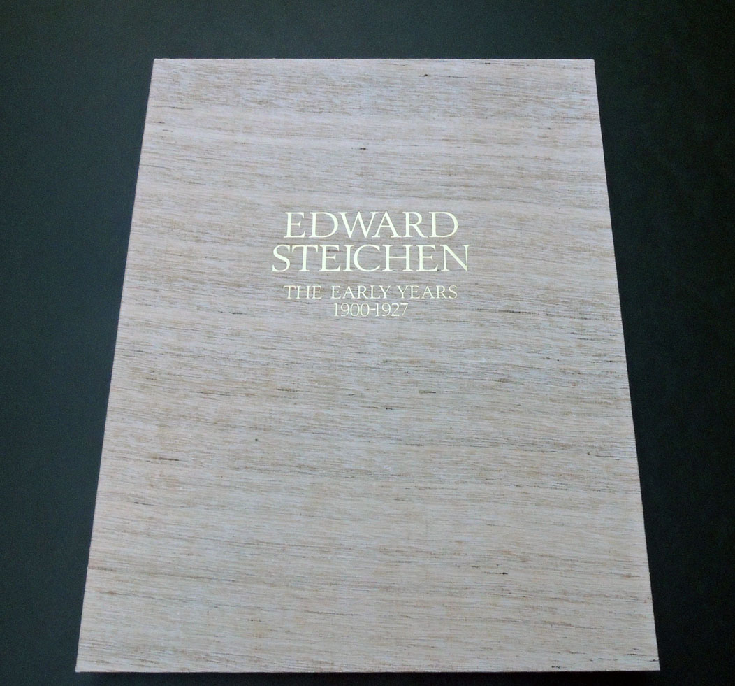
Thrilling news. The Graphic Arts Collection acquired one of the remaining 1981 portfolios, Edward Steichen: The Early Years 1900-1927, published by Aperture in the United States and simultaneously at Saint-Prex, Switzerland by the Atelier de Taille Douce.

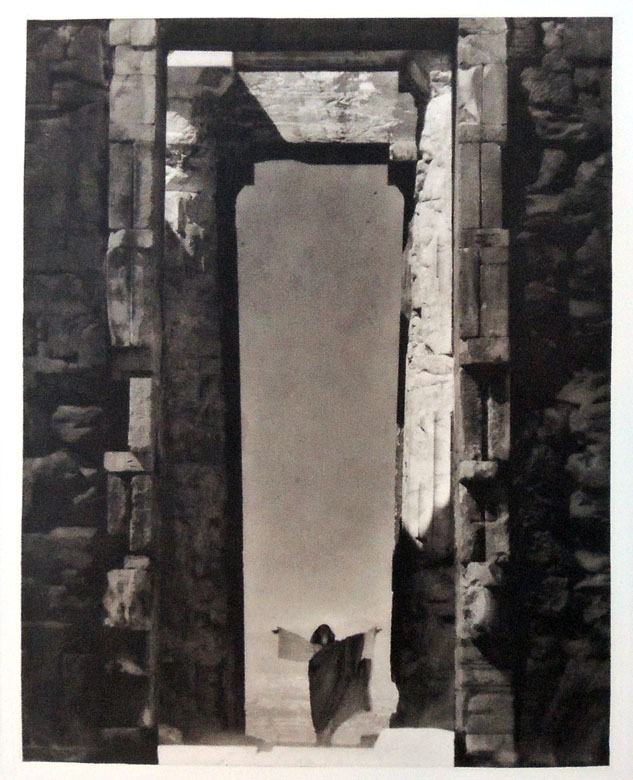
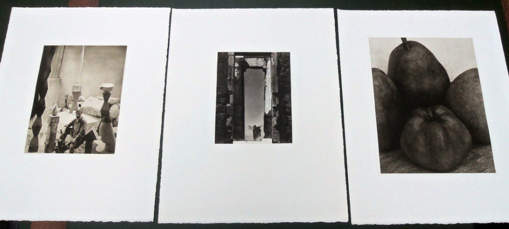
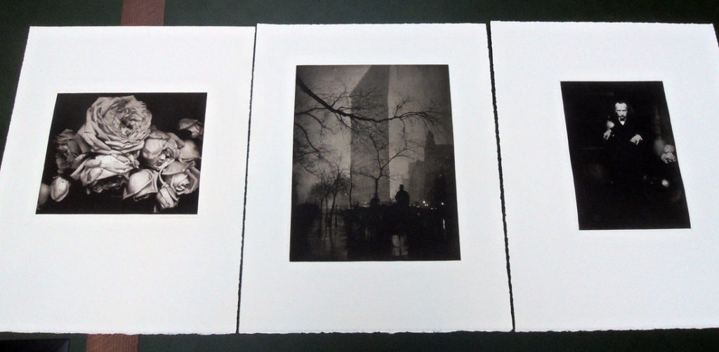
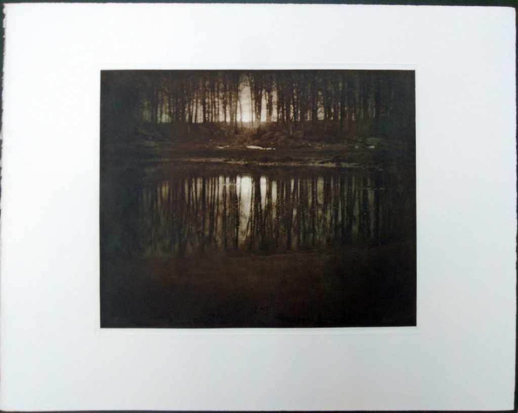
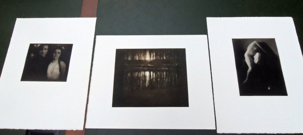
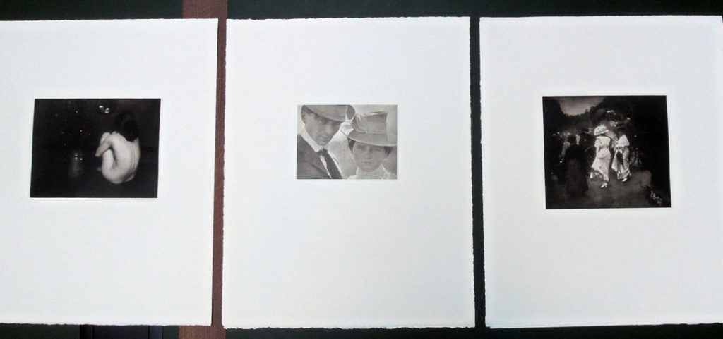
Here is a small taste but honestly, there is no digital image that reproduces the true beauty of these hand-inked and hand-pulled aquatinted and chrome-faced copper plates. The complete colophon information is reproduced below.

I asked the master printer Jon Goodman to say a few words about the project. Exerts are posted here and the complete statement can be read here: Jon Goodman steichen


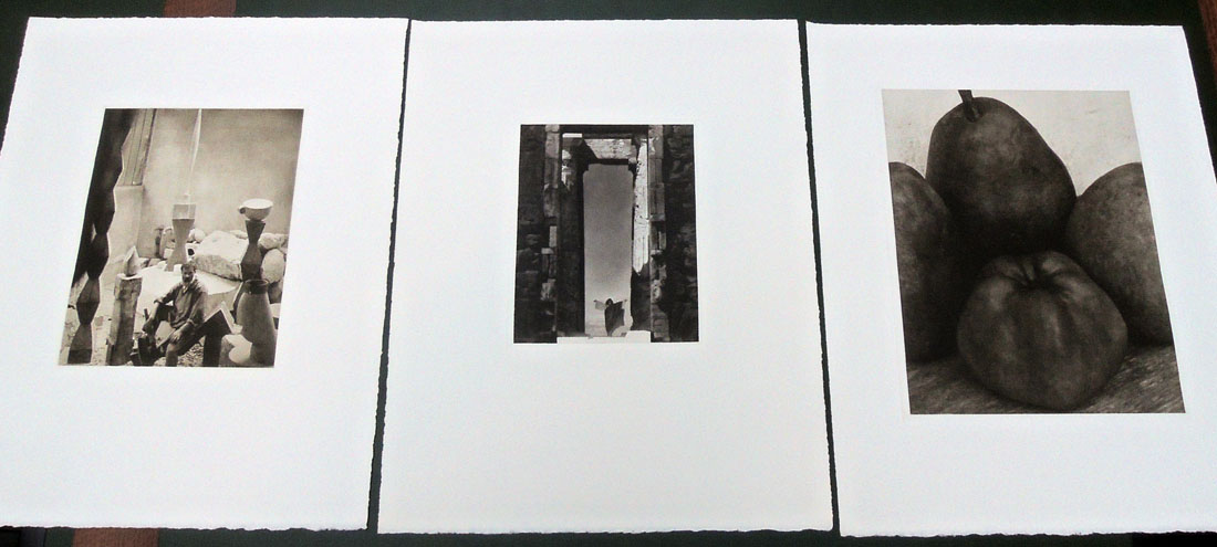
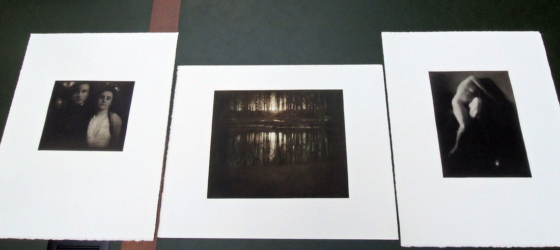
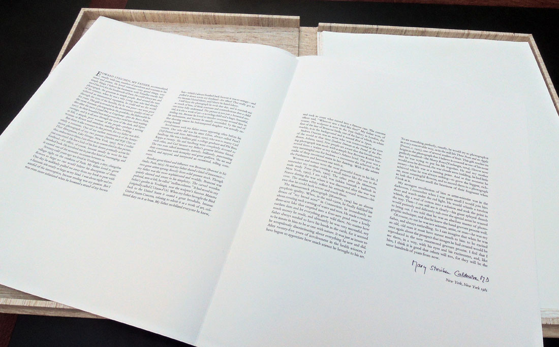
Edward Steichen (1879-1973), Edward Steichen: The Early Years, 1900-1927 ([New York]: Aperture, Inc., 1981). Texts by Mary Steichen Calderone and Beaumont Newhall. Portfolio of twelve hand-pulled dust-grain photogravures printed by the master printer Jon Goodman. Graphic Arts Collection GAX 2018- in process.
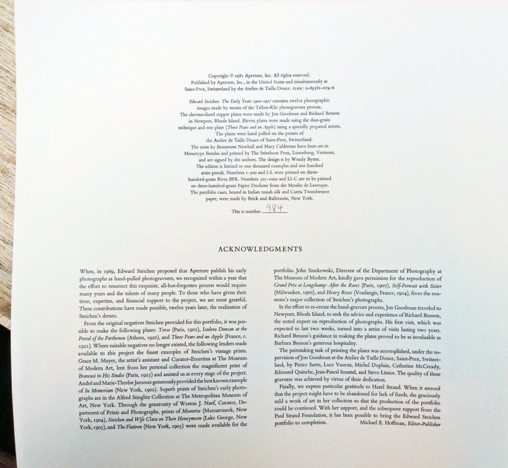
Edward Steichen: The Early Years 1900-1927 contains twelve photographic images made by means of the Talbot-Klic photogravure process. The chrome-faced copper plates were made by Jon Goodman and Richard Benson in Newport, Rhode Island. Eleven plates were made using the dust-grain technique and one plate (Three Pears and an Apple) using a specially prepared screen. The plates were hand pulled on the presses of the Atelier de Taille Douce of Saint-Prex, Switzerland. The texts by Beaumont Newhall and Mary Calderone have been set in Monotype Bembo and printed by The Stinehour Press, Lunenburg, Vermont, and are signed by the authors. The design is by Wendy Byrne. The edition is limited to one thousand examples and one hundred artist proofs. …This is number 984.” –Colophon


“The Steichen Portfolio was my first big project in photogravure,” writes Jon Goodman. “I started work on it in 1979 (I was 25). But it was a project that predated me. I was told that it was a project that Edward Steichen and Alfred Stieglitz had discussed while both were alive. In 1967 when Paul Strand’s “Mexican Portfolio” was re-editioned by Da Capo press in conjunction with a nascent Aperture (printed by Andersen Lamb Printing Co. of Brooklyn from plates made in 1939 by the Photogravure and Color Co.) Edward Steichen approached Michael Hoffman of Aperture about doing his project. . .”

Goodman continues, “I met with Michael Hoffman in New York in June of 1978 and showed him the work that I had been doing on my research which had primarily been done in Switzerland, first at the Centre Genevoise de Gravure Contemporaine and later at the Atelier de Taille Douce et Lithographie of St. Prex. He was quite interested and spoke to me about a couple of projects but primarily about the Steichen Portfolio which had been languishing for a few years.

Michael Hoffman called Richard Benson in Newport and arranged for me to go and meet with him at his home and studio. Benson had most of the equipment and facility needed to work in photogravure in his shop in Newport. He had an intaglio press that had been purchased with funds provided by Georgia O’Keeffe to make photogravures of Stieglitz’s work. I met with Benson and we arranged that I could come and work in his shop in the fall of 1978 on some of Aperture’s potential photogravure projects.”

“I returned to Newport in September of 1978 with the purpose of making some initial plates of Paul Strand’s work. I had access to Strand’s negatives through his association with Aperture and Benson had been Strand’s printer at the end of Strand’s life and knew what the images should look like. There was no funding for this work initially. It was thought that I would come to Newport for a few weeks but that turned into 3 years.

The initial Strand plates (“Gaspe’ Fisherman” and “Iris, Maine”) were a struggle. It was one thing for me to take one of my own negatives and make a photogravure plate and print but it was a whole other order of magnitude to take a negative of Paul Strand’s and make a photogravure plate and subsequent print that had a visual equivalency to Strand’s own print from that negative. The Gaspe’ Fisherman was made and editioned for the end of 1978 early 1979. Once it was established that I was a viable worker and able to try to make photogravures worthy of Paul Strand’s work and comparable to the photogravures from the Mexican Portfolio it was decided that we could proceed with the making of the Steichen Portfolio.”

“In the winter of 1979 I was sent to Munich to retrieve the material that had been provided to the printers there (Steichen’s printer had passed away by then). I had with me the “Iris” plate that I had made that fall in collaboration with Richard Benson. I asked the printers in Munich to make some proofs of that plate to take back to New York. I then went on to St. Prex Switzerland where I shared the work that I had been doing with my friends at the Atelier de Taille Douce and asked them to also proof the “Iris” plate in their manner of working.

I then took both sets of proofs of the “Iris” back to New York to show to Michael Hoffman. The difference in quality between the proofs made at the Atelier de Taille Douce and those from Munich was quite striking. There is a smoothness and a freshness to the photographic tones in the Atelier proofs while the Munich proofs were cottony and muddy. It was decided that the Atelier should edition the “Iris” plate while I went on to the making of the plates for the Steichen Portfolio.”

“It took me a full 12 months to make the 12 plates that are in the Steichen Portfolio. I learned a great deal in that time, multiple plates were made for each image before a satisfactory plate was accomplished. Then multiple proofs were made for each image, in different inks, varying both the transparency and the ink color for each. In the end after a great deal of deliberation we established the “bon a tirer” for each plate, which I then took back to the Atelier de Taille Douce in St. Prex.” Continue reading Goodman’s account here: Jon Goodman steichen


The Wars Occasioned by the French Revolution

“Britannia crowned by Victory, trampling upon the chains of France, holds in her right hand the Trident of Neptune, as Mistress of the Ocean, in her left hand Magna [Carta], whilst Fame is proclaiming to the World the Glory of her Arms, by pointing to some of her principle Battles inscribed on her Shield, which is supported by the Genius of Commerce; beneath are the Emblems of ancient and modern Warfare. London published by Rich. Evans…”


William Nicholson, The History of the Wars Occasioned by The French Revolution. Including A Sketch of the Early History of France, and the Circumstances which Led to the Revolution in that Country; Together with a Complete History of the Revolution in France, The War in Spain and Portugal, Russia, Prussia, &c. &c. Exhibiting a Correct Account of the General Congress at Vienna, the Escape of Bonaparte from the Isle of Elba, the Flight of Louis XVIII. from his Capital, the Defeat of Bonaparte at the Ever Memorable Battle of Waterloo, his Surrender to the British, and his Exile to the Island of St. Helena, with the Result of the Return and Re-establishment of Louis XVIII. on the Throne of France (London: Richard Evans Whites Row Spitalfields, 1816). 22 stencil colored wood engravings. Graphic Arts Collection GAX 2018- in process.

This history of the Napoleonic Wars from a British point of view is noted by some for the first account of a “diving boat” or submarine. Because the author is listed on the title page as L.L.D. [Doctor of Law], it can be assumed he is not the British portrait painter William Nicholson (1781-1844) or the British scientist William Nicholson (1753-1815) who wrote the multi-volume The British Encyclopedia, Or Dictionary of Arts and Sciences. The repetitive equestrian portraits of contemporary world leaders are so far unattributed (list below).


22 stencil colored plates:

1. Britannia, Crowned by Victory… [frontispiece].
2. Napoleon Bonaparte, Emperor of France. May 31, 1815.
3. Alexander 1st. Emperor of all the Russias… May 18, 1815. [Charles] Canton, del et sculp.
4. His Royal Highness, The Prince Regent of Great Britain. June 16, 1815.
5. Count Platoff, Hetman of the Cossacks. August 11, 1815.
6. Wm. Fred. King of Prussia. May 18, 1815. [Charles] Canton, del et sculp.
7. Field Marshall Von Blucher, Prince of Wagstadt. June 30, 1815.
8. The Duke of Wellington. June 29, 1815.
9. Lieut. General Sir Thos. Picton. Octr. 1815.
10. Lieut. General Lord Hill, K.B. Octr. 10, 1815. Meyron, del., [John] Romney, sculp.
11. Francis 2d Emperor of Austria. May 18, 1815.
12. His Royal Highness The Duke Of York. May 18, 1815. [Charles] Canton, del et sculp.
13. Lieut. General The Marquis Of Anglesea. Nov. 1815.
14. Lieut. General Sir John Moore, K.B. Dec. 1, 1815.
15. Field Marshall Prince Swartzenburgh. 1816. Meyron, del, [John] Romney, sculp.
16. Lieut. Genl. Sir Ralph Abercrombie. 1816,
17. The Battle of Waterloo. 1816. Engravd by [John] Romney, from a Painting by Heath.
18. Lieut. Genl. Sir Eire Coote K.B.K.C.&M.P. 1816.
19. Lieut. Genl. Lord Linedock. 1816.
20. Bernadotte Crown Prince of Sweden. 1816.
21. The Prince Of Saxe Cobourg. 1816.
22. The Prince of Orange. 1816.


Tuckenhay Paper Mill

Peter Thomas, The Tuckenhay Mill: People and Paper (Santa Cruz: Peter and Donna Thomas, 2016). Housed in clamshell box. Graphic Arts Collection GAX in process.

All copies have: Introductory pamphlet, letterpress printed, 1.They Made the Paper in Tuckenhay Mill, interviews with retired hand paper makers, a 100-page digitally printed book with the text of the interviews; 2.Flash drive with audio files, transcriptions and videos from original interviews; 3.Vintage handmade paper samples and printed ephemera from Tuckenhay Mill. Princeton’s copy has an additional pamphlet titled Handmade Paper in Tuckenhay Devon, pamphlet titled Three Hundred Years of Paper Making, and 22 paper samples with additional booklets.

In the 1830s, Richard Turner started manufacturing paper by hand in the Tuckenhay Mill, and paper was continuously made by hand there until 1962. From then until 1970, the Mill produced pulp (half-stuff) until the business went bankrupt. The equipment was scrapped and the building was sold and converted into vacation cottages, remaining so today.

A self-taught hand papermaker, Peter Thomas became interested in knowing how apprentice-trained hand papermakers working in production hand papermills made paper. He especially wanted to learn the “vatman’s shake,” the series of motions that papermakers used to form their sheets of paper. This desire circuitously led him and Donna to Tuckenhay, near Totnes, Devon, in England, where beginning in 1988, they recorded several hand papermakers, returning to make others in 1990 and 1994.

—  http://www.thelegacypress.com/tuckenhay-mill.html