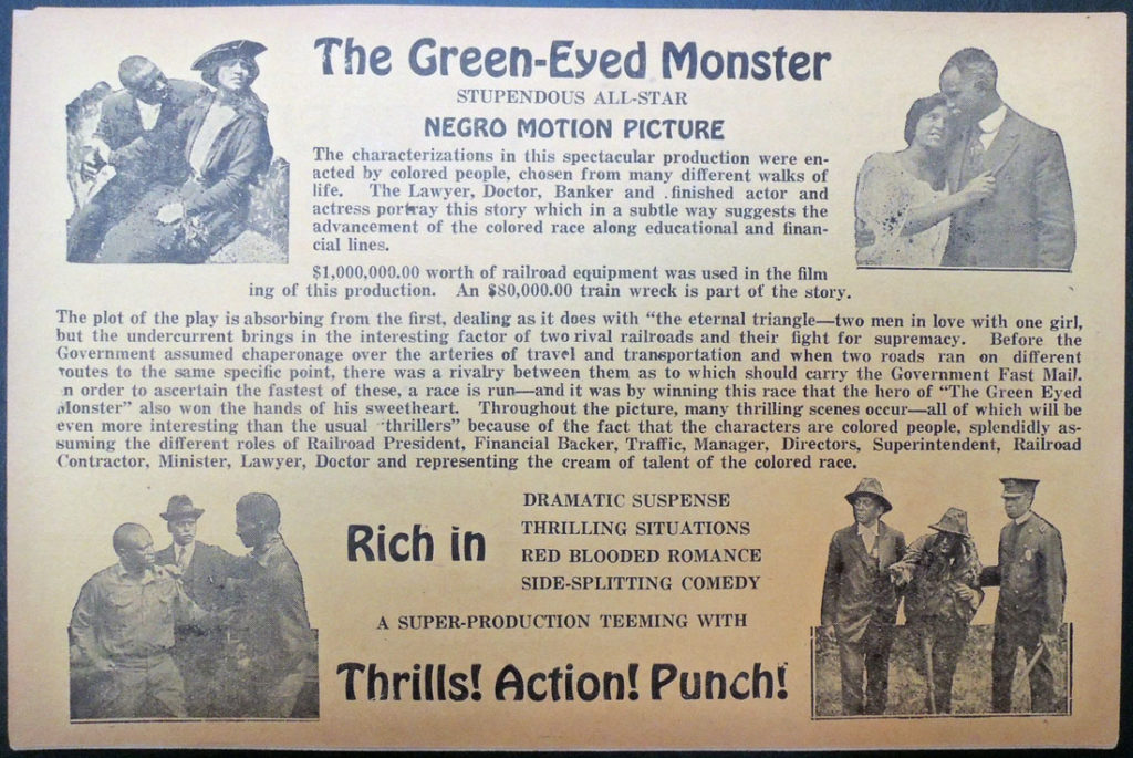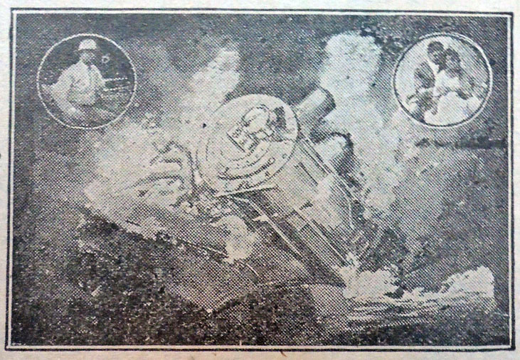
Brochure for “all colored cast” silent film

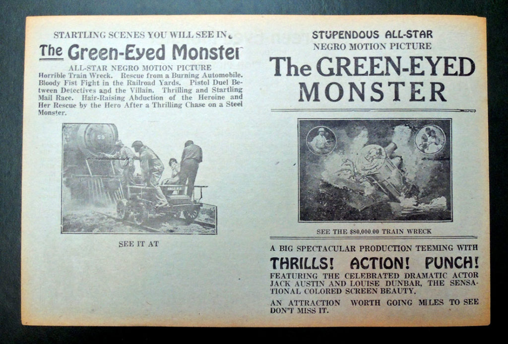
The Graphic Arts Collection recently acquired a rare promotional brochure for the Norman Film Company’s 1919 silent movie, The Green Eyed Monster, its first production with an all Black cast. Billed as a “Stupendous All-Star Negro Motion Picture,” audiences found it long and so, Norman had the film cut from eight-reels to five-reels. A second release in 1920 led to great success. Although no portion of the film survives, reviews list the actors as Jack Austin, Louise Dunbar, Steve Reynolds, and Robert A. Stuart.

“The first film company devoted to the production of race movies was the Chicago-based Ebony Film Company, which began operation in 1915. The first black-owned film company was The Lincoln Motion Picture Company, founded by the famous Missourian actor Noble Johnson in 1916.

However, the biggest name in race movies was and remains Oscar Micheaux, an Illinois-born director who started The Micheaux Book & Film Company in 1919 and went on to direct at least forty films with predominantly black casts for black audiences.

Also in 1919, seeing how lucrative the growing race movie market was, Jacksonville, Florida’s Norman Film Manufacturing Company switched tracks and began making race films, starting with an all black remake of one of their earlier films.”–The New Encyclopedia of Southern Culture: Volume 18 (2011)

“In large cities as well as in small towns, the picture broke attendance records, especially when one of the stars appeared in person to advertise it. M. Wax, of the Royal and Keystone Theaters in Philadelphia, Pennsylvania, happily reported that The Green-Eyed Monster had proven to be a wonderful attraction that did excellent business and pleased all of his patrons.

W. C. Kennedy of Knoxville, Tennessee, affirmed that ‘it broke house records in our 1,200-seat Gem Theater.’ … E. Silberman of the Douglas Theater in New York City found the Green-Eyed Monster to be such a ‘knock-out…that we turned them away daily’ throughout the week-long run.” –Barbara Tepa Lupack, Richard E. Norman and Race Filmmaking (2013)

Extended description: http://normanstudios.org/films-stars/norman-films/the-green-eyed-monster/

Exaggerated comic scenes were cut from The Green-Eyed Monster, to focus on the drama and romance. When the new print was released, it was billed together with Norman’s second film The Love Bug, which was strictly caricature and broad comedy.


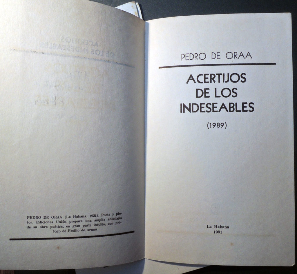
Pedro de Oraá

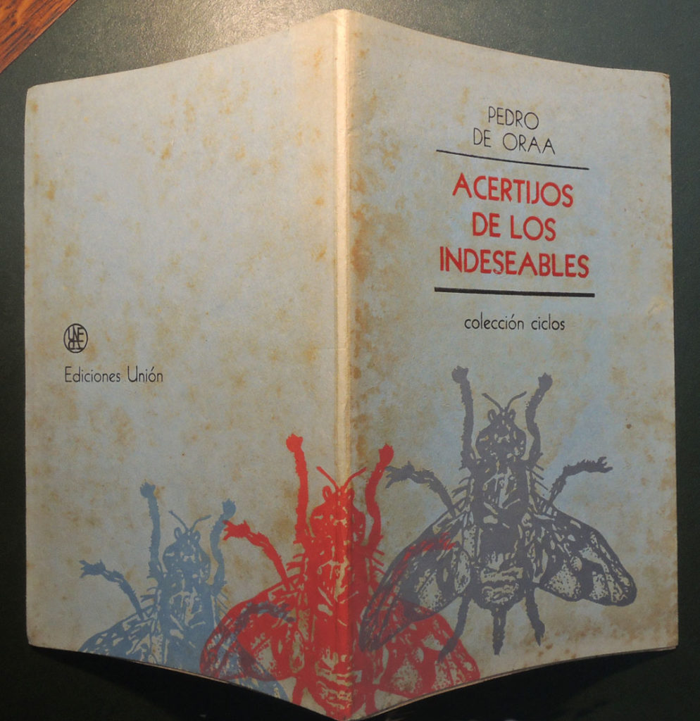
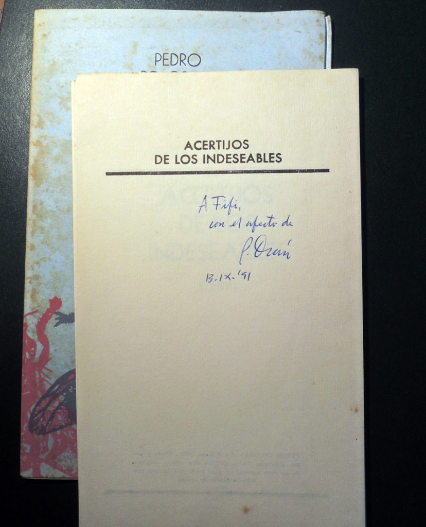
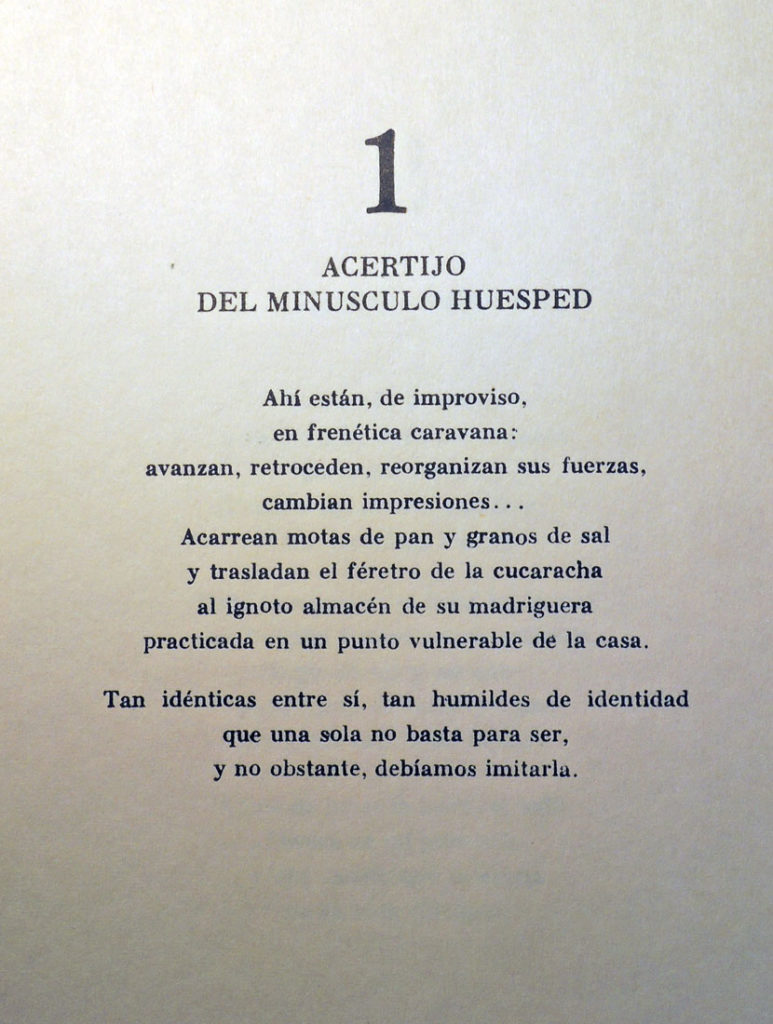
Pedro de Oraá (born 1931), Acertijos de los indeseables (La Habana: Unión de Escritores y Artistas de Cuba, 1991). Unbound poetry portfolio. Edition: 500. Graphic Arts Collection 2018- in process

Eleven books by the Cuban poet and visual artist Pedro de Oraá (born 1931) have already been collected by the Princeton University Library and so, this will make an even dozen. In 1958, De Oraá and Loló Soldevilla (1901–1971) founded Galería de Arte Color-Luz in Havana and there, organized a group of painters and printmakers known as Diez Pintores Concretos (Ten Concrete Painters).

Among his many honors, De Oraá received the National Designer Award from the Cuban Book Institute in 2011 and the Cuban National Visual Arts Award in 2015.
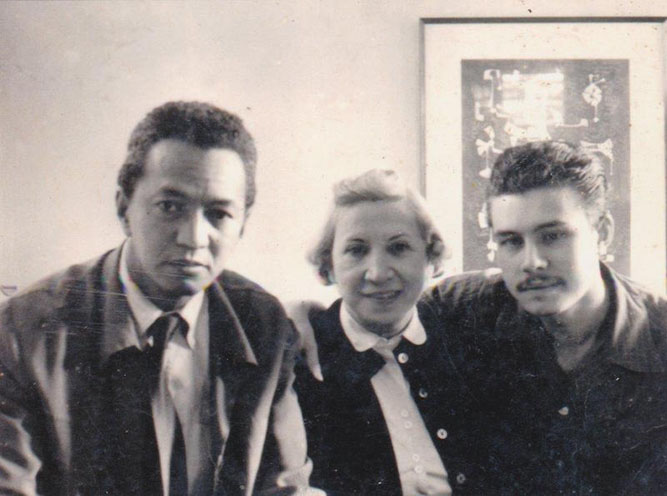
Pedro de Oraá with Wifredo Lam and Loló Soldevilla at their gallery, Posted: http://www.cubanartnews.org/news/pedro-de-oraa-concrete-thinking-on-cuban-abstract-art

De Oraá was part of the 21st International Poetry Festival of Havana (FIPH), the First “Our America” Traveling Festival and Cuban Poetry Readings dedicated to poetry convened by the Association of Writers and Artists of Cuba (UNEAC) and the Organizing Committee of the Poetry Festival.

Plans are already in the making for the 22nd International Poetry Festival, to be held in Havana from 27 May to 3 June 2018, dedicated to Spoken Poetry and Popular Poetry. Everyone should attend. For more information: http://www.unesco.org/new/en/media-services/single-view/news/una_semana_para_celebrar_la_poesia_en_la_habana/

See a brief biography: https://www.widewalls.ch/artist/pedro-de-oraa/

New York covers


Last October 2017, New York magazine launched their 50th anniversary (founded April 1968) slightly early, with a commemorative issue and book: Christopher Bonanos, Highbrow, Lowbrow, Brilliant, Despicable: 50 Years of New York ([New York, NY: Simon & Schuster, 2017]). Dixon Books Oversize PN4900.N34 B66 2017q.

Thankfully, our dust jacket is still in place, which folds out into a poster documenting highlights from the last 50 years: https://www.instagram.com/p/BbMtr-0gTZX/?tagged=nymag50.

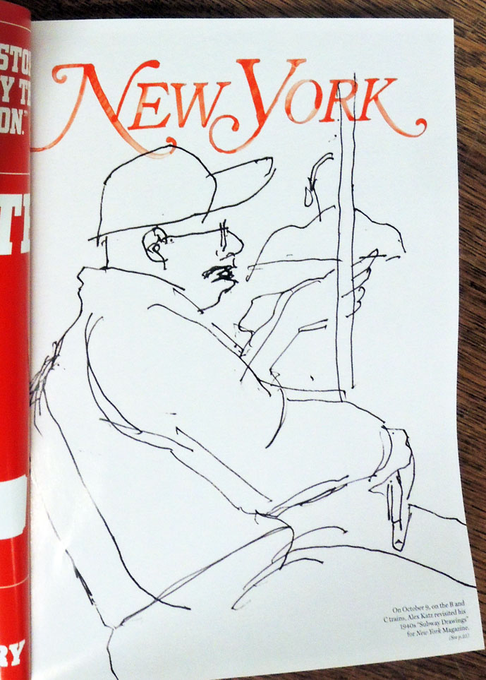
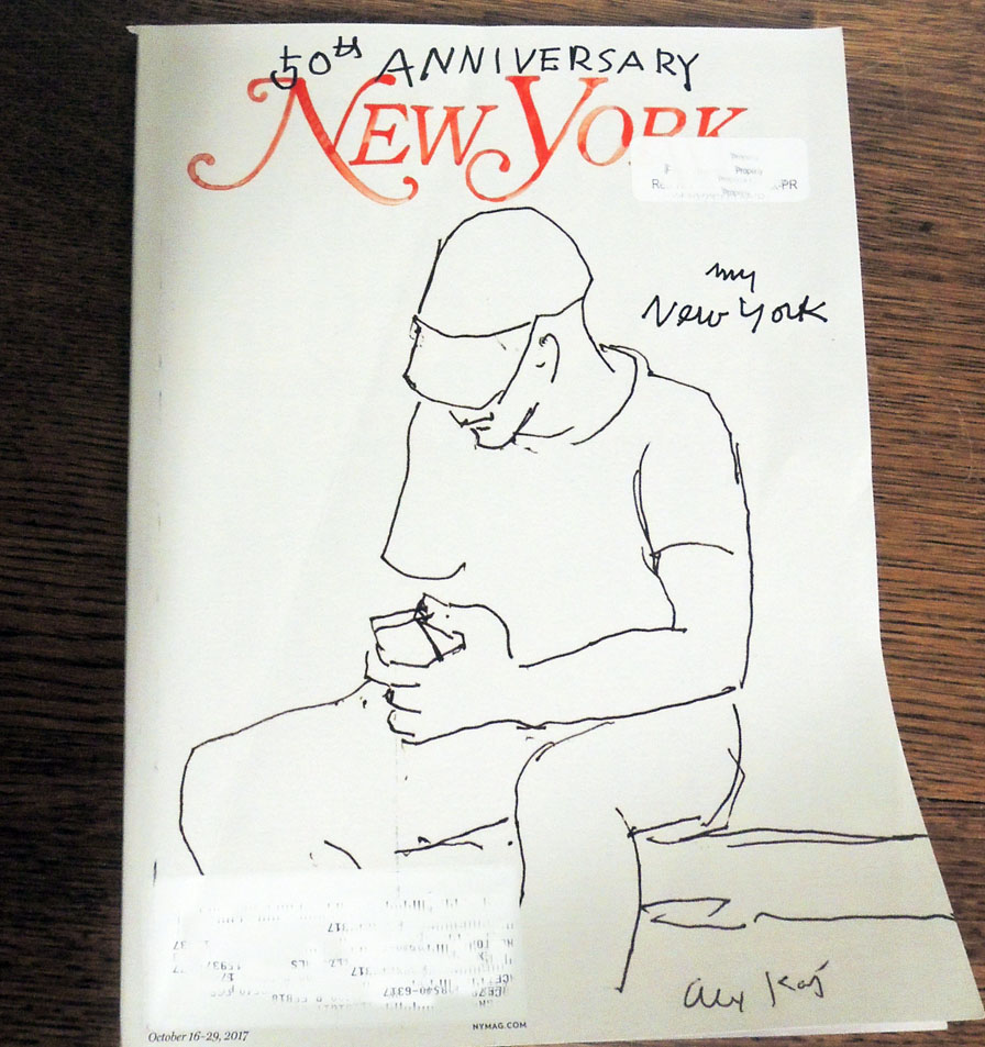
This week a new project appeared around the New York City area to mark their celebration. http://nymag.com/daily/intelligencer/2018/01/new-yorks-50th-anniversary-public-art-project-debuts.html The editors write, “In honor of New York Magazine’s 50th anniversary, the publication is launching a year-long exhibit showcasing specially-designed New York covers by 50 renowned artists, called simply ‘A Public Art Project.’ Today [January 22, 2018], the first eight covers—created by Yoko Ono, Barbara Kruger, Rob Pruitt, Alex Katz, Hank Willis Thomas, Mel Bochner, John Giorno and Marilyn Minter—were unveiled and rolled out at 25 locations across the five boroughs.

The covers are displayed in various sizes and formats, including ‘wild postings,’ on street lamp banners, and giant versions; they’ll continue being rolled out through the fall when, come October, an exhibit of all 50 will debut.”

The first of them, by Alex Katz [seen at the top], appeared on their cover last November and “is a drawing he did on the subway, an echo of those he made underground in the 1940s. The others also, in their own ways, celebrate the spirit of life in New York City, a place of solidarity — whether on packed trains or in political marches.”

**Most important, in a few locations that will be announced on Twitter (at @NYMag), there will be ten copies stacked like a pad of paper, so (if you’re one of the lucky people to get there first) you can tear off a poster and take it home. Donations to our collection are always welcome.Dust jacket for Christopher Bonanos, Highbrow, Lowbrow, Brilliant, Despicable: 50 Years of New York ([New York, NY: Simon & Schuster, 2017]). Graphic Arts Collection GAX in process.

The 100th Edition of The Compleat Angler

We live in an age of editions de luxe, and so bewildering nowadays is the succession of costly and elegant volumes issuing under this title from the contemporary press that it might seem a task of insuperable difficulty to assign the prize for supreme beauty to any one of them. If, however, we were bound to pronounce a judgment of Paris between the various competitors, our award would go with little hesitation in favour of the two Splendid volumes published by Messrs. Sampson Low & Co., . . .

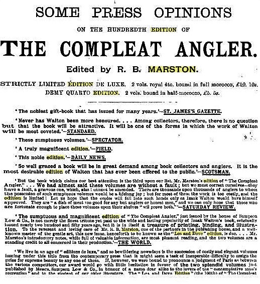
The “Lea and Dove Edition” (the 100th) of “The Compleat Angler” is a work by which the English printing industry and publishing enterprise of the later nineteenth century might well consent to be represented before the severest aesthetic tribunal of posterity, for clear-cut beauty of typography, for sober richness of binding and decoration, for lavish wealth and artistic excellence of illustration, it is a veritable triumph of the arts which have co-operated in its production.—The Daily Telegraph 1888

In 1888 I brought out the “Lea and Dove” edition, being the hundredth edition of “The Compleat Angler,” in two volumes, small quarto, and a limited large-paper edition. My idea was to make illustrations of scenes on the rivers Lea and Dove the leading feature of this issue, and to give the text of the old classic in a style worthy, if possible, of its hundredth edition, and entirely unencumbered with notes. The text was printed from new type by Messrs. William Clowes & Sons, Limited, who took the greatest interest in the work.

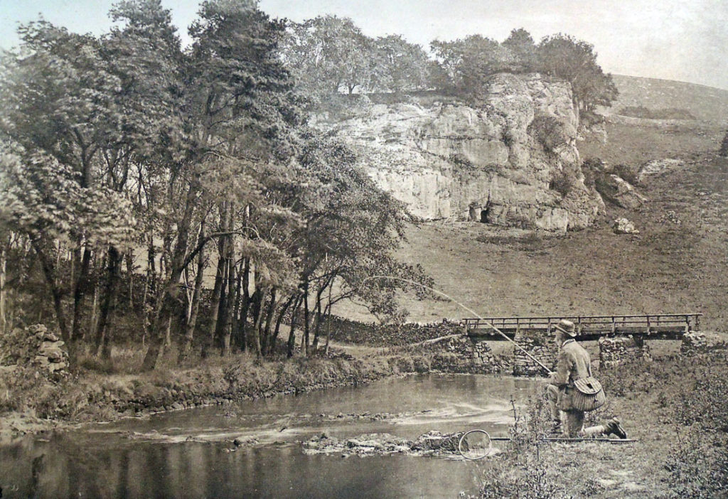
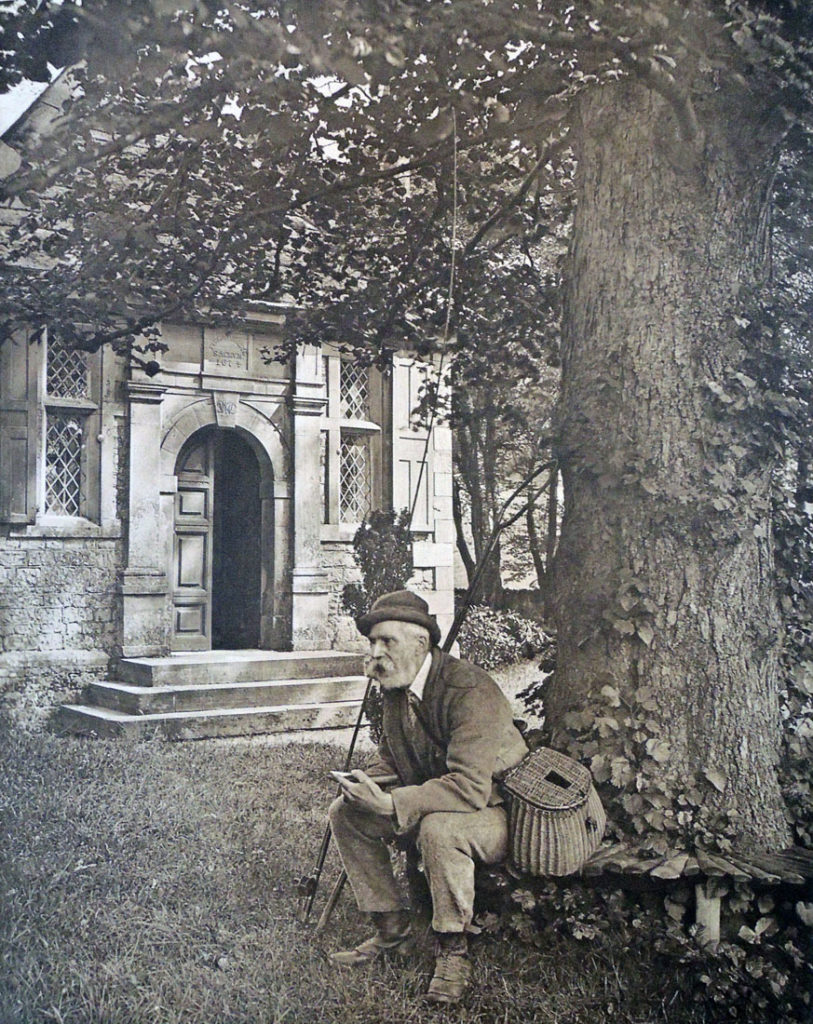
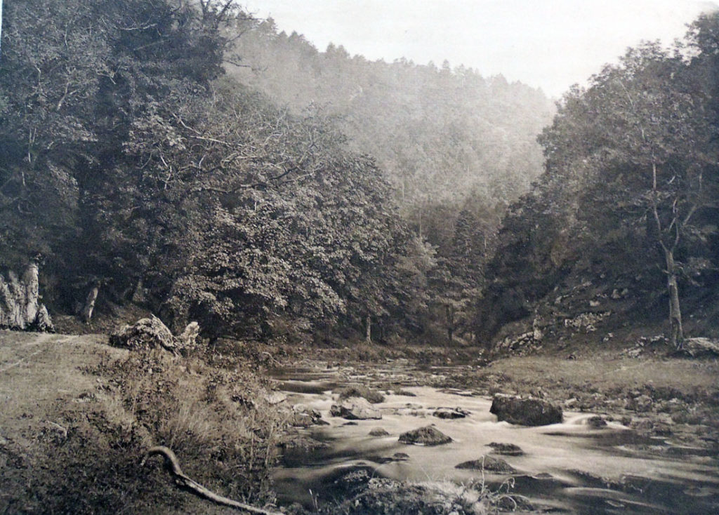
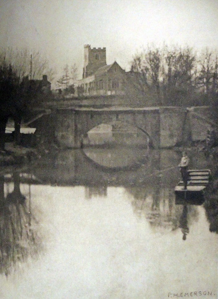
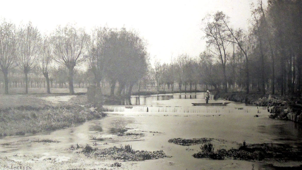
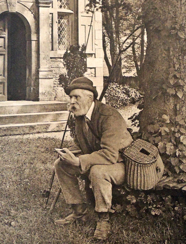
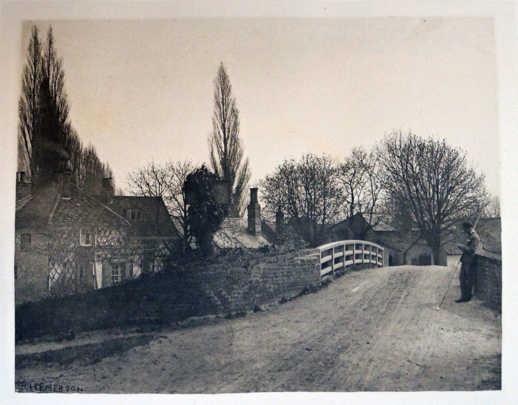
The illustrations consist of about one hundred small woodcuts and fifty full-page photoengraved plates of views on the Lea and Dove—those on the Lea by Mr. P. H. Emerson, B.A., and those on the Dove by Mr. George Bankart. Possessors of this edition may at any rate rest satisfied that it will not be reprinted, as the copperplates I had transformed into boxes for keeping fly-books free from moth, and the type has been distributed. Of the reception of this edition both by the Press and the public I will only say that I was more than satisfied.

–Robert Bright Marston, Walton and Some Earlier Writers on Fish and Fishing (Firestone Z5971 .M377 1894)

Dodd, Mead & Co. have made arrangements with Sampson Low, Marston, Searle & Rivinglon, and purchased the right in America for a limited number of a limited edition of “The Compleat Angler,” to be published this autumn.

. . . It will be known as the Lea and Dove edition. The ninety and nine editions already in the field do not deter Mr. R. B. Marston, the editor, from the idea that his firm can turn out a hundredth edition that shall have a worthy place among its predecessors. He has himself edited the ever-popular work which Charles Lamb said “might sweeten a man’s temper at any time,” and prepared biographies of Walton and Cotton for it.

The illustrations have been prepared especially for it, and depict charming scenes on Walton’s favorite rivers, which, with few exceptions, have never before appeared in the editions of Walton. There will be upwards of fifty full page photogravures, printed from copper-plates, on fine plate paper.

The quiet pastoral scenery of the river Lea is shown in a series of pictures taken by Mr. P. H. Emerson, whose fine photogravures in his works, “Life and Landscape on the Norfolk Broads” and “Peasant Life in East Anglia,” have been so much admired. The views on the rivers Dove, Wye, etc., are by Mr. George Bankart, President of the Leicester Photographic Society and one of the most successful living amateur photographers..—Publisher’s Weekly October 13, 1888.


The Publishers’ Circular and General Record of British and Foreign Literature, 51 (1888)

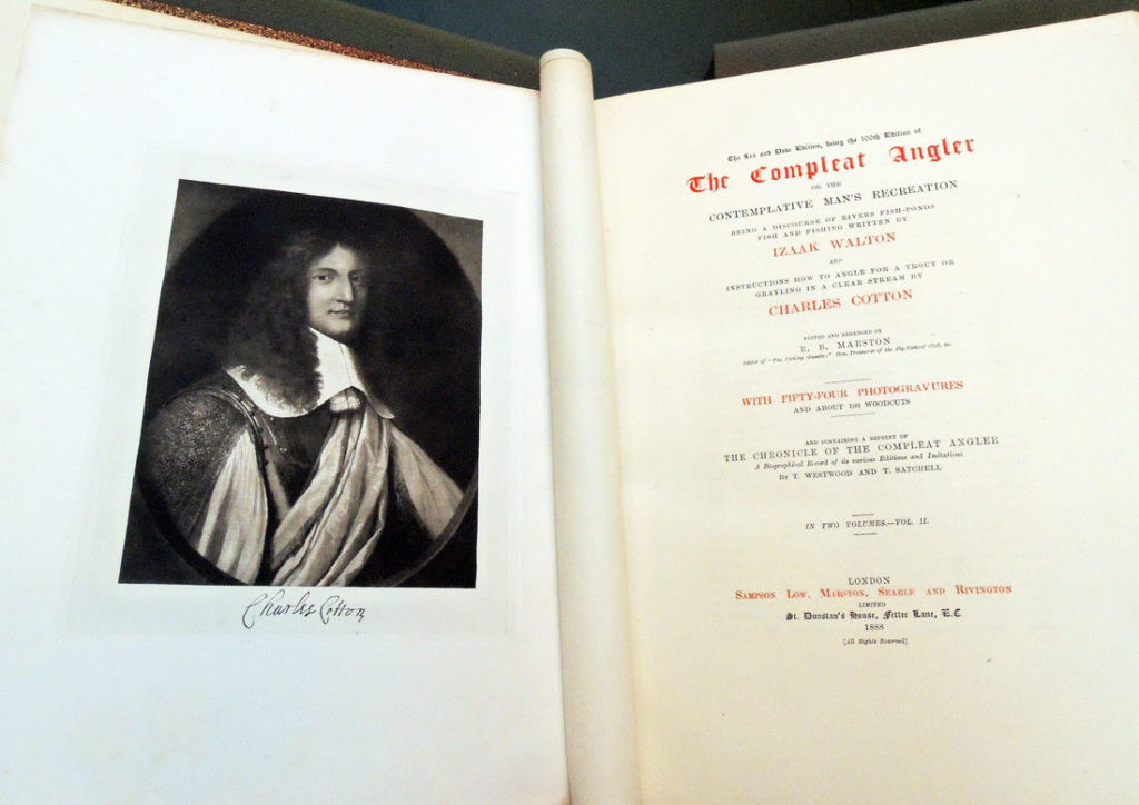
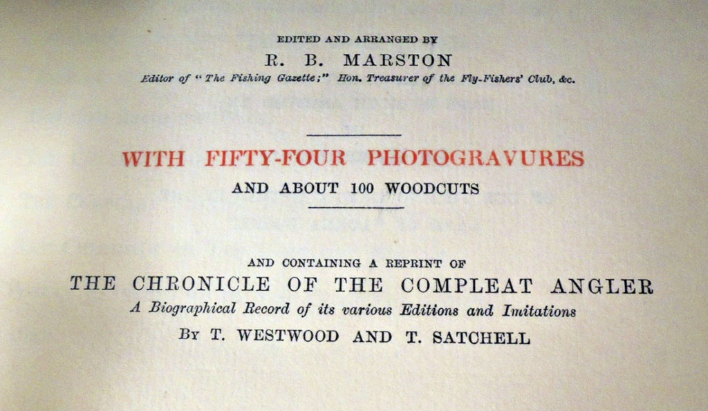
Izaak Walton (1593-1683), The Compleat Angler, or, The Contemplative Man’s Recreation: being a discourse of rivers fish-ponds fish and fishing written by Izaak Walton; and instructions how to angle for a trout or grayling in a clear stream by Charles Cotton; edited and arranged by R. B. Marston; with fifty-four photogravures and about 100 woodcuts; and containing a reprint of The Chronicle of the Compleat Angler, a [biblio]graphical record of its various editions and imitations by T.Westwood and T.Satchell (London: Sampson Low, Marston, Searle and Rivington, 1888). Copy 165 of 250. Royal Quarto Edition De Luxe. Graphic Arts Collection (GAX) Oversize 2006-0967Q

1897: Kodak Portfolio

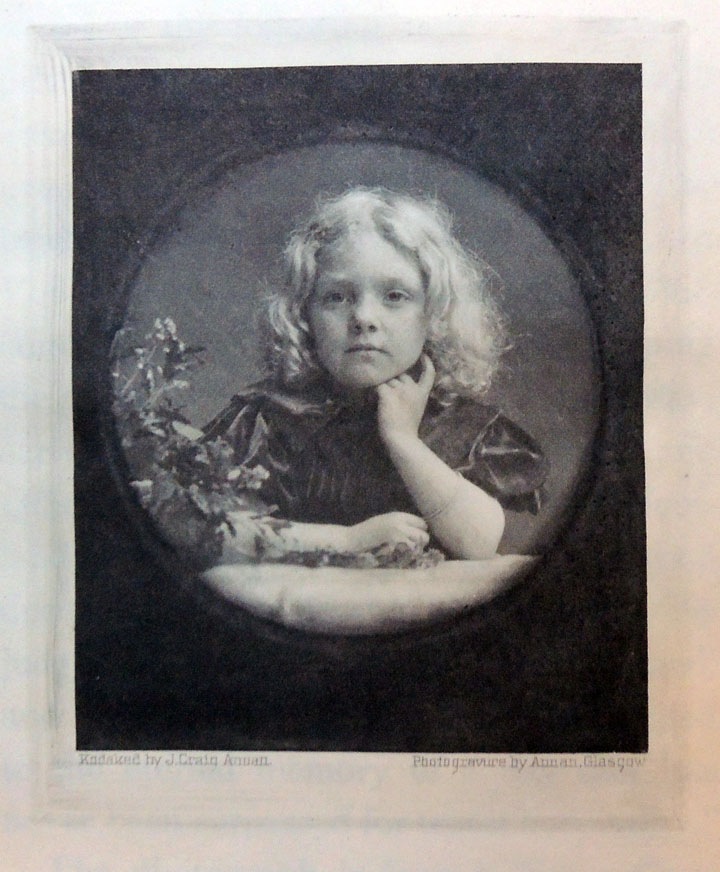
“Child Portrait” by Mr. J. Craig Annan. There is no more delightful occupation for the Kodaker than to photograph a charming child. The self-consciousness which so often spoils an otherwise capital model of more mature years is entirely absent, and the operator has full scope to exercise his skill in reproducing some of the childish graces of his dainty subject. The present picture was taken with a No. 4 Cartridge Kodak, and cut down to its present dimensions.
Introduction.

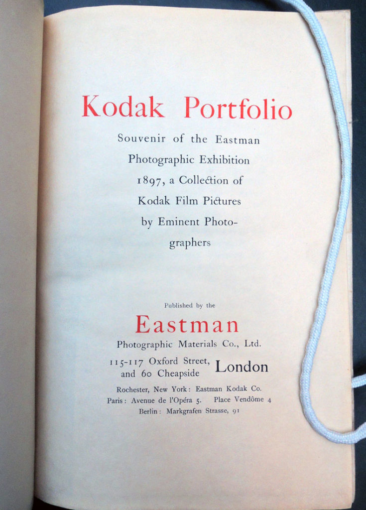
This edition de luxe of 14 photographs by eminent photographers is a souvenir of the Eastman Photographic Exhibition, held at the New Gallery, Regent Street, London, from 27th October to 16th November, 1897. It is aimed chiefly to exemplify some of the pictorial applications of the Kodak and film photography.

The pictures, without exception, are Kodak film pictures, and the assortment is specially arranged to illustrated a few of the various classes of subjects which can all be effectively exploited by Kodak photography.

Landscape, seascape, architectural pictures, portraiture pure and simple done at home, portrait head and shoulders, portraiture of three-quarter figure, portraiture of the whole figure with drawing-room surroundings, will be found pictorially exemplified in this little volume.

We wish to express our hearty thanks to the eminent photographers who have kindly lent us their film negatives, from which the fine reproductions have been made by Mr. J. Craig Annan, of Messrs. Annan & Sons.
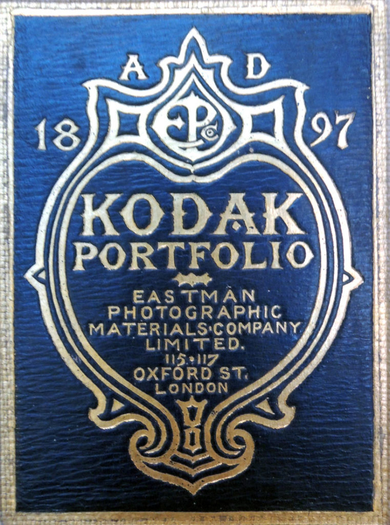
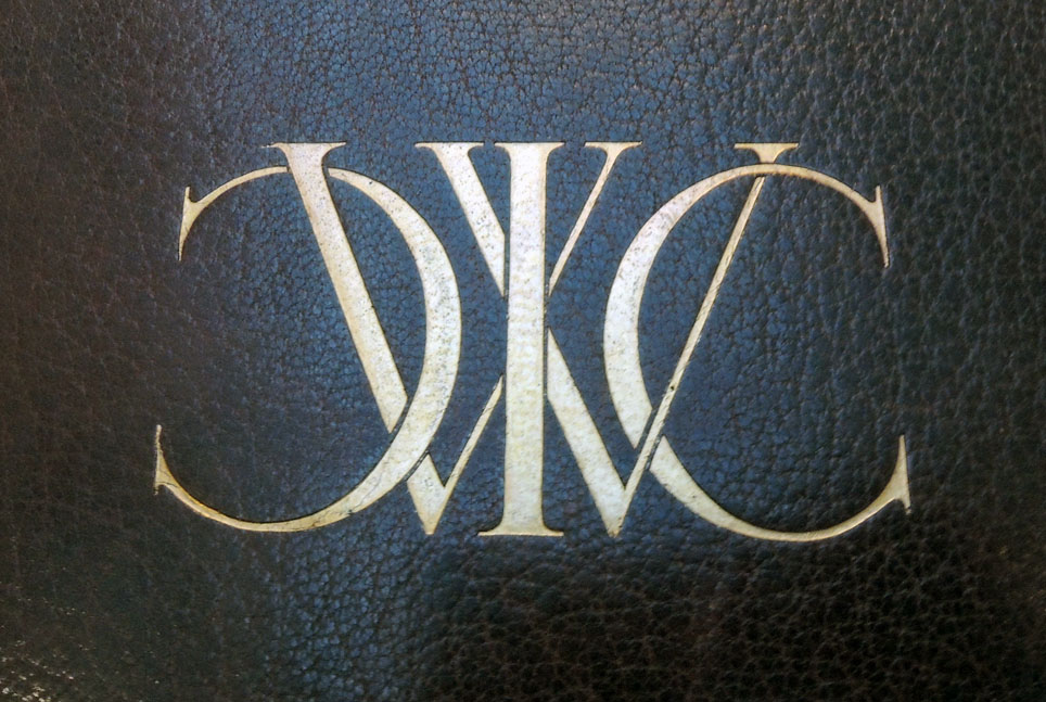
The design stamped upon leather on the cover is by Sir David Young Cameron RA (1865-1945).

Kodak Portfolio: Souvenir of the Eastman Photographic Exhibition 1897: A Collection of Kodak Film Pictures By Eminent Photographers (London: Eastman Photographic Materials Co., Ltd.; Rochester, N.Y.: Eastman Kodak Co., [1897]). SAX in process.

This catalogue and the London exhibit featured the photographs of Henry Peach Robinson (1830-1901), W. Stoiber (active 1890s), George Davison (1854-1930), James Craig Annan (1864-1946), Eustace Calland (active 1890s), Andrew Pringle, Frances Benjamin Johnston (1864-1952), and Alfred Horsley Hinton (1863-1908). Each negative was engraved and printed in photogravure by James Craig Annan’s company Annan & Sons in Glasgow, Scotland.

Here are a few more examples from the catalogue.
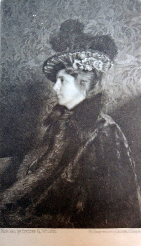
“A Portrait” by Miss Frances B. Johnston. This profile portrait has been specially taken by Miss Johnston for the Kodak portfolio. It furnishes another example of the successful use of the lighting of ordinary rooms for portraiture. The textures of the different surfaces represented are effectively rendered in the picture. The photograph was taken with a No. 2 Bull’s-Eye Kodak.
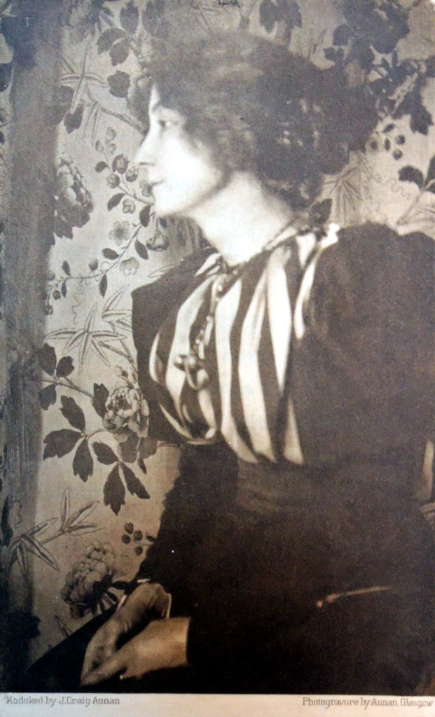
 

“Portrait of a Lady” by Mr. J. Craig Annan. The effect obtained in this picture is, as we feel it, made up of a selection of an interesting face, a simple pose, and a pleasing decorative arrangement of figure, costume, and background. The picture was taken with a No. 4 Cartridge Kodak.
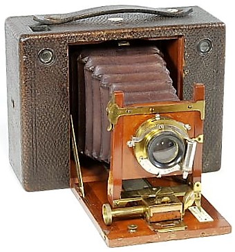


One example of the 1897 No. 4 Cartridge Kodak, the type used to make the negatives for several of these images.
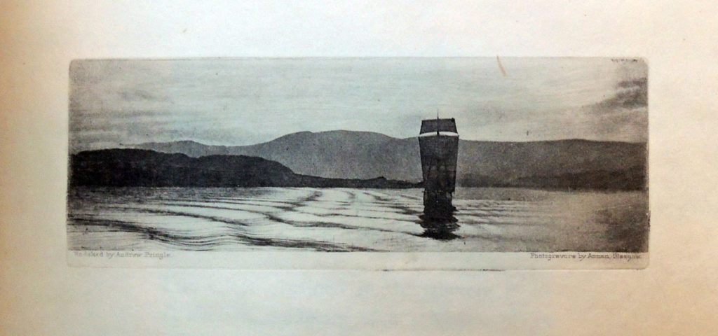


“Night on a Norwegian Fjord” by Mr. Andrew Pringle. Mr. Pringle informs us that this picture was taken about 9 P.M. on a July evening on a Norwegian fjord. The boat is an old Norway lugger, and the curious lines in the water are waves formed in the wake of the steamer form which the photograph was taken. The negative was taken in a No. 4 Cartridge Kodak.
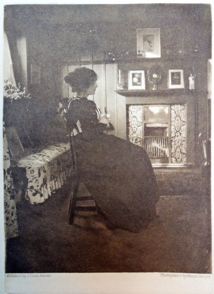
 

“Portrait with Interior” by Mr. J. Craig Annan. This little picture shows what can be done with the Kodak in the way of home portraiture. The complete figure is shown gracefully posed in an interesting light, and suggests a more natural portrait than one generally finds in a studio photograph. Photographers  would do well to make more experiments with the lighting secured by a judicious use of their ordinary domestic rooms. The negative was taken with a No. 4 Cartridge Kodak.
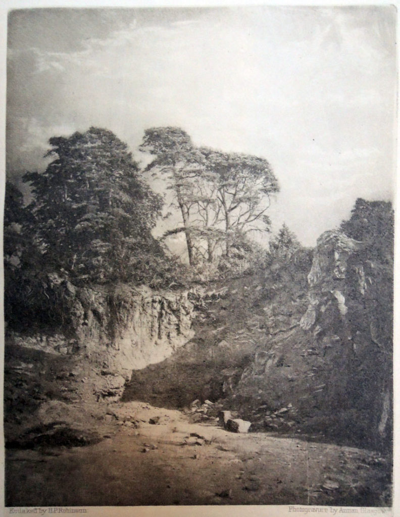
 

“Rusthall Quarry” by Mr. H.P. Robinson. In response to a request for a note upon his picture, Mr. H. P. Robinson kindly writes as follows: This little known but very picturesque dell is part of the beautiful Rusthall Common, near Tunbridge Wells, of which it is part. Although it is most accessible it is so hidden in the hollow between the rocks of the disused quarry and some rising ground and tall trees, that few lovers of the picturesque find their way into it.

For thirty years it has been a happy hunting-ground that almost seemed my own, both for photography and natural history. I feel ashamed of appropriating so much beauty to myself, and should be glad to see other photographers at work in it. There are plenty of subjects for all. We think no one can fail to recognize in this picture a delightful effect of a kind which is associated in our minds with many beautiful old engravings. The negative was taken with a No. 4 Cartridge Kodak.
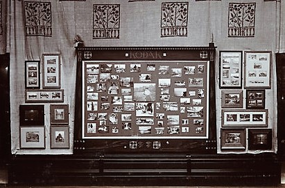
Kodak exhibition interior, 1897. Printing out paper print of a Kodak exhibition interior designed by George Walton (1867-1933), at the New Gallery, Regent Street, London. © Kodak Collection. National Science & Media Museum. Science & Society Picture Library


Pathological Color

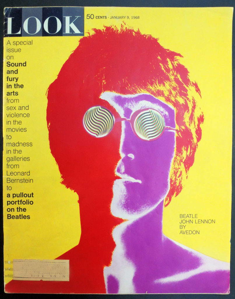
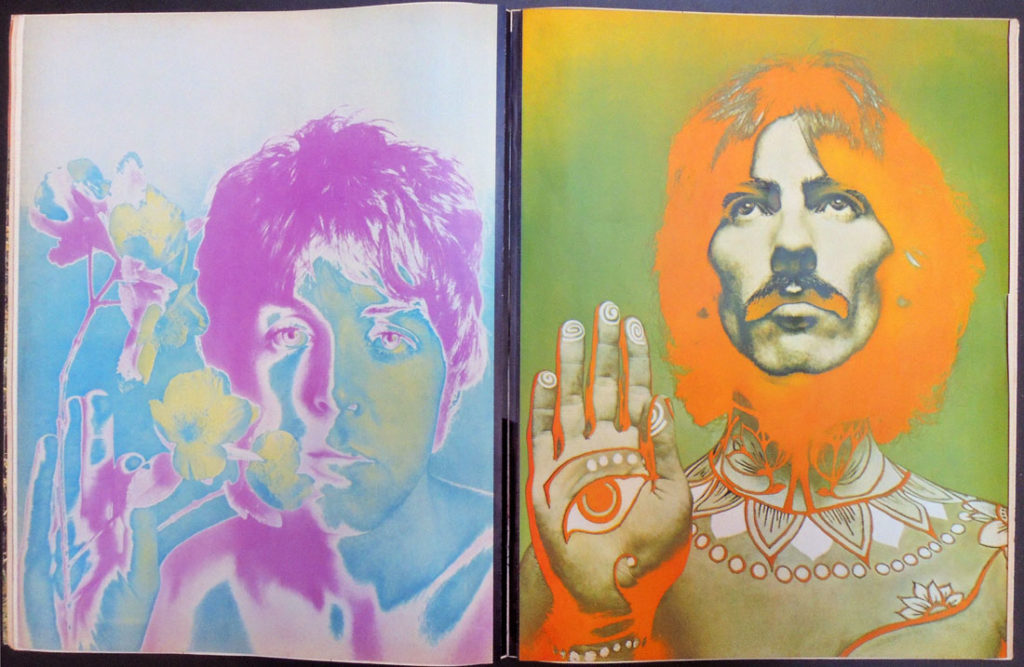
The Graphic Arts Collection recently acquired the January 9, 1968 issue of Look magazine for Princeton University’s upcoming class: Pathological Color, VIS 326 • Spring 2018, being taught by James Welling, Lecturer with the rank of Professor in Visual Arts.

This course will examine photography’s ongoing negotiation of evolving color technologies. Students will use film and digital cameras to explore color as a physiological phenomenon and a technology of image reproduction as well as a virtual construct to be created at will. The analog darkroom and the digital lab will be used to make prints for periodic critiques. A range of new tools will be introduced, including sheet film development, less used Photoshop tools, and analogue color pigment printing. This course will require independent and collaborative assignments, augmented by field trips, readings and discussion.

http://arts.princeton.edu/courses/pathological-color-spr-18/

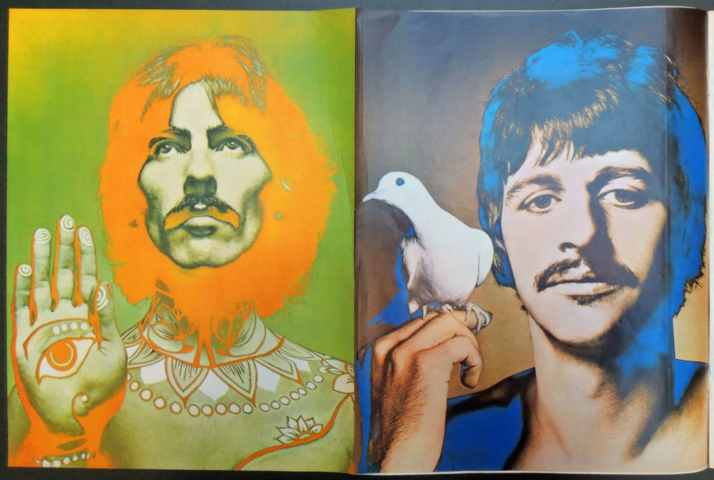
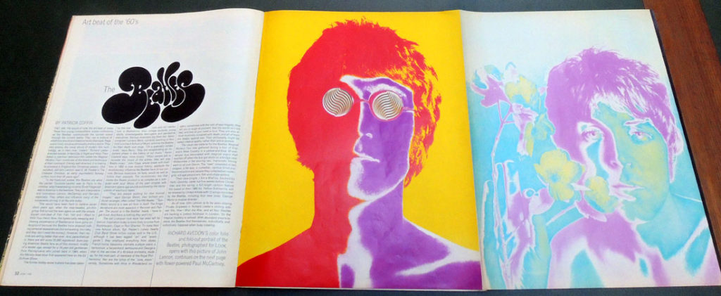
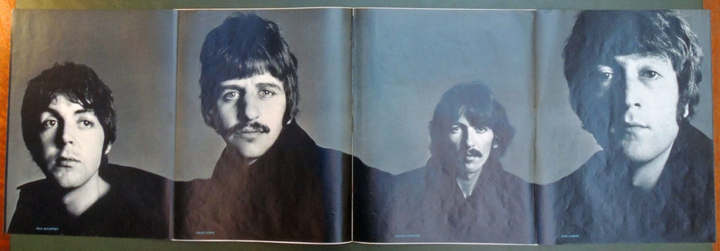
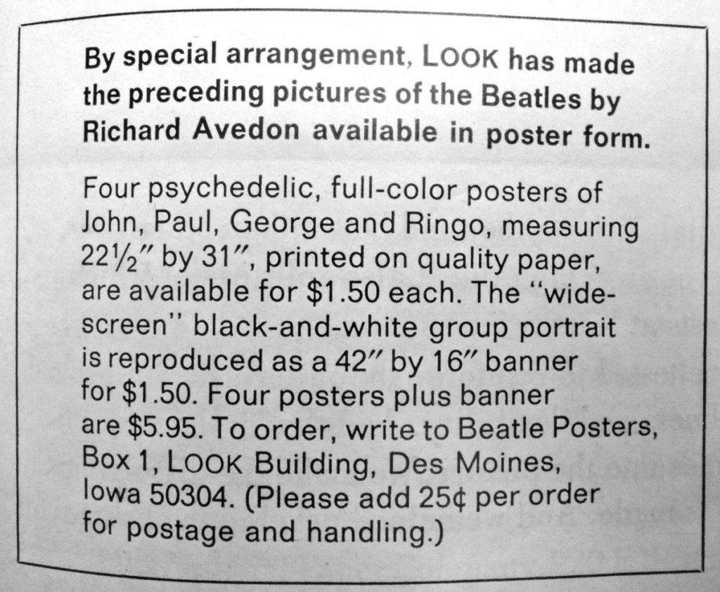
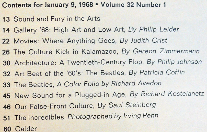
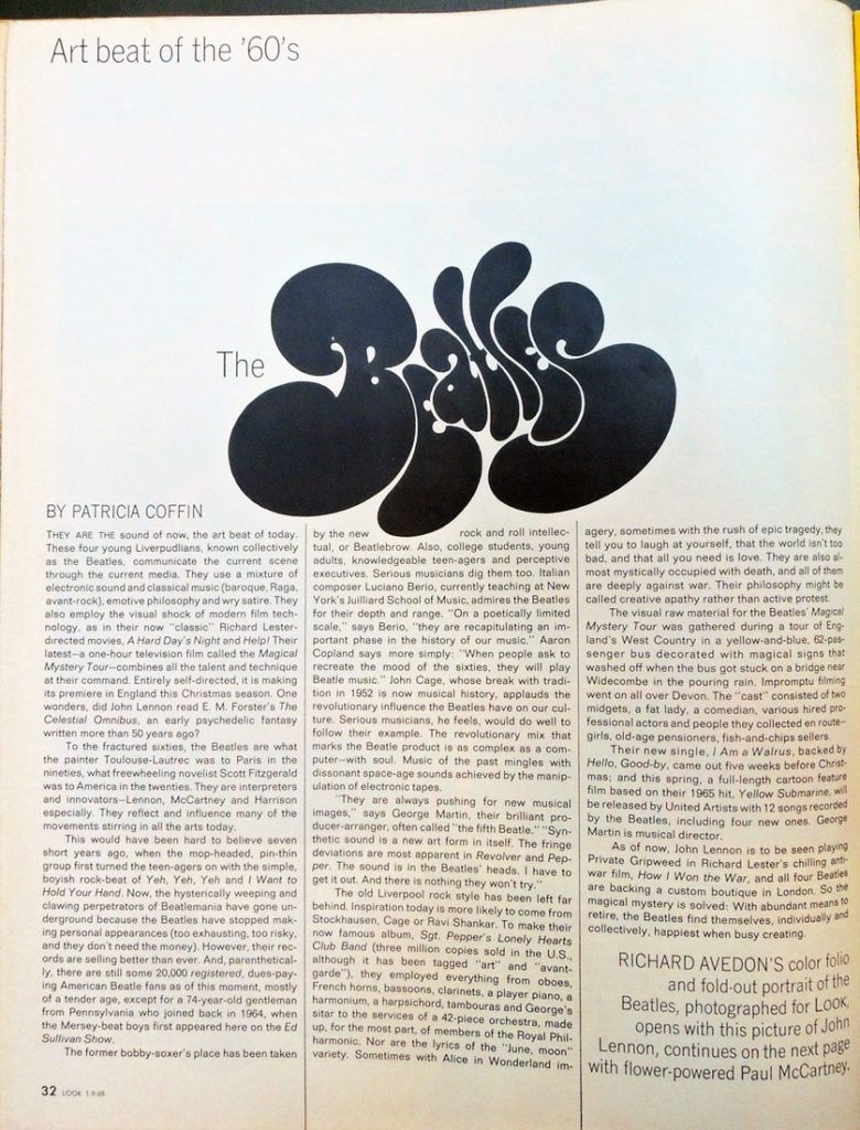
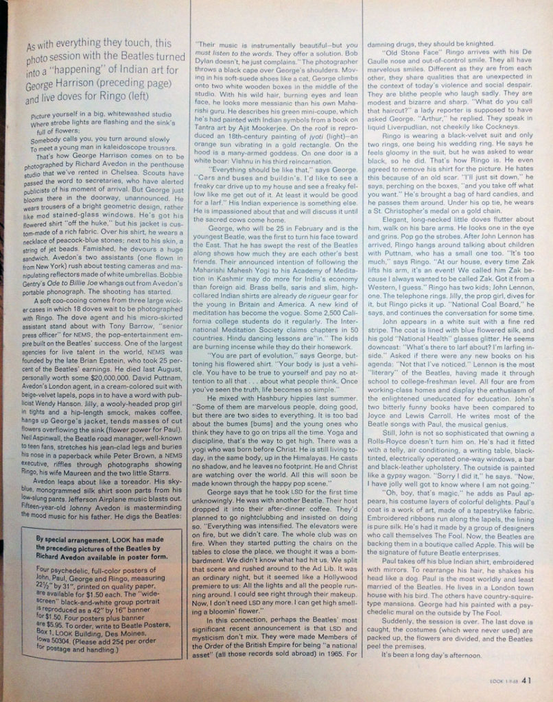
For this issue, an article on the success of the Beatles entitled “The Art Beat of the ’60s” was written by Patricia Coffin and Richard Avedon was commissioned to photograph the four young men. The shoot took place in New York City on August 17, 1967, but there were changes in the layout throughout the fall, with the size and sequence of the portraits changing several times at the insistence of the record company.

Avedon’s photographs are at the center of the issue so they can easily be removed for framing. One side has the psychedelic color version and the other has the black and white.

Currently, there is room for one more student in this class. The sample reading list includes Ludwig Wittgenstein, Notes on Color; Johan Wolfgang von Goethe, Theory of Colors; Wassily Kandinsky, Concerning the Spriritual in Art; Rudolph Steiner, Colour; Julia Kristeva, Black Sun; and Michael Taussig, What Color is The Sacred?


Gutenberg 2018 Jubilee

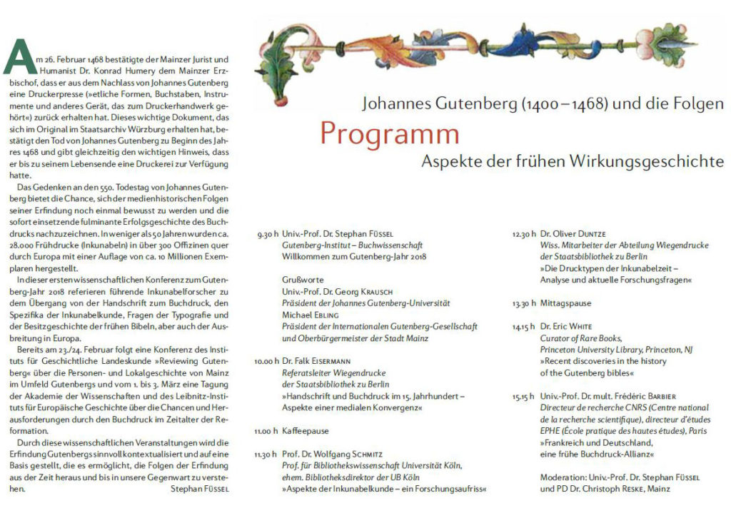
Move over Shakespeare, Poe, and Luther. Next week brings the start of the Gutenberg 2018 Jubilee. Leading scholars of incunabula will descend on Mainz, Germany, for the opening symposium Friday, 26 January 2018. Held in the Atrium Maximum, Alte Mensa, Johann-Joachim-Becher-Weg 3-9, on the campus of Johannes Gutenberg University Mainz, the day of lectures is free of charge. A full program can be found here: http://www.buchwissenschaft.uni-mainz.de/wp-content/uploads/2018/01/Kolloquium-2018-Gutenberg-Programm.pdf

The event website, in English, is here: https://www.mainz.de/en/service/gutenberg-jubilee-2018.php

“On February 26, 1468, the Mainz lawyer and humanist Dr. Konrad Humery, archbishop of Mainz, that he has got back a printing press from the estate of Johannes Gutenberg. This important document, which was preserved in the original in the Würzburg State Archive, confirms the death of Johannes Gutenberg at the beginning of the year 1468 and at the same time gives the important indication that he had a printing shop until the end of his life.

The commemoration of the 550th anniversary of the death of Johannes Gutenberg offers the opportunity to once again become aware of the media-historical consequences of his invention and to trace the immediate success story of the printing press. In less than 50 years approximately 28,000 early incunabula (incunabula) were produced in more than 300 officers across Europe with a circulation of about 10 million copies.” https://idw-online.de/de/news687644


A year of events, programs, tours, music, and study follows.

Suggestion: Prepare for the year by reading our colleague Eric White’s new book: Editio Princeps: A History of the Gutenberg Bible (Harvey Miller Studies in the History of Culture), reviewed here by Paul Needham: https://harveymillerpublishers.com/2017/12/06/paul-needham-on-editio-princeps-a-history-of-the-gutenberg-bible/

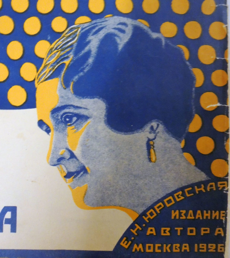
Portrait of Ekaterina Nikolayevna Yurovskaya


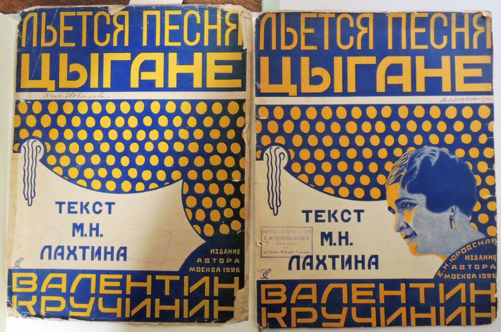
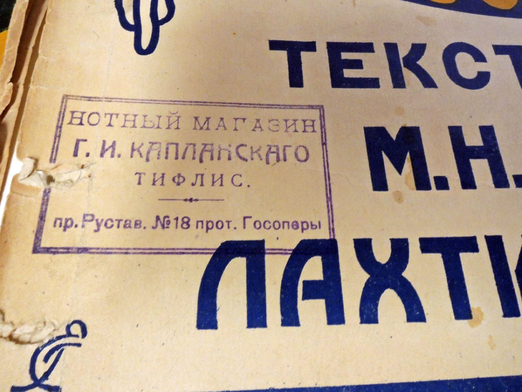
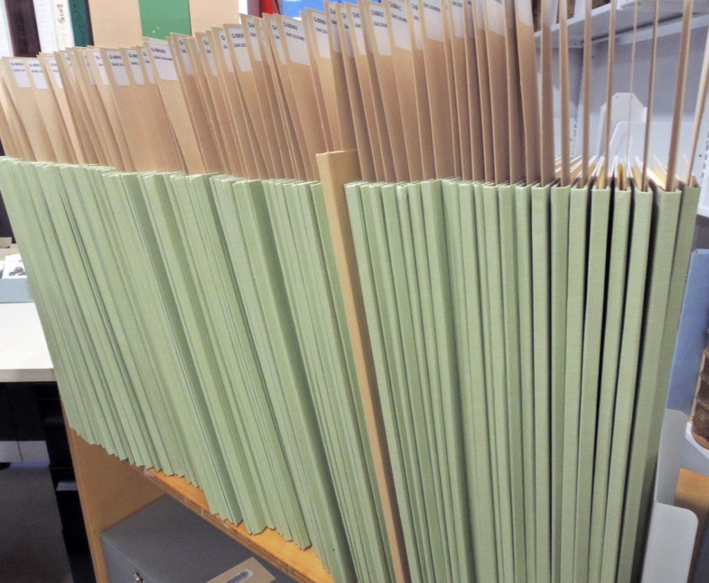
The Graphic Arts Collection of Early Soviet sheet music, purchased in conjunction with Slavic East European Studies, has been conserved, digitized, and now, individually catalogued by special collections assistant Anna Meerson, along with dozens of new name authority records created by Eva Eslami, Western Languages Cataloging Team.

Thanks to Thomas Kenan, Slavic, East European, and Eurasian Librarian, two copies of the sheet music for the same 1926 song were identified, which is already rare but in addition, one has a portrait on the cover of the Russian singer E. N. I︠U︡rovskai︠a︡ (also written Ekaterina Nikolayevna Yurovskaya, 1886-1949) while the other has no such image.

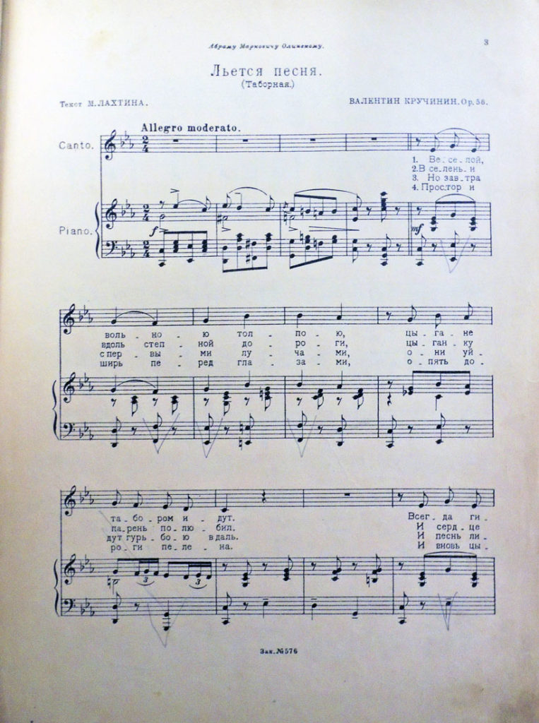
The music, “L’etsi︠a︡ pesni︠a︡. t︠s︡ygane” was written by Valentin Kruchinin and the lyrics by M.N Lakhtin. Our score is designed by the artist Evgeniĭ Mikhaĭlovich Gol’shtein (ca. 1880-ca. 1942).

Each piece of music can be searched by composer, lyricist, title, and other elements here: http://library.princeton.edu/. This one is: Valentin Kruchinin (composer) and M.N. Lakhtin (lyricist), Lʹetsi︠a︡ pesni︠a︡ t︠s︡ygane (Moskva: Izdanie avtora, 1926). Notes: “Abramu Markovichu Olinskomu”—Cover; Artist’s monogram “EG”—Cover; Illustrated by Golʹshteĭn, Evgeniĭ Mikhaĭlovich. Artist’s full name is taken from the book “Opredelitelʹ monogramm khudozhnikov-oformiteleiĭ proizvedeniiĭ pechati”; sostavil Alekseĭ Morozov. Graphic Arts Collection Q-000377

Listen to a recording by Ekaterina Yurovskaya here: http://www.russian-records.com/details.php?image_id=18812&l=Russian
Thanks to Mike Siravo for processing the collection.

Blizzard on Fifth Avenue, traffic coming and going

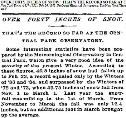
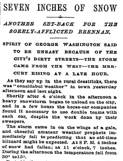
Above: New York Times February 26, 1893, p. 9.   Below: New York Times February 18, 1893

February of 1893 brought terrible weather throughout the United States with the “heaviest snowfalls in years” recorded for New York City.

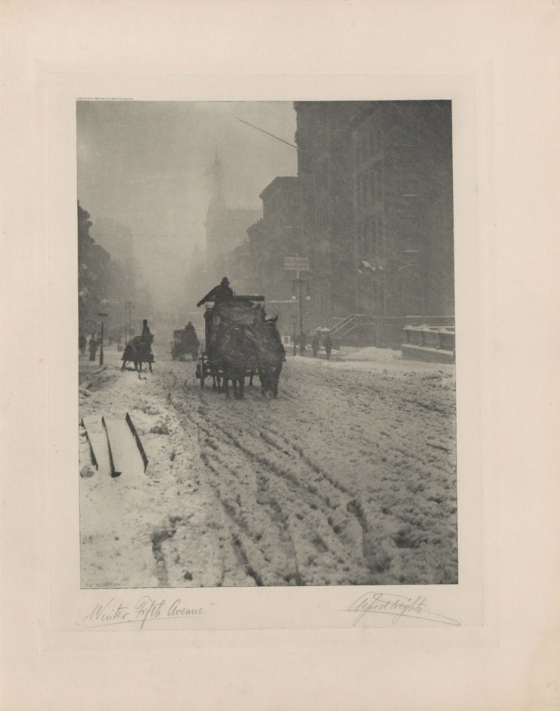
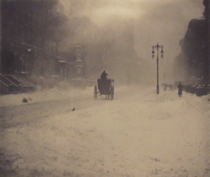
Alfred Stieglitz (1864-1946) took a day off from work at the Photochrome Engraving Company (formed after the demise of the [New York] Heliochrome Company), and famously spent several hours shooting photographs on Fifth Avenue with a hand-held camera. In particular, he captured a horse drawn coach coming towards him and then, driving away.

Back in the Photochrome studio on Leonard Street, he printed some as magic lantern slides and on April 7, 1893, presented them at the Exhibition of Lantern Slides for the Society of Amateur Photographers of New York.

“The first slides shown were by Alfred Stieglitz, comprising scenes on the Battery, the squalid localities of New York, as well as some interesting souvenirs of life on Fifth Avenue between Murray Hill and the Central Park, and several shots taken during the sloppy weather of March. They exhibited the same knowledge of what to do and how to do it that we have become accustomed to expect from the hand of this accomplished photographer.”– “Society News,” The American Amateur Photographer: A Monthly Review of Amateur Photography (New York), 5, no. 5 (May 1893).

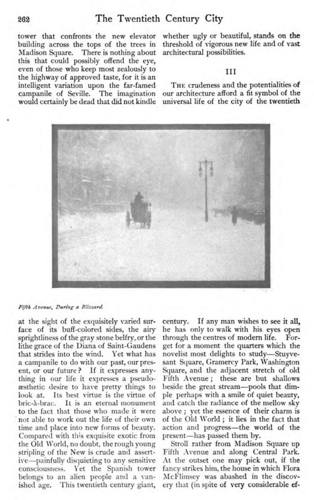
Below: Detail from John Corbin, “The Twentieth Century City,” Scribner’s Magazine 33, no. 3 (March 1903).
Over the next few years, various negatives from the blizzard were printed as photogravures, carbon prints, gelatin silver prints, and as halftone ink prints making the chronology of these iconic images and their reproductions complex. It is unfortunate that today most paper copies of the publications where they appeared are only available in digital form, leaving the identification of the ink print process impossible.

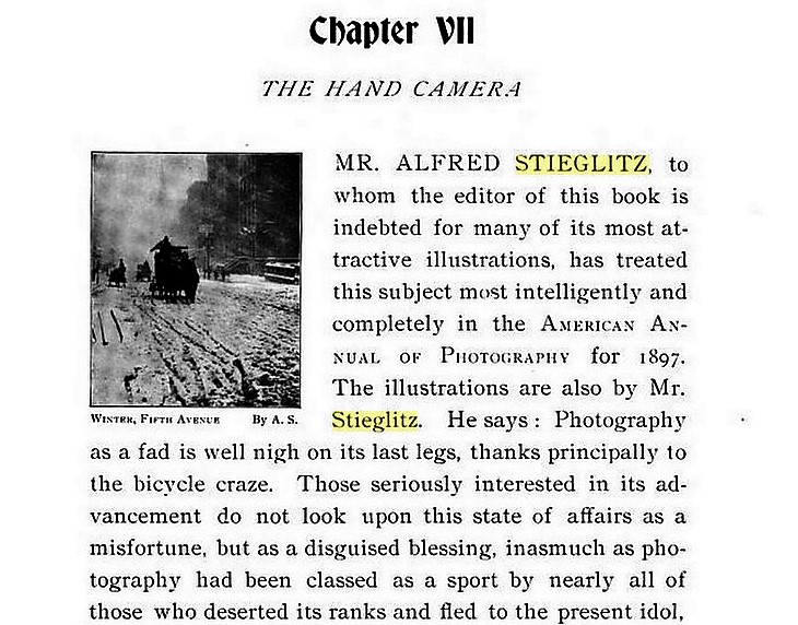
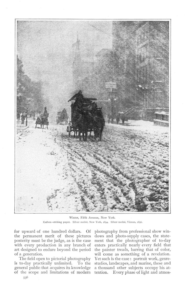
Ink prints of Stieglitz’s negatives for “Winter-Fifth Avenue” appeared in the Photographic Times, 28 (April 1896); W. I. Lincoln Adams (1865-1946), Sunlight and Shadow (New York: The Baker & Taylor company [1897]); the luxury photogravure portfolio Picturesque Bits of New York and other studies (New York: R. H. Russell, 1897); Alfred Stieglitz, “Pictorial Photography,” Scribner’s Magazine 26, no.56 (November 1899); John Corbin, “The Twentieth-Century City.” Scribner’s Magazine 33, no. 3 (March 1903); and of course, Camera Work: A Photographic Quarterly 12 (October 1905). p. 7; among many others. Multiple negatives, multiple processes, multiple headaches.

Detail from W. I. Lincoln Adams (1865-1946), Sunlight and shadow (New York: The Baker & Taylor company [1897]). Originally published in the Photographic Times, 1896. Recap 4597.114.2


Alfred Stieglitz, “Winter-Fifth Avenue,” 1893, carbon print 1894.

The Blizzard, New York. Gelatin silver print, used for the reproduction in Corbin’s article 1905.

Alfred Stieglitz, “Pictorial Photography,” Scribner’s Magazine 26, no.56 (November 1899).

 
Nine versions are listed in: Sarah Greenough, Alfred Stieglitz: the key set: the Alfred Stieglitz collection of photographs (Washington, D.C.: National Gallery of Art; New York : H.N. Abrams, 2002). Marquand Library Oversize TR653 .N38 2002q.

Note: In-between blowing snow the signs can be read.


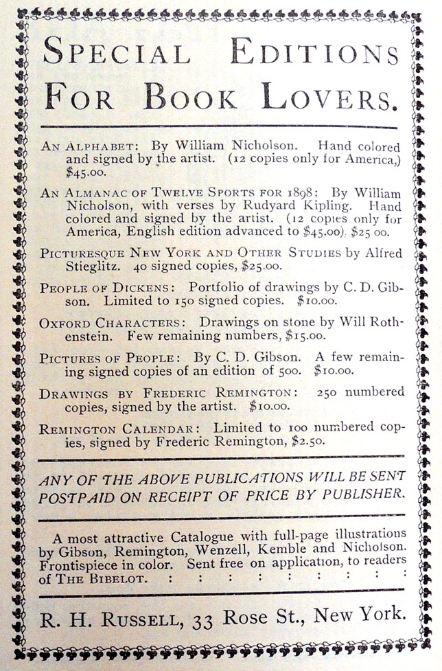
Advertisement for Stieglitz’s Picturesque Bits of New York (New York: R.H. Russell, 1897) in Bibelot 3, no. 12 (December 1897). No illustration but price: $25.


American Editors

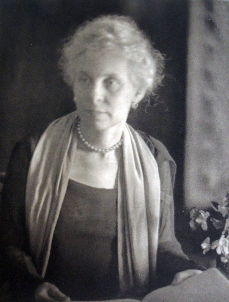
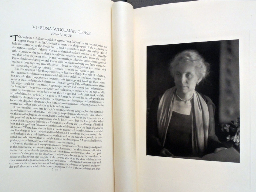
Edna Woolman Chase (1877–1957), editor-in-chief of Vogue magazine from 1914 to 1952. Detail from Doris Ulmann’s A Portrait Gallery of American Editors, full page below.


In 1924, when Doris Ulmann (1882-1934) began photographing the leading magazine and newspaper editors in the United States, she made 43 portraits; 41 were men and 2 were women.

Many of the sitters Ulmann met through The Art Center on 56th Street, incorporated in 1921 to bring together seven organizations: Art Alliance of America, Art Director’s Club, American Institute of Graphic Arts, New York Society of Craftsmen, Pictorial Photographers of America, Society of Illustrators, and the Stowaways.

Elmer Adler (1884-1962), founder of Princeton’s Graphic Arts Collection and a member of AIG and the Stowaways, was the original owner of our book.

A student of the Clarence White School, Ulmann published three volumes of portraits printed in photogravure between 1919 and 1925: The Faculty of the College of Physicians & Surgeons, Columbia University in the City of New York: Twenty-Four Portraits (1919), A Book of Portraits of the Faculty of the Medical Department of the Johns Hopkins University, Baltimore (1922), and A Portrait Gallery of American Editors (1925).

With each, she collaborated with a small circle of friends from the White School and The Art Center, including the Center’s president, Frederic W. Goudy (1865-1947). Goudy designed and arranged the type for her books and Bertha M. Goudy (1869-1935) set the type at their Village Press, which had recently moved from Queens to Marlborough-on-Hudson. The photogravures were engraved and printed from her negatives by Harry M. Phillips at his Manhattan Photogravure Company, 142 W. 27th Street.
At an Art Center meeting, Goudy introduced the typeface he used:

“Members were gratified and reassured to see our ex-president, F. W. Goudy, at the March 22 meeting, the first public affair he had attended since his operation and convalescence. Many compliments were heard that evening, and since, concerning Mr. Goudy’s new typeface, “Garamont,” a classic interpretation of the face used by Geoffrey Tory’s pupil. In further celebration of Mr. Goudy’s return to health and productivity, the Committee on Publications in April distributed to members, as one of their “keepsakes,” Clarence White’s portrait study of Mr. Goudy, reproduced in gravure by Harry M. Phillips of Manhattan Photogravure Company.”–Bulletin of The Art Center May 1923 [Keepsake: Graphic Arts Collection GAX 2010-0022F].
Their friend Ralph Steiner (1899-1986) also worked for Phillips at Manhattan Photogravure during the early 1920s when they producing the photogravures of Robert Joseph Flaherty’s negatives for Revillon Frères. It is likely that Steiner also worked on Ulmann’s books. https://graphicarts.princeton.edu/2018/01/09/revillon-freres-portfolios/ . Steiner went on to become photographer for Adler’s Pynson Printers, https://www.princeton.edu/~graphicarts/2009/02/adlers_pynson_printers_photogr.html.

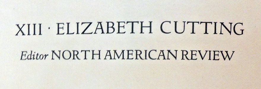
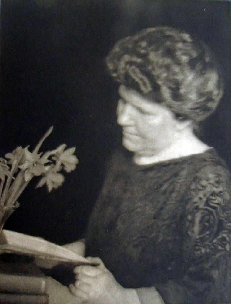
Note: Each of the sitters was asked to write a short statement about themselves and their work. All except one was published. Why is there no text along with the portrait of Elizabeth Cutting (1871-1946)? Did she not write one or was it considered unacceptable and not printed?

Cutting’s 1947 obituary in New York History notes that she received a B.A. from Vassar College and an M.A. from Columbia University. She joined the editorial staff of Harper’s Bazaar in 1907 before moving to The North American Review in 1910, serving as managing editor from 1921 to 1927. She was among the founders of the Cosmopolitan Club in New York and made a Chevalier of the Legion of Honor by the French government. It is too bad her statement, if there was one, does not appear.


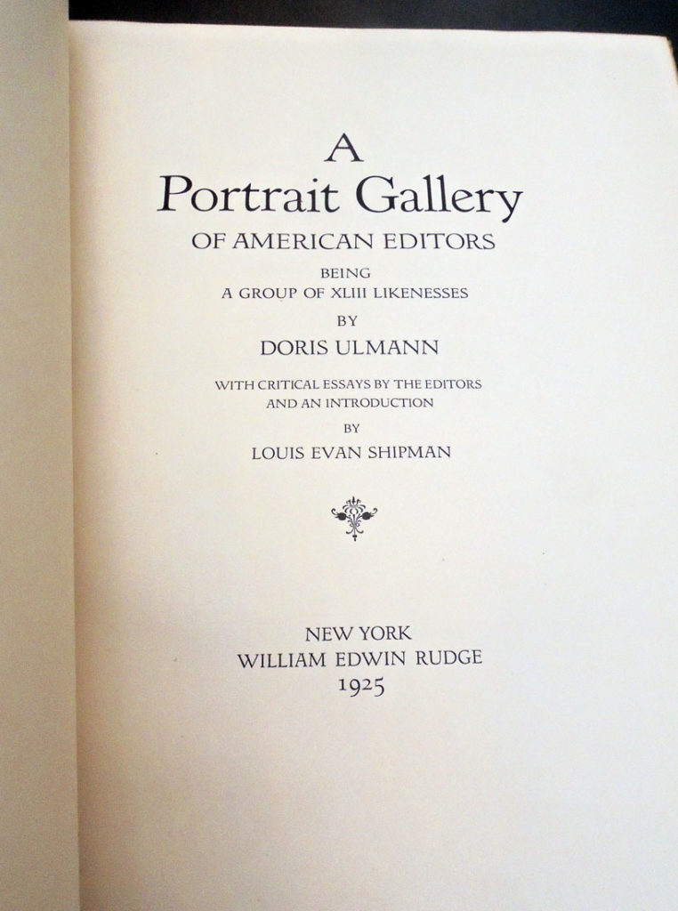
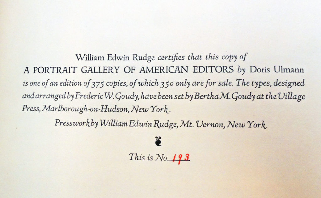
Doris Ulmann (1882-1934), A Portrait Gallery of American Editors, Being a Group of XLIII Likenesses by Doris Ulmann; with critical essays by the editors and an introduction by Louis Evan Shipman (New York: W.E. Rudge, 1925). Copy 193 of 375. “The types, designed and arranged by Frederic W. Goudy, have been set by Bertha M. Goudy at the Village Press, Marlborough-on-Hudson, New York. Presswork by William Edwin Rudge, Mt. Vernon, New York.” Graphic Arts Collection GAX Oversize 2006-0205F

See also: Elizabeth Brown Cutting, Old Taverns and Posting Inns (London: G.P. Putnam, 1898).