Category Archives: Acquisitions

new acquisitions

Shopping at Walter Schatzki’s on 57th Street

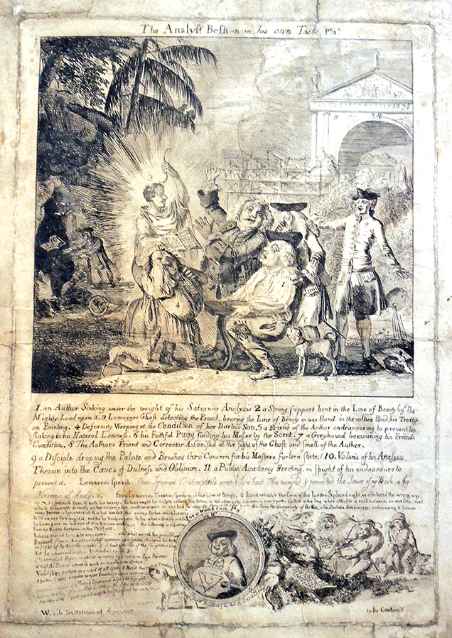
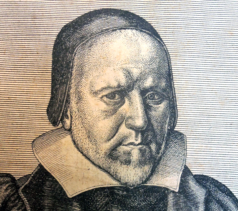
Back in April 2020, when we were all desperately searching for online resources to finish the semester’s work, we posted the British Museum’s portrait print by Wenceslaus Hollar (1607-1677), Vera Effigies, Rich. Bernard [Richard Bernard, 1568-1641], 1641.  https://graphicarts.princeton.edu/2020/04/02/the-legall-proceeding-in-man-shire-against-sinne/

Within a day a cheerful email appeared that began,

“Yesterday’s post about Richard Bernard with his portrait by W. Hollar especially caught my eye, as we have the etching, purchased at Walter Schatzki’s on 57th St. in October 1967 when I was a graduate student. We bought several prints from Schatzki around that time. Professor Koch had recommended him and his wonderful shop as a place for undergraduates to buy inexpensive but interesting works. We paid $6.67 for the print (the sheet of paper is 20.3 cm. high by 13.8 cm. wide), on sale for 1/3 off. Beyond my liking of the print as a work of art, I suppose I have thought Bernard might have resembled New England Puritans.”

With sincere thanks to William and Sally Rhoads (and to Walter Schatzki), that $6.67 etching is now in the Graphic Arts Collection, where it will certainly be used by a new generation of students and faculty.

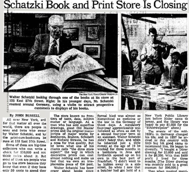
When Walter Schatzki’s Book and Print Shop closed in 1976, John Russell wrote a long article in the New York Times praising the dealer:

All over New York, and for that matter all over the world, there are people in ones and twos who swear by Walter Schatzki, and by the print‐cum‐bookstore he runs at 153 East 57th Street. Some of them are big‐time collectors who can write a check for 550,000 and not think twice about it. But most of them are people who go to the store because they know that even if they have only 50 cents to spend they can come away with something they like and be treated exactly as if they were Paul Mellon himself. All these enthusiasts—the experts and the beginners, the rich and the not so rich —have had bad news. On July 1 Mr. Schatzki is closing his store. “My lease is up,” he said the other day. ‘My rent would be almost tripled. I don’t feel like moving.

. . . Walter Schatzki has been crazy about books since 1910, when he hung around the bookstore in the town of Siegen, not far from Cologne, where he was born. And he has been in the business since 1919, when as a tall and very young man, already bespectacled, he went from village to isolated village in his native Germany with a violin in one hand, and a pack full of cheap good books on his back. “I went from fair to fair, and I would play my violin. People gathered round, and sometimes they sang a song or two, and then I opened my pack of books, and people would buy a book who had never seen a bookstore, let alone walked into.


Wenceslaus Hollar (1607-1677), Vera Effigies, Rich. Bernard [Richard Bernard, 1568-1641], 1641. Etching. Inscribed in the design, u.l., ‘Ætatis suæ 74’. Inscribed in the plate, l.l. to l.r., ‘Vera Effigies RICH. BERNARD vigilantis/ simi Pastoris de Batcombe Somrset: Ao; 1641’; l.c. to l.r., ‘W:Hollar. Bohem, ad viuum del: Londini:’ Gift of William and Sally Rhoads. Graphic Arts Collection GAX 2020- in process

Hollar’s 1641 print appears as a frontispiece in the subject’s 1644 book (and perhaps others):


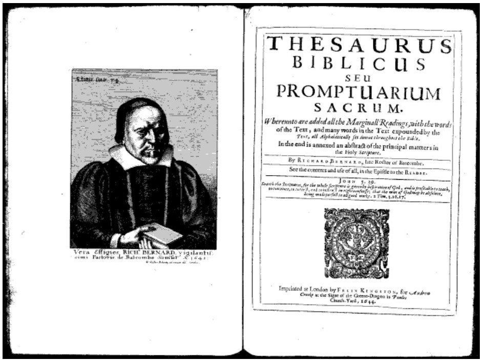
Richard Bernard (1568-1641), Thesaurus Biblicus seu promptuarium sacrum, whereunto are added all the marginall readings, with the words of the text, and many words in the text expounded by the text, all alphabetically set downe throughout the Bible. In the end is annexed an abstract of the principal matters in the Holy Scripture (London: Imprinted by F. Kingston, 1644).

See:

Richard Pennington A Descriptive Catalogue of the Etched Work of Wenceslaus Hollar, 1607-1677. Cambridge University Press, Cambridge, 1982, cat. no. 1363 only state.

Simon Turner Wenceslaus Hollar: New Hollstein German engravings, etchings and woodcuts, 1400-1700. Giulia Bartrum, vols. 1-9, 2009–2012, cat. no. 337 only state.


Pilori-Phrenologie = Phrenology Pillory

Guillaume-le-Boucher = Wilhelm the Butcher is a French caricature of Prussian King Wilhelm I. The verse below the image mentions the dream of a “United States of Europe” (this is a detail, the whole sheet is below).

[Above] André Belloguet (1830-1873), Pilori-Phrénologie ([Paris: variously signed Imprimerie Marchandeau and Lith. Fraillery r. Fontaines 9, Propriéte de l’Auteur]. 1870). Provenance: Collection de Louis Bretonnière. Graphic Arts Collection GAX 2020- in process

[ Left] André Belloguet (1830-1873), Pilori-Eternel (Paris, [variously signed Imp. Grognet, Lith. Fraillery et Cie Pte de l’Auteur].1871). 3 color lithographs. Provenance: Collection de Louis Bretonnière. Graphic Arts Collection GAX 2020- in process


Best known for his anthropomorphic maps (not owned by Princeton), André Belloguet also produced a rare series of satirical caricatures morphing various words, figures, and objects into celebrated faces, creating phrenology pillory or facial embarrassment. The Graphic Arts Collection recently acquired two volumes from the collection of Louis Bretonnière. Bound in two volumes, the first with 13 lithographs, all but one colored, and the second with 3 lithographs. Each portrait includes four lines of satirical verse written below, presumably also by Belloguet.

The first volume includes: 1. Napoléon III; 2. Pie IX; 3. Olivier Iscariote; 4. SS. Guillaume le Boucher; 5. Bismarkoff Ier; 6. Bazaine de Metz; 7. Rouher le Mignon; 8. Pierre l’Assassin; 9. Bonaparte le Corse; 10. Trochu de Paris; 11. Thiers l’Ancien; Pl. 12. Le Bœuf; 13. Favre dit le Grand Jules (the only plate uncoloured).

The next series, Pilori-Éternelis includes: 1. Qui… ???; 2. La Bouteille à l’encre; and 3. Le Prussien de l’intérieur.

The Analyst Besh[itte]n, in His Own Taste

Paul Sandby (1731-1809), The Analyst Besh[itte]n, in His Own Taste, ca. 1753. Etching. Graphic Arts Collection GAX 2020- in process

The Analysis of Beauty, first published by William Hogarth (1697-1764) in 1753, was an attempt to describe the artist’s theories of visual beauty in a manner accessible to the common man. Not everyone was persuaded of the book’s success, especially Hogarth’s younger rival Paul Sandby (1731-1809), who lost no time in making fun of the old master.

In truth, they disagreed about many things, including The St Martin’s Lane Academy, a drawing club Hogarth organized in 1735. The Academy prized new ideas over traditional styles and operated under a democratic rule that allowed everyone to have an equal vote, down to the poses their model would take. But in 1853, the Academy began to change under various leaders, moving and eventually closing 1871 to form the Royal Academy of the Arts, which Sandby joined. Hogarth did not.

Sandby lampooned Hogarth and his artistic theories in a series of satirical etchings dubbed “The Analysis of Deformity.” Writing for the New York Times, Souren Melikian noted that “Humor does not age well. Seen with a modern eye, Sandby’s satirical etchings are unamusing and the texts intended to be witty seem immature in their crudeness. But the art historical interest of the prints is unquestionable. They confirm Sandby’s astonishing ability to practice with great ease genres at opposite ends of the aesthetic spectrum.”

Depending on how you interpret them, Sandby may have published as many as eleven prints against Hogarth (although some can be interpreted as jokes on other artists) including Hogarth Vindioated; Burlesque sur le Burlesque; A New Duneiad; Puggs Graces; The Analyst, &c.; The Author run Mad; A Satire, &c.; The Magic Lantern; The Painters March; Mountebank Painter; and A Stir in the City, &c.

The Graphic Arts Collection recently acquired one  of these prints caricaturing The Analysis of Beauty, titled The Analyst Besh[itte]n, in His Own Taste, ca. 1753. Although the condition of this sheet is not perfect, the contents are highly desirable and outshines the surface imperfections. There are two editions of this print. The reference table etched at the foot of the first is :— “A. Dianas Crescent B. a Multiplying Glass. 0. a Modern Cherubim 76 a Gammon of Bacon 14 Rays of Light 4 Beauty stays 68 jack boot”. On the second the following is added :——“ n. a Disciple unable to find out the Meaning of y’ Book 1!: the Daubers Face shewn (by a Satyr) in proper Colours 1. his hour is out 2, a Bust of Raphael Destroyd for pugs Wig block “.

Notice the numbers on the figures, beginning with Hogarth, who sits with a copy of Analysis of Beauty on his lap. The references beneath the design are as follows :  1. an Author Sinking under the weight of his Saturnine Analysis ; 2. a Strong support bent in the Line of Beauty by the Mighty Load upon it ; 3. Lomazzos Ghost detecting the Fraud, bearing the Line of Beauty in one Hand. in the other Hand, his Treatise on Painting. ; 4. Deformity Weeping at the Condition of her Darling Son. ; 5. a Friend of the Author endeavouring to prevent his sinking to his Natural Lowness. ; 6. his Faithful Pugg, finding his Master by the Scent. ; 7. a Greyhound bemoaning his Friends Condition. ; 8. The Authors Friend and Corrector Astonishd at the sight of the Ghost and smell of the Author. 9. a Disciple droping the Palate and Brushes thro’ Concern for his Masters forlorn state. ; 10. Volum’s of his Analysis Thrown into the Caves of Dulness and Oblivion. ; 11. a Public Academy Erecting in spight of his endeavours to prevent it. Lomazzo’s speach, ‘Thou Ignorant Contemptable wretch how hast Thou mangled Q‘ perverted the Sense of my Book, in thy Nonsensical Analysis.

Thanks to the British Museum, some of the other Sandby satires of Hogarth include:


Obsolete ideas from 1805: Single ladies, vulgarly called old maids

Eliza Browne, Obsolete Ideas, in Six Letters Addressed to Maria By a Friend (Sherborne: for the author by James Langdon, 1805). Graphic Arts Collection GA 2020- in process.

If the contents of this small volume written by a women to a female reader were not appealing enough, the provenance of a female owner,  Catherine P[ayton] Fox, (inscribed on the title page with her label on front pastedown), makes it extra desirable.

Eliza Browne, identified in the fourth edition of her work, wrote six letters giving advice to a younger women. This is not your usual etiquette book or guide to modern manners. It would be interesting to compare all four editions to see if the advice changes over the years.

“Under this singular title, are comprised some shrewd and useful observations on the relative conduct of parents and children; the fashionable dissipation of young men, who have been piously educated; the respect due to aged persons; chaste women, and women of character; on the poor in general; and on single women. To the latter two classes, the fair author, though apparently allied to neither, is in every respect very charitably disposed. In proof that a deserving person may be reduced even to beg in the streets, she relates a very pleasing and pathetic story… No part of the short table of contents, probably, may excite the curiosity of our readers, so much as the distinction between chaste women and women of character.”–The Eclectic Review, vol. II, part 1, 1806, pp. 148-49

“Courteous, candid, and gentle Reader,” Eliza begins, “those are epithets that must sound very strange in modern ears, but the writer of the following pages cannot by any means do without them; and as she makes a point of rejecting nothing that may answer her purpose, even though it should have been the fashion of the sixteenth century, it is therefore hoped that the introduction of so obsolete an address with give offence [sic] to [no one].”

The fourth edition of this book introduces yet another women to the mix. It is dedicated to the Viscountess Cremorne, probably Philadelphia Hannah Freame, the daughter of Thomas Freame and Margaretta Penn, fourth daughter of William Penn (1644-1718), the founder of Pennsylvania.

“In 1770 she married the widowed Thomas Dawson (1725-1813), who in that same year was elevated to the Irish peerage, as Baron Dartry of Dawson’s Grove. Dawson was the son of Dublin banker Richard Dawson and his wife Elizabeth Vesey Dawson. From 1749-1768 Thomas Dawson served as a member of Parliament for County Managhan [Ireland].

He was married firstly in 1754 to Lady Anne Fremor, daughter of the first Earl of Pomfret, with whom he had a son and a daughter. Dawson and his second wife had a son and daughter as well. In 1795 he was made Viscount Cremorne, and in 1797 he became Baron Cremorne of Castle Dawson.

Dawson was a patron of the arts and a collector of paintings. Gilbert Stuart painted his portrait, as well as that of the Viscountess, and he was included on Stuarts’ 1895 list of those patrons who were to receive copies of the artist’s portrait of George Washington (although it is unknown whether he actually received one).”–National Gallery of Art, Washington D.C.


Gilbert Stuart, Portrait of ‘Philadelphia Hannah’, ca. 1785. Oil on canvas. Philadelphia Academy of the Fine Arts 1999.11

The New Gypsy Fan

The New Gypsy Fan ([London, ca. 1795]). Approximately 26.7 x 46 cm open. Graphic Arts Collection GA2020. in process.


The Graphic Arts Collection recently added a late-18th-century fortune telling fan to the growing collection of printed fans in our library. Along the top border are twelve sections marked with the month and sign of the zodiac. Each section is further divided into “Earthy,” Fiery,” “Airy,” and “Watry,” listing the characteristics of those born under these signs.

At the center is a large oval providing “The Explanation” for using the fan to tell fortunes. The user is told to shuffle a pack of cards and lay out an odd number face up, which are read according to the fan’s descriptions.  To the left are the thirteen fortunes for each of hearts and diamonds, and on the right a similar arrangement for spades and clubs. The suit and number of the card are located and nine fortunes are read out to the player. The final instruction is to “draw your general conclusions.”

George Woolliscroft Rhead, writing in his History of the Fan (2014) notes:

“Gypsy, fortune-telling and necromantic [black magic] fans form a large class, and were common during the latter part of the eighteenth century. As early, however, as Aug. 3, 1734, a necromantic fan was advertised in the Craftsman as follows:—
‘By Eo, Meo, & Areo.
On Monday last was published
The Necromantick Fan; or, Magick Glass.
Being a new-invented Machine Fan, that by a
slight Touch unseen a Lady in the Fan changes her
Dressing-Glass according to the following Invitations:
If any one himself would see,
Pray send the Gentleman to me:
For in my Magick Glass I show
The Pedant, Poet, Cit, or Beau;
Likewise a Statesman wisely dull,
Whose plodding Head’s with Treaties full.”

This fan shuold not to be confused with The New Woburn or Bedford Gipsy Fan at the British Museum; or The New Gypsy Fan at the Fitzwilliam Museum and Huntington Library; or several other titles for the fan inscribed “The Art of Fortune Telling by Cards.” Each of these has “an oval vignette of a gypsy woman reading the palm of a young girl, watched by a boy, with an egg timer and cards on the table beside her. Text lists the months with the characteristics of their star signs, and fortune-telling readings from playing cards, such as: “Promises a Country Partner with a good future”; “Is the worst Card in the Pack sign of poverty”; “Three times well married”; and “A Coffin”. On the verso of the fan, directions for fortune telling with cards.”—Huntington Library

Pikoenelojo Stencil (Maurice Huenún)


In the fall of 2019, protests began in Chile’s capital, Santiago, in response to an increase in the subway fares, as well as general cost of living and social inequality. Demonstrations, vandalism, and riots appeared throughout the country, bringing over a million people into the streets to protest against President Piñera, demanding his resignation.

Beverly Karno of Howard Karno Books was in Chile when the protest movement began. She was able to personally collect graphic material and ephemera relating to the demonstrations, including a striking collection by the noted street artist, Pikoenelojo Stencil. His bold stencils merge audacious political statements with gender-bending images. It is fabulous and timely.

Six months, a revolution, a pandemic, international demonstrations, and a fragile mail system later, the material finally arrived at Firestone Library and was unpacked.


Back in October, the BBC reported “Protestas en Chile: ‘Estamos en guerra,’ la frase de Piñera que se le volvió en contra en medio de las fuertes manifestaciones.” Santiago was under a curfew but a message appeared a building in Plaza Italia that read: “No estamos en Guerra” [We are not at war].

“The phrase has gone viral on social networks and has become an icon of these protests that have taken to the streets of various cities in the South American country … some with violent protests (looting of supermarkets and burning of various public spaces), but also with peaceful demonstrations through saucepans. The [phrase] is directly related to the President of Chile, Sebastián Piñera, who, on Sunday night and after the 36 most violent hours that have occurred in Chile since the return to democracy, said:
“Estamos en guerra contra un enemigo poderoso, implacable, que no respeta a nada ni a nadie, que está dispuesto a usar la violencia y la delincuencia sin ningún límite”. =
“We are at war against a powerful, implacable enemy, who respects nothing and no one, who is willing to use violence and crime without limit.”

The huge print in the Graphic Arts Collection and below, one on a Chilean building.


Take a look at Pikoenelojo Stencil (Mauricio Huenún) at work:

https://www.perrerarte.cl/pikoenelojo-me-sorprendio-que-un-candidato-de-derecha-utilizara-mi-obra/

In 2016, the artist wrote: My name is Mauricio Huenún, I work in the art of the stencil, a branch of graffiti. In the street world I call myself Pikoenelojo Stencil, a stamp with which I stamp images on public walls referring to political, religious and social situations or events (pages and notes that account for my work can be found in the Google search engine). However, as an art form away from political contingency, I also paint walls -with the same stencil technique- but which are oriented to contents that relate to the original place of the wall to intervene.

http://stencilvegacentral.blogspot.com/2016/?m=0


Here are a few more images:


Locals pose with Pikoenelojo Stencil work found on buildings in Santiago

Black Lives Matter

This week it’s hard to concentrate with the continuing inequities in the United States so blatantly exposed. While it is necessary for everyone to do better, here are just a few recent acquisitions that might help to highlight interesting and important Black lives, for upcoming classes.

This slideshow requires JavaScript.

Here is a small selection from a group of approximately 120 press and wire photographs dating from the early 1960s through 1980, recently acquired by the Graphic Arts Collection with the help of Steven Knowlton, Librarian for History and African American Studies. These heavily used prints all relate to the Civil Rights movement in the United States, documenting protests, marches, sit-ins, and police confrontations in Atlanta, Alabama, Chicago, Louisiana, Massachusetts, Mississippi, and Washington, D.C.

[left] “Selma, Ala., Mar. 12 — The ‘Wall’ is down — Jubilant demonstrators held aloft a rope barricade after it was cut down in Selma, Ala. today [by] public safety director Wilson Baker. The demonstrators had sung [unclear] referring to the barricade as the Berlin wall and Baker unexpectedly walked over and severed it. He said “nothing has changed” and still refused to allow the non-stop demonstrators to march. …1965.” Read more about 1965 events in Selma: https://www.cnn.com/2013/09/15/us/1965-selma-to-montgomery-march-fast-facts/index.html

Read more about this photo-archive: https://graphicarts.princeton.edu/2018/02/23/the-civil-rights-movement-in-america/


jones set designs3

This beautiful design by Robert Edmond Jones (1887-1954), is for the production of Simon the Cyrenian, one of three short plays that opened April 5, 1917 at New York’s Garden Theater under the heading Three Plays for a Negro Theater. Jones not only designed but directed the three productions, which each featured all Black casts. As one of the first straight plays to feature Black actors exclusively, without melodrama or burlesque, this production is often cited as the beginning of the period we call the Harlem renaissance.

W. E. B. Du Bois (1868-1963) transcribed the outpouring of critical review in The Crisis, beginning with poet Percy MacKaye’s comment, “It is indeed an historic happening. Probably for the first time, in any comparable degree, both races are here brought together upon a plane utterly devoid of all racial antagonisms—a plane of art in which audiences and actors are happily peers, mutually cordial to each others’ gifts of appreciation and interpretation.” Read more; https://graphicarts.princeton.edu/2014/03/12/robert-edmond-jones-directs-an-all-black-cast/


During his years as an undergraduate at the Hampton Institute, Willis J. Hubert (1919-2007) kept a scrapbook, filling it with programs, report cards, newspaper articles, and many informal photographs of his classmates. This enormous volume bound in carved wood boards, 30 x 46 x 7 cm, provides an intimate look at undergraduate life at this primarily black school from 1936 to 1940.

According to his obituary, published in The Atlanta Journal-Constitution from May 15 to May 17, 2007, Hubert went on to have a distinguished military career in which he achieved the rank of Lieutenant Colonel. Not long after he graduated from the Hampton Institute, he entered the U.S. Air Force and trained at Tuskegee Army Air Field, where Hubert was one of the original Tuskegee Airmen.

Hubert became the first African American to earn an M.A. and Ph.D. (New York University) while on active duty, as well as the first to complete the Harvard Business School (Military Co-op) Statistics Training Program. Read more: https://graphicarts.princeton.edu/2018/05/04/undergraduate-life-at-the-hampton-institute/


The Graphic Arts Collection recently acquired a set of photographic postcards documenting the “Burning of the Negro Smith.” Two are captioned in white ink. None of them were ever addressed or mailed. The postcards came in a plain envelope marked with the caption in pencil: “Greenville, TX, 28 July 1908”.

“Ted Smith, aged 18 years old, was accused of raping a young white woman in Clinton, Texas. He was arrested and brought to jail in nearby Greenville. A mob took him from his cell at eight the next morning. Rather than the usual hanging, they covered him under a pile of wood, doused him with kerosene, and burned him alive in the center of town, in front of a large crowd. The postcards depict the horrible scene, with the crowd gathered around the fire. Read more: https://graphicarts.princeton.edu/2018/05/03/the-murder-of-ted-smith-in-1908/


The Graphic Arts Collection acquired a rare promotional brochure for the Norman Film Company’s 1919 silent movie, The Green Eyed Monster, its first production with an all Black cast. Billed as a “Stupendous All-Star Negro Motion Picture,” audiences found it long and so, Norman had the film cut from eight-reels to five-reels. A second release in 1920 led to great success. Although no portion of the film survives, reviews list the actors as Jack Austin, Louise Dunbar, Steve Reynolds, and Robert A. Stuart.

“The first film company devoted to the production of race movies was the Chicago-based Ebony Film Company, which began operation in 1915. The first black-owned film company was The Lincoln Motion Picture Company, founded by the famous Missourian actor Noble Johnson in 1916. However, the biggest name in race movies was and remains Oscar Micheaux, an Illinois-born director who started The Micheaux Book & Film Company in 1919 and went on to direct at least forty films with predominantly black casts for black audiences.”–The New Encyclopedia of Southern Culture: Volume 18 (2011).

Read more: https://graphicarts.princeton.edu/2018/01/24/brochure-for-all-colored-cast-silent-film/


avery haitian boat3

Eric Avery, USA Dishonor and Disrespect (Haitian Interdiction 1981-1994), 1991. Linoleum block print on a seven-color lithograph printed on mold made Okawara paper. 46½ x 34 inches. Edition: 30. Graphic Arts Collection 2014- in process.

Dr. Eric Avery incorporates his medical practice with his activist art, delving into such themes as infectious diseases, human rights abuse, and the death penalty, among others. Many of his complex prints appropriate one or more iconic art historical images into contemporary events. A few examples are now at Princeton University.

On July 14, 1990, The New York Times reported, “Bahamas Facing More Questions As It Buries 39 Drowned Haitians.” The story continued “Thirty-nine Haitians fleeing their impoverished Caribbean island drowned when their sailboat capsized and sank in choppy seas while being towed by Bahamian authorities, Government officials said. No explanation for what caused the sinking was given.” Published by the Tamarind Institute, Avery’s complex linocut incorporates the facts of the 1990 tragedy with three separate art historical paintings: Theodore Gericault’s The Raft of the Medusa, 1824; John Singleton Copley’s Watson and the Shark, 1778; and Rembrandt’s Christ in the Storm on the Sea of Galilee, 1633.

Read more: https://graphicarts.princeton.edu/2014/10/01/eric-avery/

A Born Classic

Mark Argetsinger, A Grammar of Typography: Classical Book Design in the Digital Age (Boston: David R. Godine, 2020). 528 pages; 8.5 x 12 inches; illustrated with over 425 images, many in full color.

The arrival of Mark Argetsinger’s new book, A Grammar of Typography, sent me running to a thesaurus in search of a word larger than comprehensive. Should we describe it as thorough? Inclusive? Far-reaching, in-depth, sweeping, or simply grand?

The publisher’s material begins: “A Grammar of Typography is a comprehensive guide to traditional book design that is both practical and historical. Interspersed with discussions of digital typesetting and page layout are broad historical views of the tradition of the book along with specific reference to the printer’s grammar or manual, the industry’s own codification of its usage, from Joseph Moxon in the seventeenth century through Theodore Low De Vinne in the nineteenth. In addition, there are chapters on house style, proof-reading, copy-editing, paper, binding, and appendices on typographical ornaments and Greek type. The book ends with an annotated bibliography and an index.”

How can you not love a book with an introduction titled “The Hidden Soul of Harmony: The Classical Tradition. A Practice in Search of a Theory”? Although Argetsinger claims “this is primarily a practical manual, not a scholarly treatise,” one would be hard-pressed to find a more philosophical look at “marks of quotation,” “font editing,” or “horizontal space.”

There is also biography and chronology. “In addition, Aldus was the first to cast in type the humanist’s running or cursive hand, known as the Italic. The busy work of the humanist, who daily, it seemed, uncovered new works of the Ancients, lying long neglected in the monastic or royal libraries of Europe, had required an efficient script to match the urgent copying of new texts.”

In his preface, Argetsinger writes, “This book intends to provide a historical context to the enterprise of book-making. The term grammar appears in its title both in reference to the historical phenomenon of ‘grammars’ of printing, regarding which much will be said along the way, as well as in reference to a certain graphical literacy that is requisite for the intelligent use of design and production tools in the digital age. Historical context is important both from the point of view of tracking evolving trends in the composition and display of printed matter, as well as from the point of view of preserving the traditions of its best practices.”

Open it anywhere and start reading.


“After the first necessities of life, nothing is more precious to us than books. The Art of Typography, which produces them, provides essential services to society and secures incalculable benefits. …Thus one could rightly call it par excellence the art of all arts and the science of all sciences.” –Pierre-Simon Fournier, le jeune, Manuel Typographique, Book 1 (1764).


A classical book designer, Argetsinger also embraces 21st-century technology, writing:
“There is something wonderful about working out the proportion of the page on screen, precisely mapping out its structure with the (by turns visible or invisible) grid and and page line; setting up one’s font with a complement of sorts so vast, even Christopher Plantin would feel a twinge of envy; readily changing size, font, color, position; and arraying, say, a two-volume, 800-page book heavy with illustrations and then placing its entire content on a digital thumb-drive….”

[Forgive my poor photography, the book itself is perfect.]

Colophon: “A Grammar of Typography set in DTL’s Fleischmann and printed on 115 Gem Munken print cream. All printing and binding by PBtisk Printing Company in the Czech Republic. This first edition consists of 1,875 hardcover trade copies as well as a deluxe slipcased edition of 125 copies signed and numbered by the author and only available directly from the publisher. Designed and composed by Mark Argetsinger, Holyoke, Massachusetts.”


A PostScript: My favorite Argetsinger design, proof he can do it all.

Optical games with letters

Detail from below

The Alphabet. The Alphabet in Capitals. The Lord’s Prayer. May his efforts to please his kind patrons succeed... (London: W. Snow [prob. circa 1815]). Hand colored steel engraved card, 14 x 10.5 cm. Graphic Arts Collection Recap 103360002
Detail from below.


This fun piece of ephemera offers three puzzles on one printed card, each with an optical trick. Published by W. Snow in Theobalds Road, London, the card showcases two alphabets written in the shape of monograms and a micrographic script with Lord’s Prayer.

W. Snow might refer to William Higgin Snow, publisher of another optical trick: A map of the country ten miles round London, printed around 1815 on a card 15 x 12 cm, the same as our optical card.

Such printed games were popular throughout the 19th century. A second copy of Snow’s card can be found in the John Johnson Collection of Printed Ephemera at the Bodleian Library along with dozens of other examples of the Lord’s Prayer or other texts “written in the compass of a silver penny.” https://library.princeton.edu/resource/4747

Here’s Two ALPHABETS rare;
With our blessed LORDS PRAYER;
‘Graven neat, Sirs, to please,
With precision and care.

While the ARTIST relies
On the strength of your eyes
And the help of kind Judgement
To AID his supplies

May his efforts to please his kind PATRONS succeed
And He’ll Emulous prove and feel grateful indeed.


Can you find all the letters of the alphabet?
X and Z might be the most difficult, easier in capitals below.

Checking the provenance of John Foster’s 1670 woodcut

Have you checked to bottom of your sewing basket recently for rare prints?

For many years, an impression of the first woodcut portrait printed in colonial America laid in the bottom of the work-basket of Sarah Catherine Mather (1840-1924) before it was discovered. The rare print was passed down to her nephew Frank Jewett Mather Jr. (1868-1953), former art history profession at Princeton University and a direct descendant of the subject of the print, Reverend Richard Mather (1596-1669). In 1957, the woodcut was given to the Princeton University Library, in memory of Frank Jewett Mather, Jr., by his wife, son, Frank Jewett Mather III, and daughter, Mrs. Louis A. Turner.


Sinclair Hamilton wrote,

“This cut is not only the first woodcut portrait produced in what is now the United States, it is also our first portrait print. Indeed, it is the first print of any significance to be made in this country, in any medium or of any kind, and may be said to mark the beginning of engraving, using that word broadly to embrace all types of cuts, in North America. … It is further reported by a good friend of his that, when the cut finally came into [Frank Mather’s] possession, he hung it near the front door so that, in case of fire, it would be the first object to be rescued, even before his Giorgione painting, which, a gift from him shortly before his death, now hangs in Princeton’s Art Museum”.

There are four other extant impressions from Foster’s woodblock. The first to be given to a public institution was presented in 1807 to the Massachusetts Historical Society by Arthur Maynard Walter, a descendant of Richard Mather.

William Bentley, another descendant of Mather, willed his copy of the print to the American Antiquarian Society, who acquired it in 1819. Green compared this copy with the one at the Massachusetts Historical Society, saying “A similar engraving, in which the two parts fit, is owned by the American Antiquarian Society at Worcester. Evidently this is a later impression from the same block, as the two parts fit; and furthermore, the left arm has been considerably pared off.”

According to Gillett Griffin in his 1959 article in PaGA, “The Harvard copy alone has a satisfactory seventeenth-century provenance. The handwriting of William Adams of Dedham, who died in 1685 and the fact that the print also belonged to his son, Eliphalet Adams of New London, who had it ‘bound in 1701-2’, provide the means of establishing its record.” This copy in the Houghton Library was not purchased individually but found, according to Samuel A. Green, “pre fixed to a copy of Increase Mather’s The Life and Death of That Reverend Man of God, Mr. Richard Mather, Cambridge, 1670, which in turn was bound up with a number of other pamphlets. Except for this one instance, nothing has been recorded which would indicate that the cut was originally intended for use as a frontispiece.” No date of the discovery is given.

In 1935 Tracy William McGregor (1869-1936) acquired the best collection in private hands of books and manuscripts written by or relating to the Mathers. Formed by William Gwinn Mather of Cleveland, Ohio, the collection numbered over 2,100 items, including John Foster’s woodcut of Richard Mather. Three years later, the trustees of the McGregor Fund donated the collection to the University of Virginia, beautifully housed today in the Tracy W. McGregor Library of American History.

Circle of Giorgione, Infant Paris Abandoned on Mount Ida, ca. 1510. Oil on wood panel. Gift of Frank Jewett Mather Jr., y1948-65